Tag: video
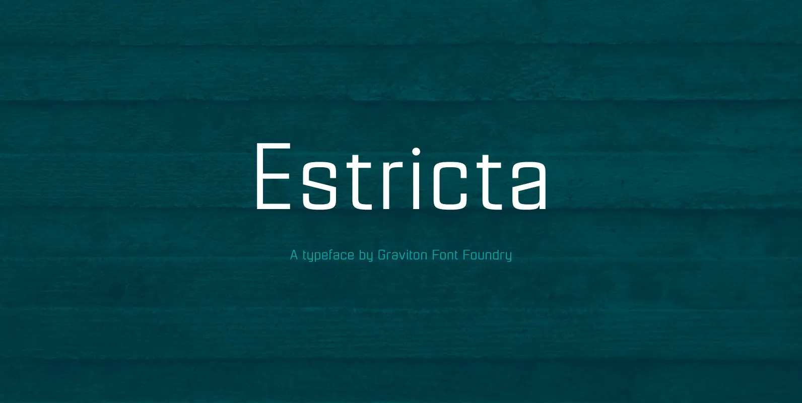
Estricta Font
Estricta font family has been designed for Graviton Font Foundry by Pablo Balcells in 2017. It is a sans serif typeface with a geometrical and mechanical appearance, its sharp, angular edges provide a strong and solid design. It has been
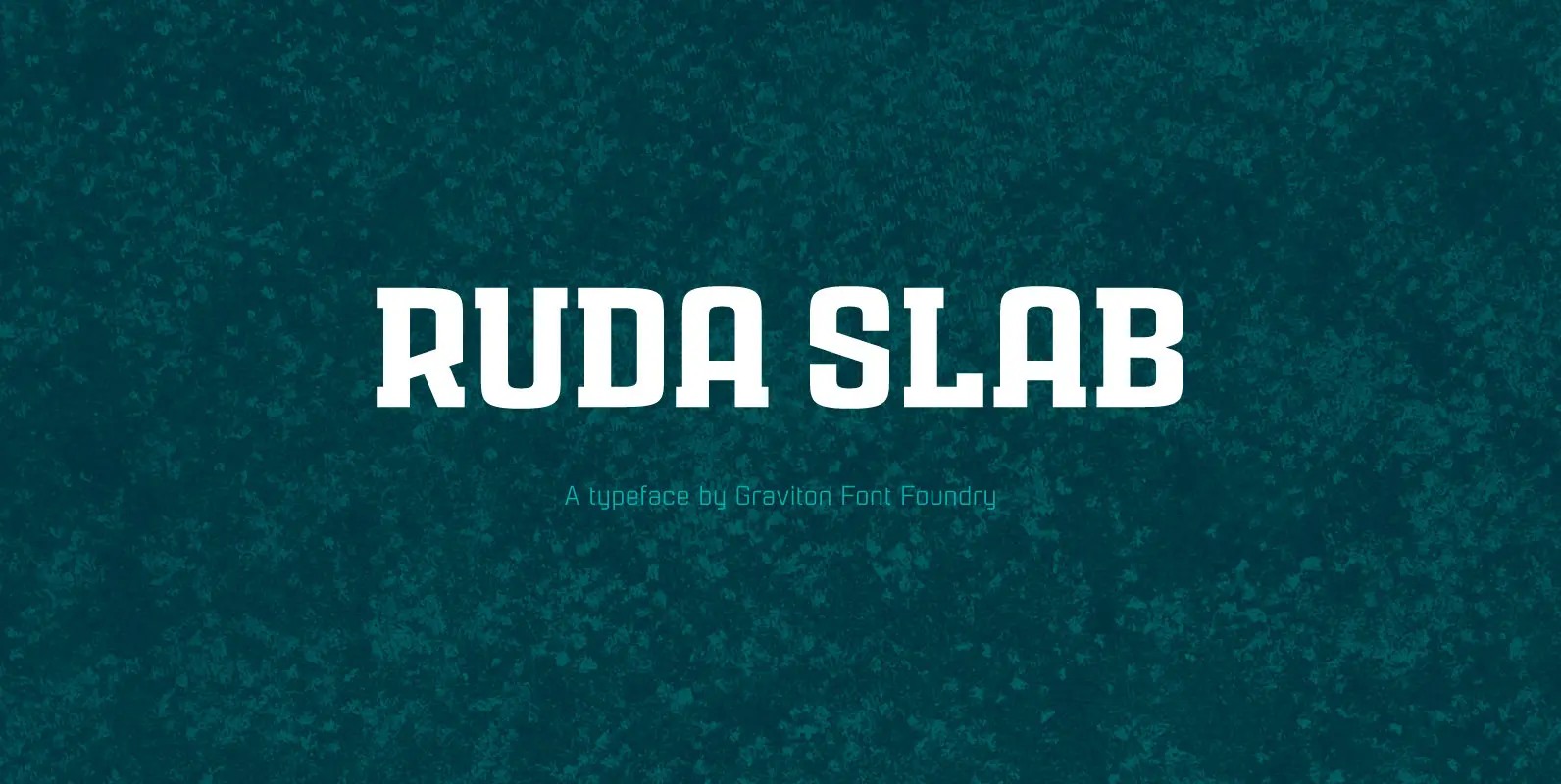
Ruda Slab Font
Rauda Slab font family has been designed for Graviton Font Foundry by Pablo Balcells in 2017. It is a display, slab serif, geometric typeface, with sharp angles that provides a strong and solid appearence. Rauda Slab consists of 8 styles.
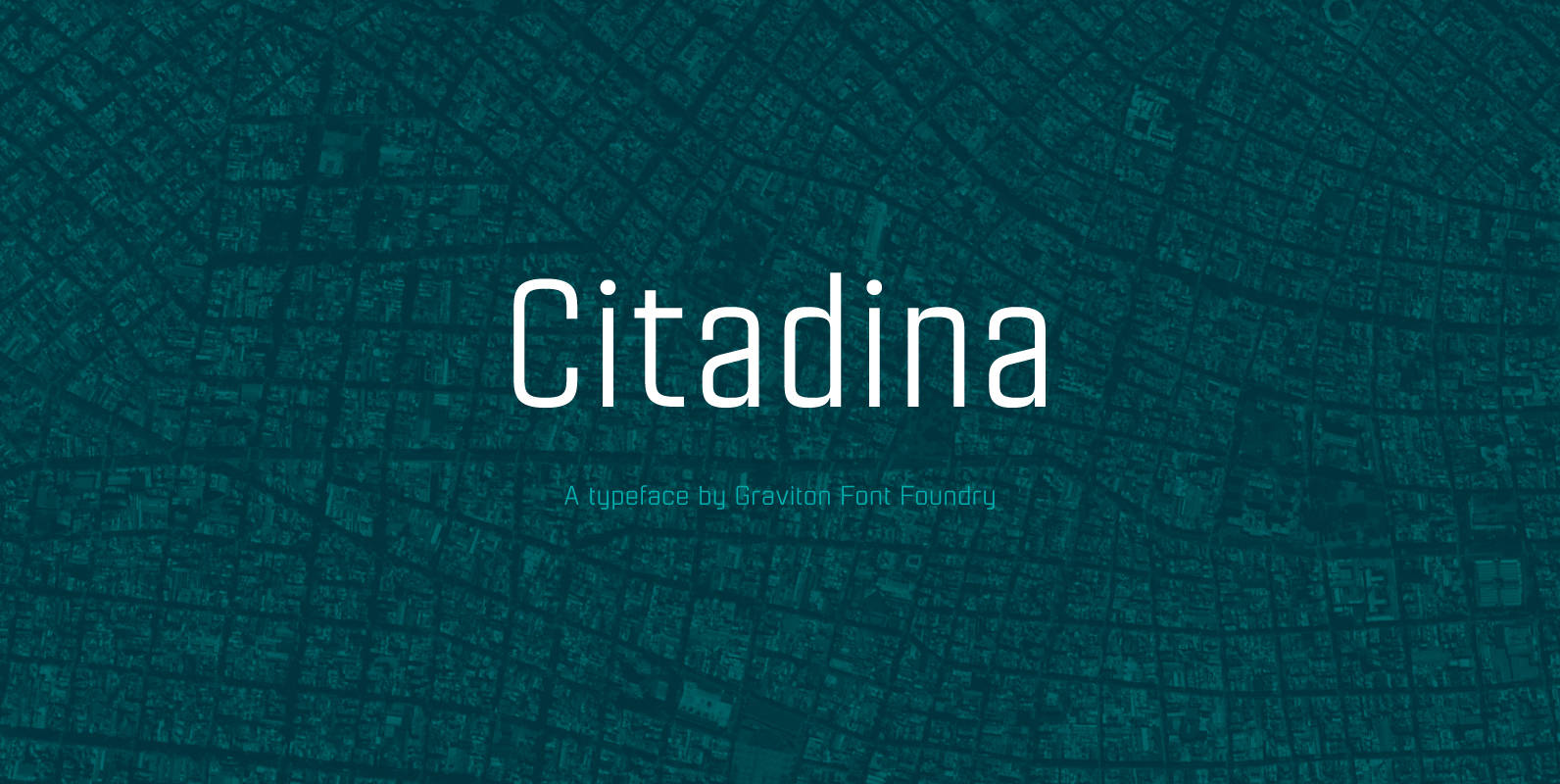
Citadina Font
Citadina font family has been designed for Graviton Font Foundry by Pablo Balcells in 2016. It is a sans serif typeface with a geometrical, mechanic, neutral appearance and a slightly condensed design which makes it particularly effective for space economizing.
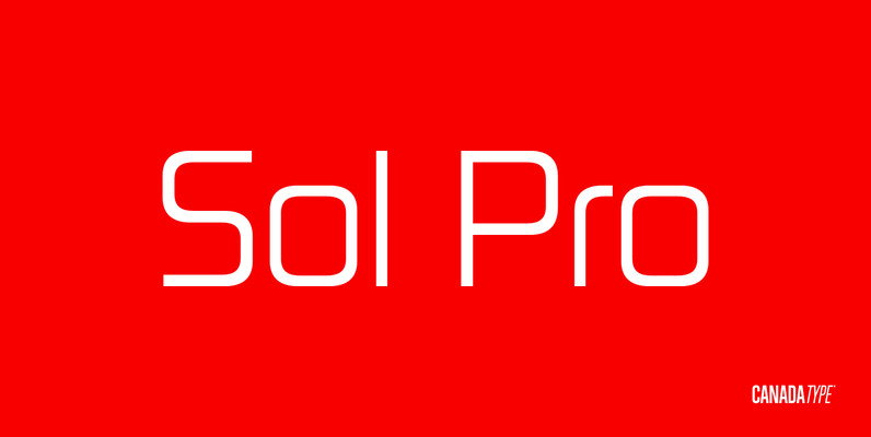
Sol Pro Font
Based on the classic Sol design by Marty Goldstein and C.B. Smith, published by VGC in 1973, Sol Pro goes above and beyond the call of revival/retooling to include plenty of optical improvements to the original design, more weights, italics,
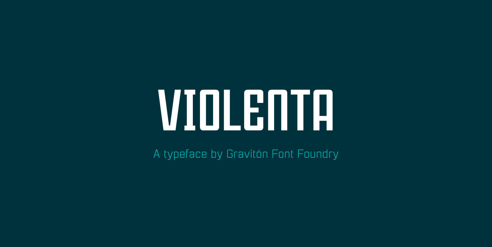
Violenta Font
Violenta font family has been designed for Graviton Font Foundry by Pablo Balcells in 2015. It is a display, geometric typeface, with a condensed design and sharp angles that provides an aggressive and strong appearance. Violenta consists of 8 styles.
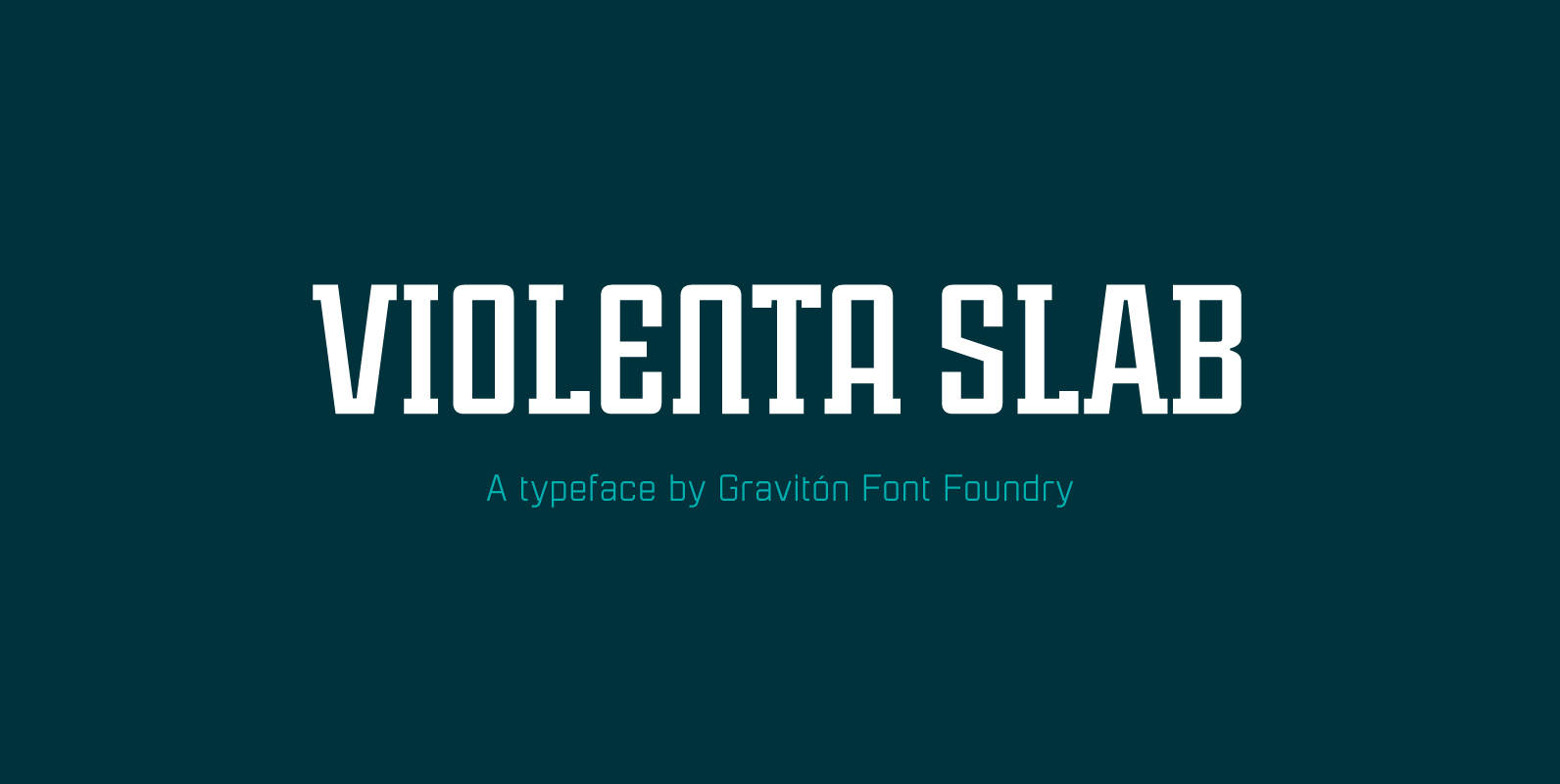
Violenta Slab Font
Violenta Slab font family has been designed for Graviton Font Foundry by Pablo Balcells in 2015. It is a display, geometric typeface, with a condensed design and sharp angles that provides an aggressive and strong appearance. Violenta Slab consists of
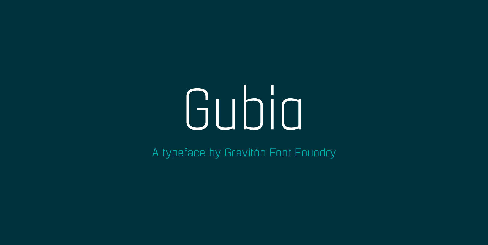
Gubia Font
Gubia font family has been designed for Graviton Font Foundry by Pablo Balcells. It is a geometric, sans serif typeface with a slightly condensed design. It has been conceived to be most suitable for all sized headlines, as well as
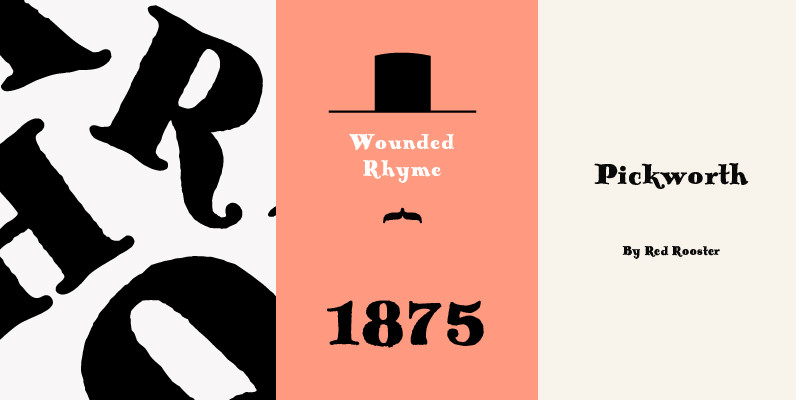
Pickworth Font
Designed by Steve Jackaman & Ashley Muir. An antique, rustic or even mystical design that will grow on you the more you use it. Pickworth contains all the high-end features expected in a quality OpenType Pro font. Published by Red
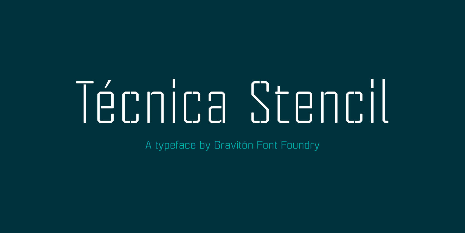
Tecnica Stencil Font
Tecnica Stencil font family is the stencil version of Tecnica font family, it has been designed for Graviton Font Foundry by Pablo Balcells in 2014. Tecnica Stencil consists of 8 styles. The 4 “Stencil 1” styles contain a narrow stem
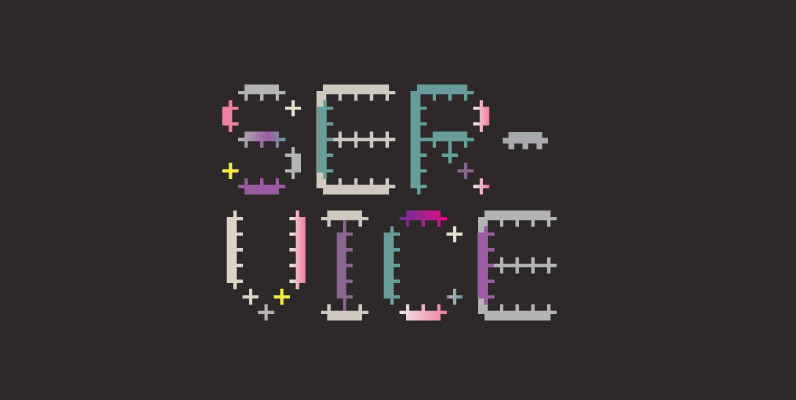
YWFT OneCross Font
Comprised entirely of “plus signs” of varying weights, YWFT OneCross had its genesis in YWFT OverCross (2002). When it was reworked later that year in order to create a more integrated blend of positive and negative space, Over became One,
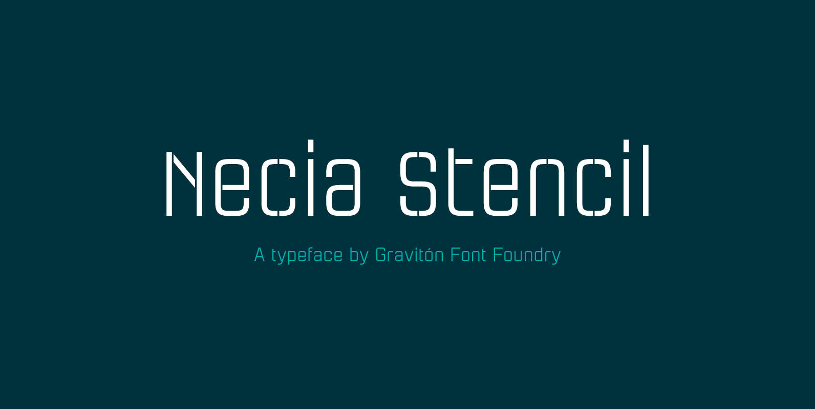
Necia Stencil Font
Necia Stencil font family is the stencil version of Necia font family, it has been designed for Graviton Font Foundry by Pablo Balcells in 2014. Necia Stencil consists of 16 styles. The 8 “Stencil 1” styles contain a narrow stem
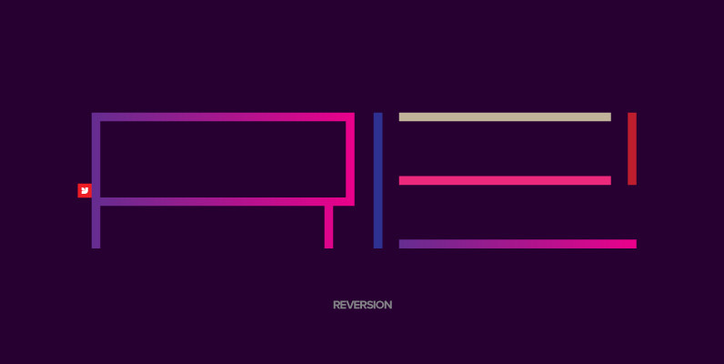
YWFT Reversion Font
YWFT Reversion is an interestingly wide and versatile display type design, perfect for a striking headline or an attention-grabbing poster or billboard. One of YWFT Reversion’s strengths is its ability to help any designer start custom lettering jobs with a
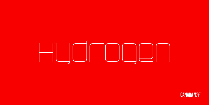
Hydrogen Font
Hydrogen is a clean geometric unicase family that expresses the mechanics, expansive technologies and conflicted ethics of the rapidly changing 21st century. Coupled with the right measure of Oxygen, Hydrogen becomes water, the ace of elements – rhythmic, dynamic, ever-flowing,
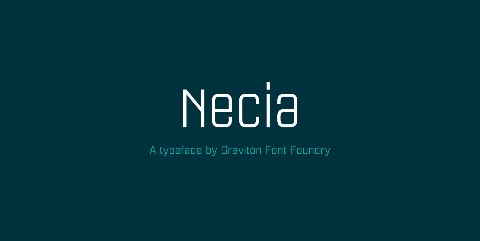
Necia Font
Necia font family has been designed for Graviton Font Foundry by Pablo Balcells in 2014. It is a modular, geometric and slightly condensed typeface which has been conceived to be primarily a display typeface, but given its clarity it can
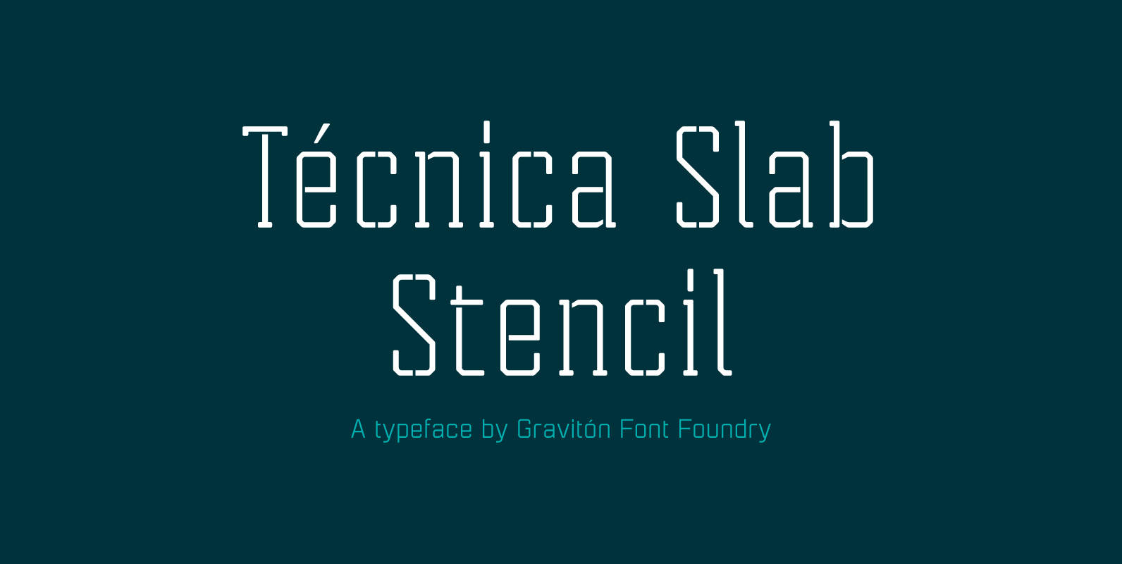
Tecnica Slab Stencil Font
Tecnica Slab Stencil font family is the stencil version of Tecnica Slab font family, it has been designed for Graviton Font Foundry by Pablo Balcells in 2014. Tecnica Slab Stencil consists of 8 styles. The 4 “Stencil 1” styles contain
PF Handbook Pro Font
This typeface is the result of an attempt to modernize DIN, by introducing round smooth corners and distinct design elements to several characters like ‘a, g, k, m’, without compromising legibility. In order to retain its sharpness, inner corners as
