Tag: vintage

Anodyne Font
Anodyne is a warm and weathered all-caps font from Yellow Design Studio with hand-printed texture and unique shadow options. Features include four distress variations for each letter and at least two for every other character. Double-letter ligatures add realism by
Coffee Service Font
Whether you prefer Drip or Automatic, there is nothing quite like quality Coffee Service! This speedy retro script has a generous x-height and is Chock Full ‘o OpenType automatic ligatures so it sets perfectly every time! One sip and you’ll
YWFT Trisect Font
Looking like sections of racetracks from some fantastic vector landscape, the letter shapes of YWFT Trisect were inspired by retro soccer/football jerseys and their triple line numbers. Many years in the early 90’s were spent dreaming of creating this face,

Voyage Font
Voyage is a smooth and friendly vintage script family of two weights and ornament sets. Voyage is packed with alternate characters and OpenType features to allow you create customized headlines. To activate the alternates click on Swash, Contextual, Stylistic or
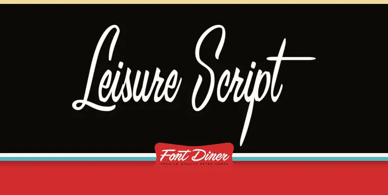
Leisure Script Font
Take it easy with Leisure Script! This casual fine brush script is to the eyes what Dean Martin is to ears! Published by Font DinerDownload Leisure Script

Behrens Kursiv Font
Behrens Kursive – a beautiful Art Nouveau italic font and a great add-on to Behrensschrift. Beware of the following key combinations to get access to the implemented ornaments: (alt) + (comma), (alt) + (d), (alt) + (p), (alt) + (shift)

Filmotype Honey Font
Filmotype Honey was released by Filmotype in the mid-1950s as part of its handlettered script styles and it gained wildly popular use with many corporations throughout the 1950s and 1960s. Filmotype Honey was developed from the original font filmstrips and
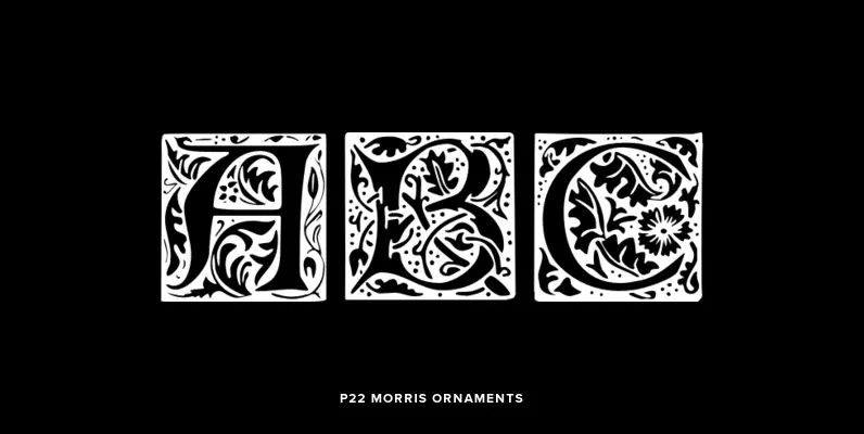
P22 Morris Ornaments Font
William Morris (1834-1896) was probably the most influential figure in the decorative arts and private press movements of the late 19th and early 20th century. In reaction to the increasing lack of quality that the industrial revolution brought on, Morris
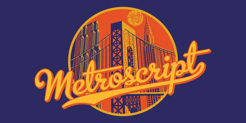
Metroscript Font
Metroscript is a completely original typeface that is designed in the spirit of hand-lettering from the first half of the 20th century. Michael Doret had been doing hand-lettering in styles similar to Metroscript in his work for many years before
Turnpike Font
Take a trip down the interstate with Turnpike, an extra wide 1960s style modern gothic font inspired by classic dashboard lettering. Published by Font DinerDownload Turnpike
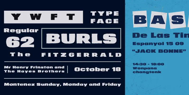
YWFT Burls Font
YWFT Burls comes at you like the late-60s Minnesota Vikings defensive line. Burly, thick, massive, manly, and tough with retro thickness and fifty pounds of lard-enriched meat sauce. Pour out a tall single-malt straight up, and order up a Kansas

Wood Type Collection Font
Wood Type Collection is a set of wonderful, warm and weathered hand made typefaces designed by Mateusz Machalski. The Inspiration for this collection comes from a wooden letter blocks and other old technologies used for printing. WTC supports 40 different
Amsterdam Old Style Font
Designed by Steve Jackaman. An original design, loosely based on a typeface from an old wood type specimen book from the turn-of-the-century. Published by Red RoosterDownload Amsterdam Old Style
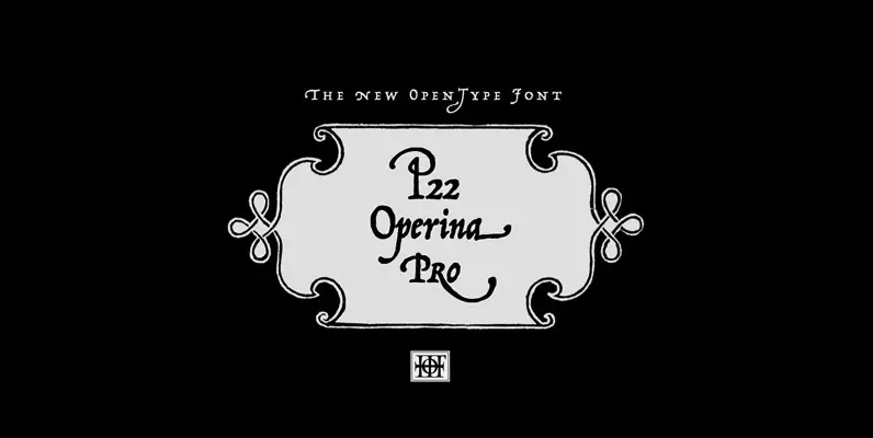
P22 Operina Pro Font
Operina is based on a 16th century lettering model of the scribe Ludovico degli Arrighi (Vicentino Ludovico degli Arrighi) used in his 1522 instructional lettering book, “La Operina da Imparare di scrivere littera Cancellarescha.” This book contains what is considered
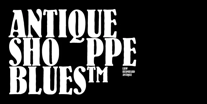
Bernhard Antique Font
Bernhard Antique is a distressed serif font designed by Lucian Bernhard in 1912, released by URW. Bernhard Antique is a Trademark by Bauer Types Published by URW Type Foundry GmbHDownload Bernhard Antique
Dharma Slab Font
Dharma Slab is an antiqued slab serif designed inspired by 1800s-style wood type. All glyphs had been designed carefully to be retro-looking of the old time and to fill all with nostalgia. This condensed font family with 42 styles will

Grover Font
The object of Grover was to join two distinctive typeface designs: the basic European gothic of the late nineteenth century and the ’rounded’ style found in 1960s America. The result is a clear, friendly face with subtle yet unforgettable features.
Rhythm Font
I hate the idea of revivals. I have publicly said I choose not to do revivals because they make me uncomfortable. This is as close as I have been to crossing my own line. To be direct, Rhythm is based