Tag: web optimized
Meridiana Pro Font
The concept behind Meridiana Pro was to create an amalgamation between a rounded sans and a monospaced font in order to obtain an extensive and usable variable type-system. This typeface encapsulates a symmetrical and balanced rhythm due to the unique
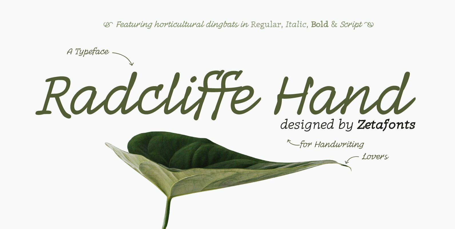
Radcliffe Hand Font
Radcliffe Hand is a typeface family designed by Cosimo Lorenzo Pancini with the help of Giulia Ursenna Dorati, re-inventing our Radcliffe family as a handwritten typeface. Each glyph of the original typeface has been lovingly traced by hand, interpreting every
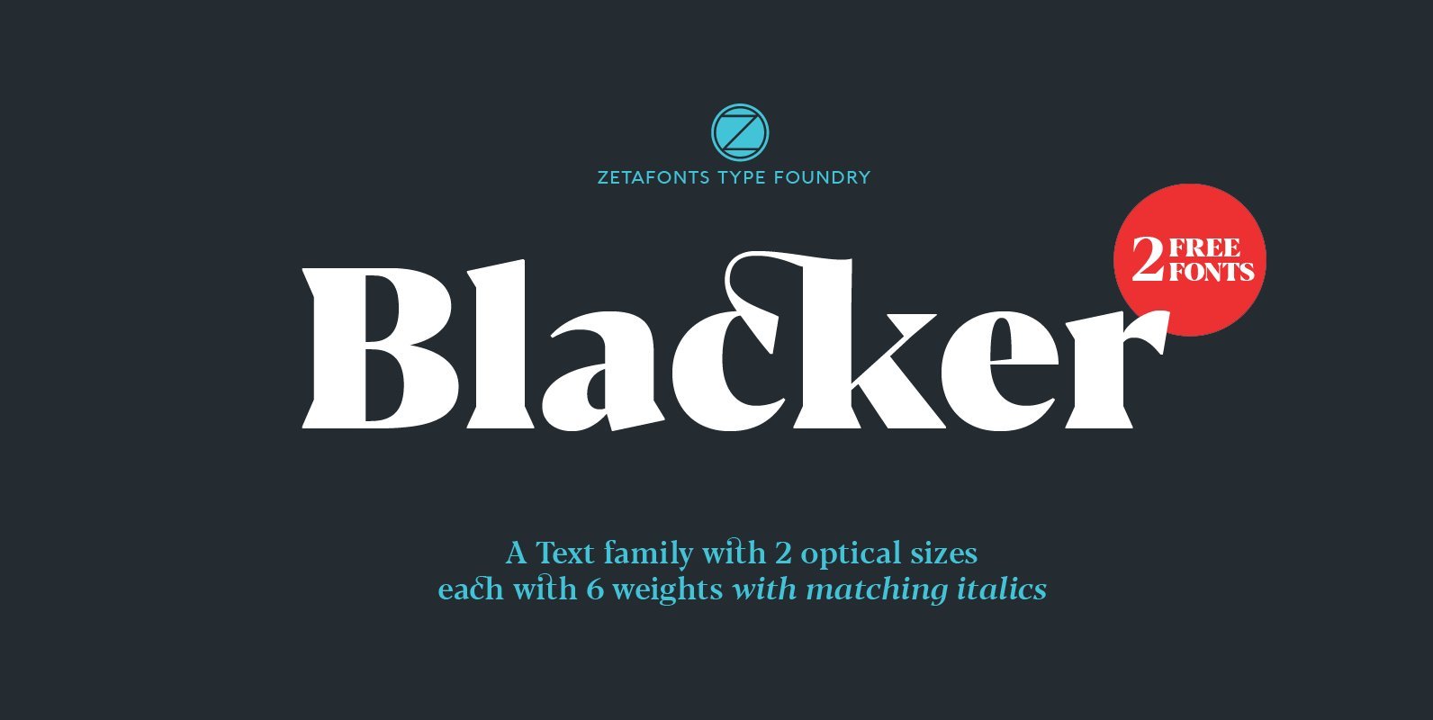
Blacker Font
Blacker is a wedge serif type family designed by Cosimo Lorenzo Pancini and Andrea Tartarelli as a take on the contemporary “evil serif” genre: typefaces with high contrast, 1970s-evoking proportions and sharp wedge serifs. Design details have been fine-tuned in
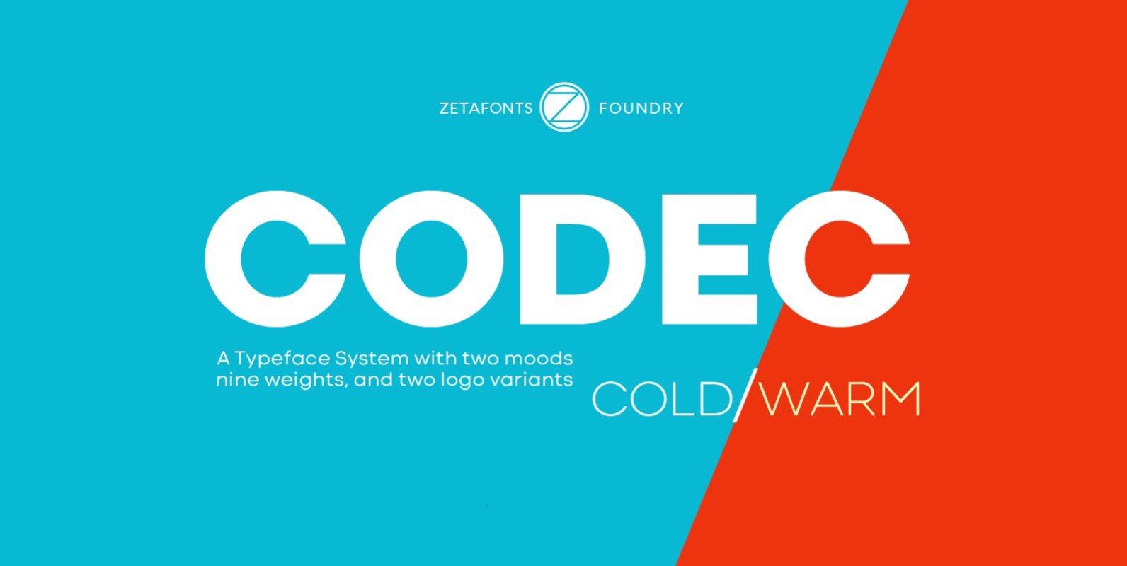
Codec Font
Codec is a geometric sans serif type system, designed by Cosimo Lorenzo Pancini with Francesco Canovaro and Andrea Tartarelli. Codec provides you with two coherent variant fonts built on the same base skeleton: Codec Cold and Codec Warm. In Codec
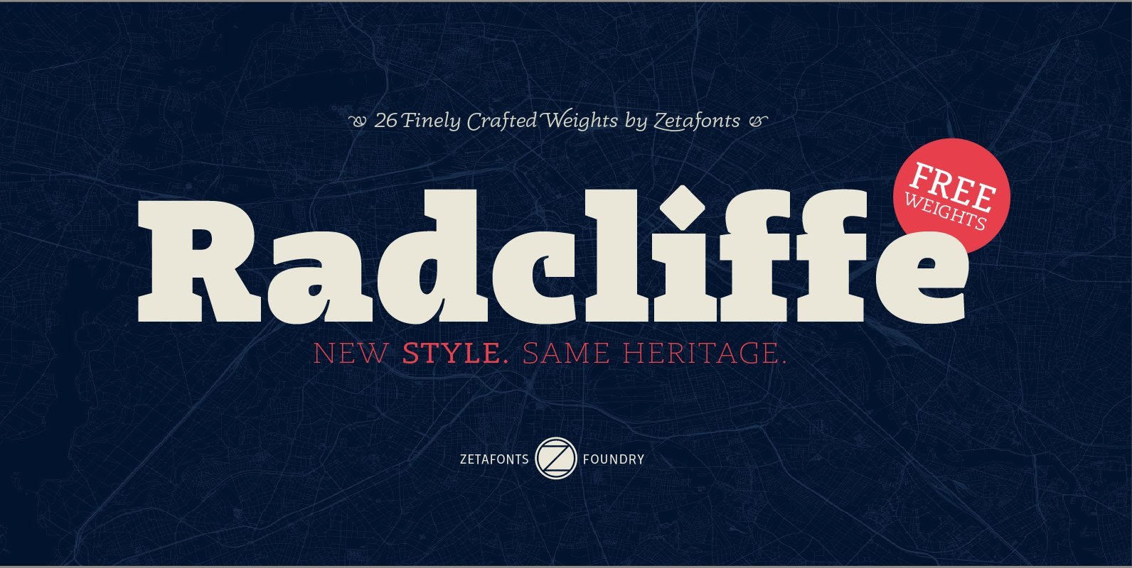
Radcliffe Font
Radcliffe is a typeface family designed in 2018 by Cosimo Lorenzo Pancini and Andrea Tartarelli, as a reinvention of traditional Clarendon design in search of a “contemporary classic” typeface look. Tailor made for elegance, Radcliffe features the strong bracketed serifs,
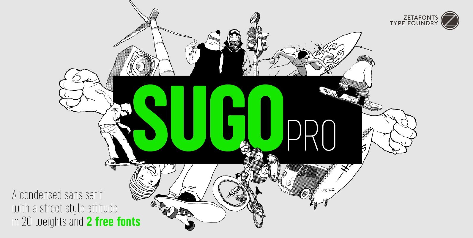
Sugo Pro Font
Sugo Pro is a condensed geometric sans serif with a robust body, slightly rounded corners and no-nonsense street style attitude. The sturdy, robust design of Sugo makes it an ideal choice for sports branding and street-style editorial use. Lighter weights
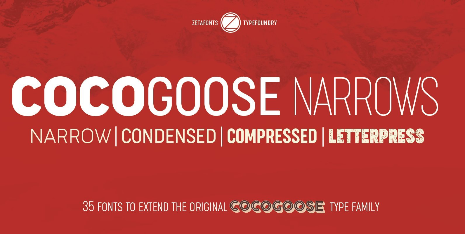
Cocogoose Narrows Font
Cocogoose is a geometric sans serif typeface designed with straight, monolinear lines and circular or square shapes. Its strong, modernist look has been softened by rounded corners and slight visual corrections that make Cocogoose not only perfect for logos and
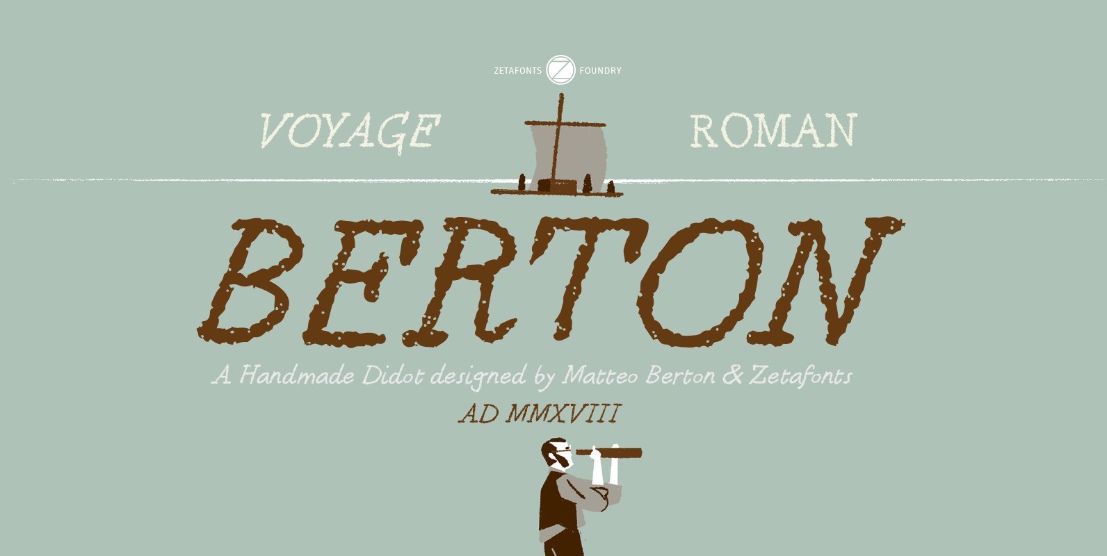
Berton Font
Berton – the third in the Zetafonts Signature artist-designed fonts – was hand drawn by italian illustrator Matteo Berton and lovingly digitized by Zetafonts to be used as main lettering font of the graphic novel “Voyage au Centre de la
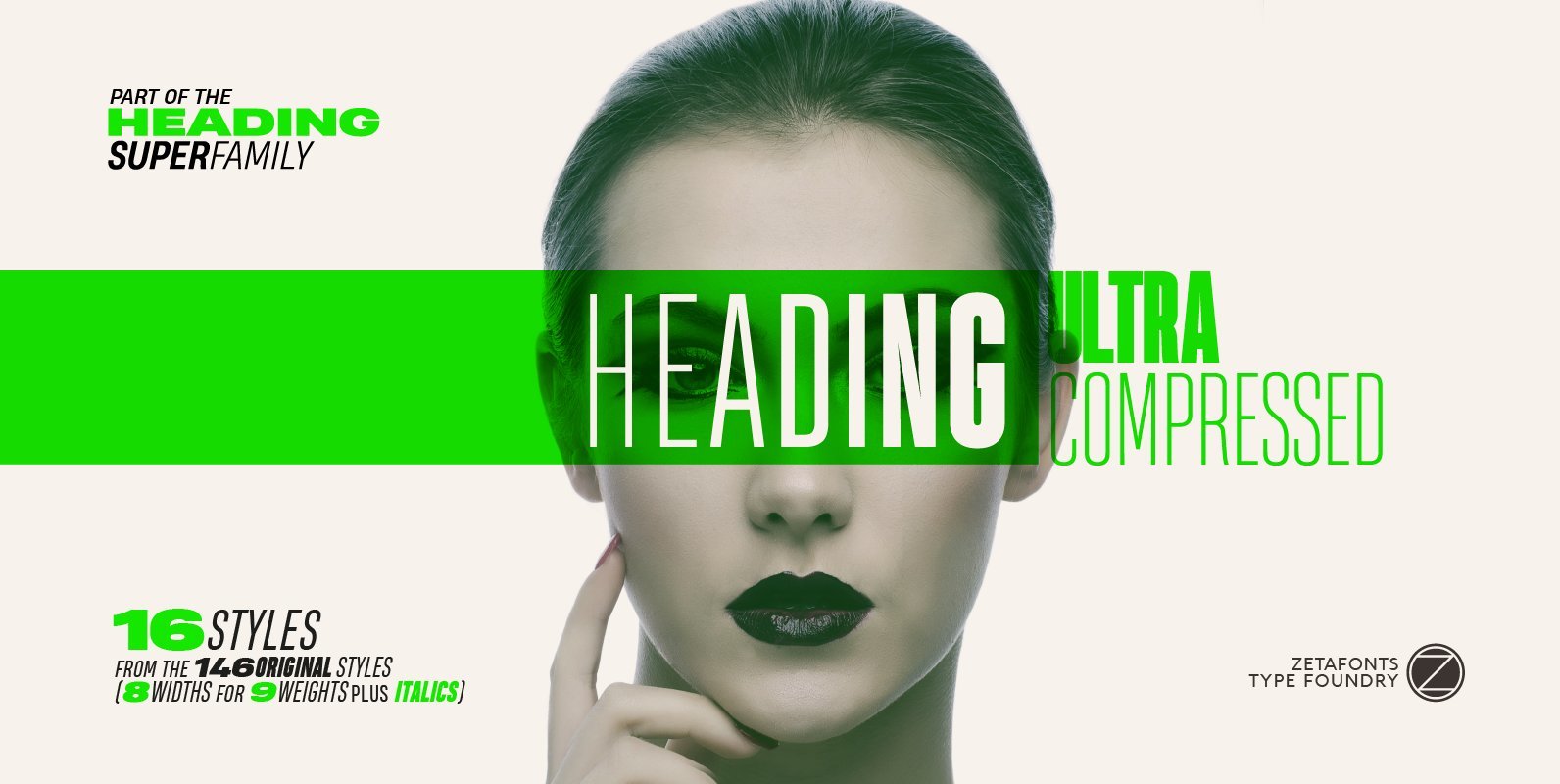
Heading Pro Ultra Compressed Font
Heading Pro Ultra Compressed is a variant of the original Heading Pro typeface designed by Francesco Canovaro for Zetafonts. Each Heading Pro typeface includes over 800 characters with coverage for 100+ languages using latin, cyrillic and greek alphabets. A full
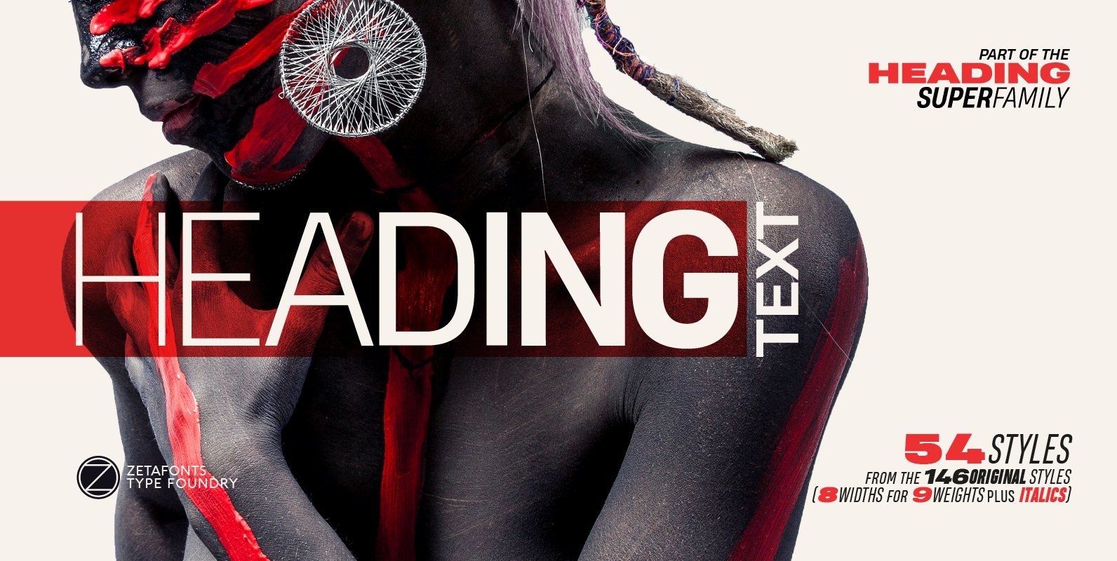
Heading Pro Text Font
Heading Pro Medium, Heading Pro Double and Heading Pro Treble are three variants of the original Heading Pro typeface designed by Francesco Canovaro for Zetafonts. These three medium width families have been added to the original condensed width family to
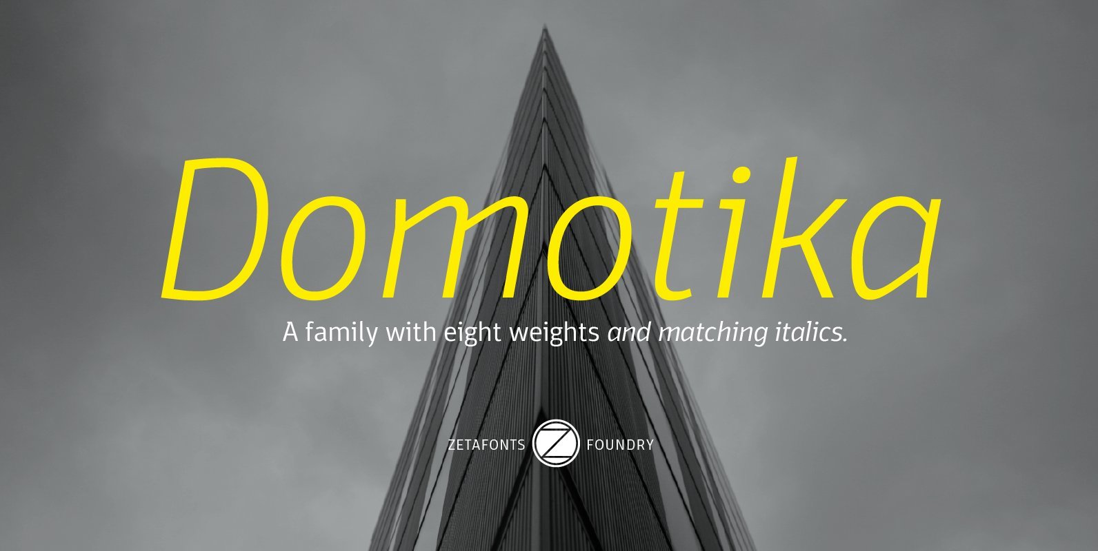
Domotika Font
Domotika is a typeface family designed by Cosimo Lorenzo Pancini, with italics designed by Andrea Tartarelli. It's a humanist sans serif font, with a semi-condensed feel, great for editorial and display usage where readability and personality must match convenient space
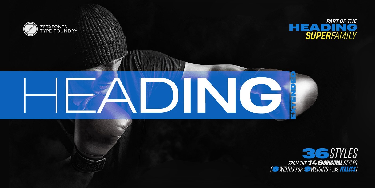
Heading Pro Extended Font
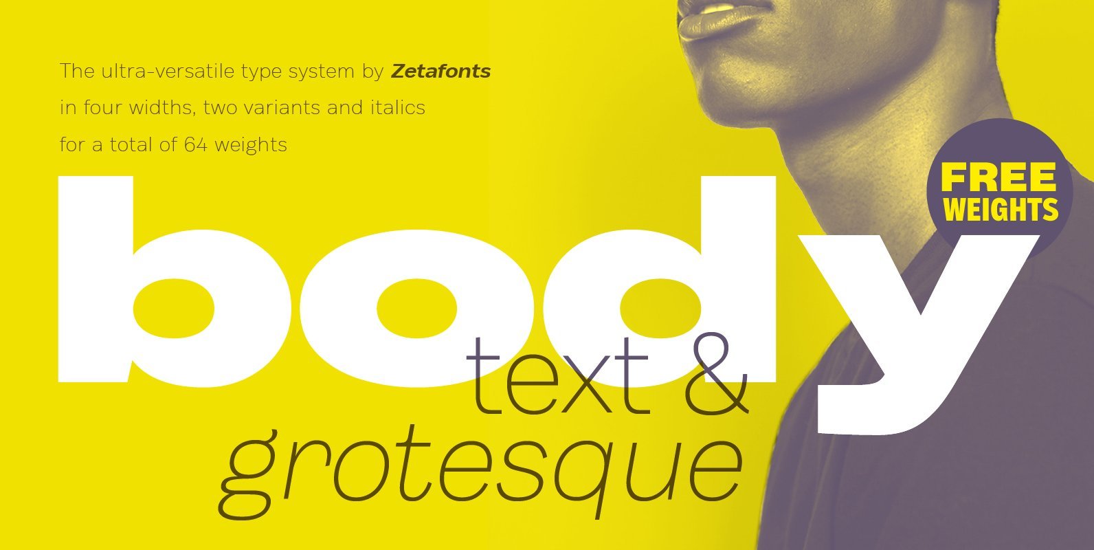
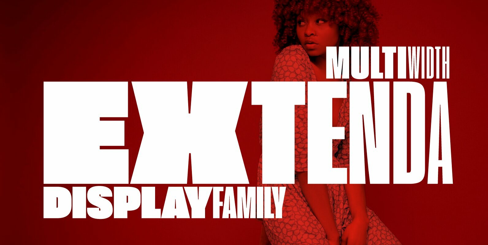
Heading Pro Wide and Heading Pro Ultra-Wide are two variants of the original Heading Pro typeface designed by Francesco Canovaro for Zetafonts. These two extended width families have been added to the original condensed width family to be used for
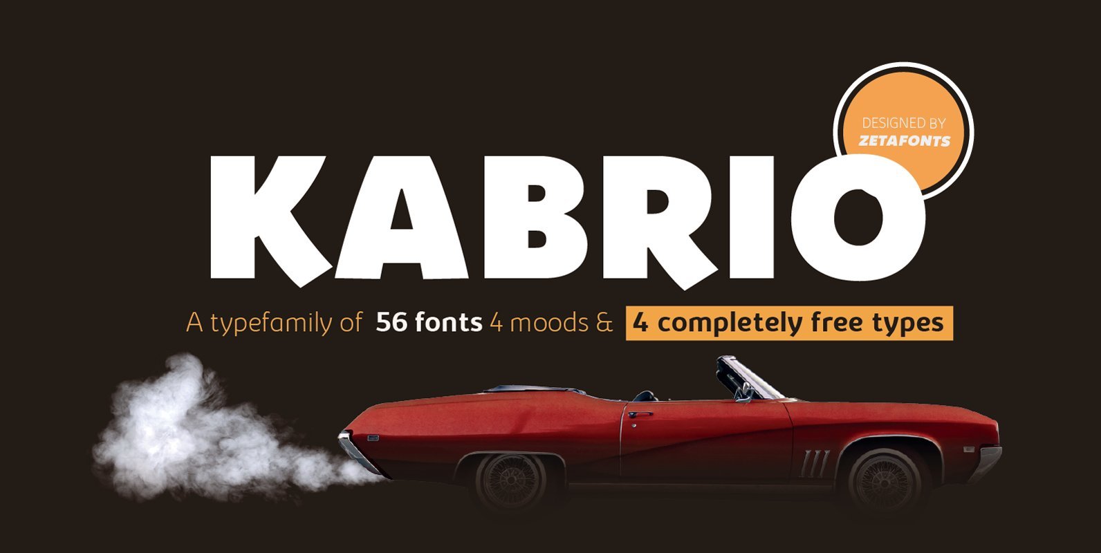
Kabrio Font
Designed by Cosimo Lorenzo Pancini and Andrea Tartarelli, Kabrio is a sans serif typeface for the lovers of minimal design, and great curves. It features four different corner treatments to offer variation in display and logo use: the “alternate” variant
