Tag: wedge
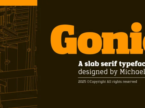
Gonia Font
Artistry in the digital realm is often defined by the tools that birth a creation. In the world of graphic and digital design, nullifying boundaries and broadening scopes stand as a pivotal requirement. One such tool that outbalances its contemporaries

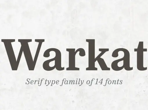
Warkat Font
Back in late 2019, Wahyu Wibowo designed a logotype for Wahyu and Sani Co., he decided to shorten the name to be WSCo. for the logo. Then by the end year of 2021, he got an idea to develop the
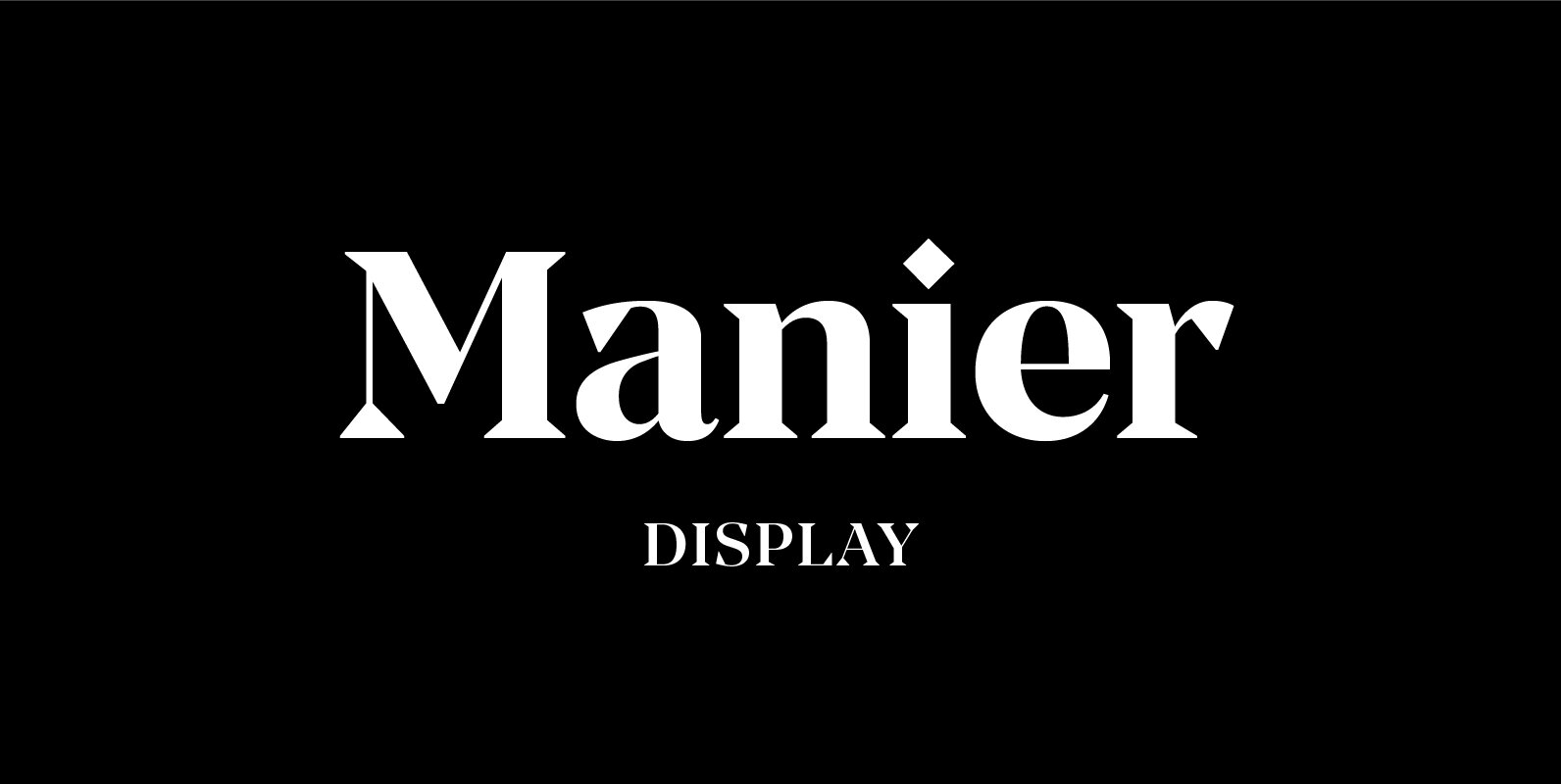
Manier Font
Manier is a fresh, display, wedge-serif font family inspired by transitional and contemporary typefaces. Manier has a big x-height value, modern proportions, sharp serifs and an extreme stroke contrast with a vertical stress. The typeface is a great choice for
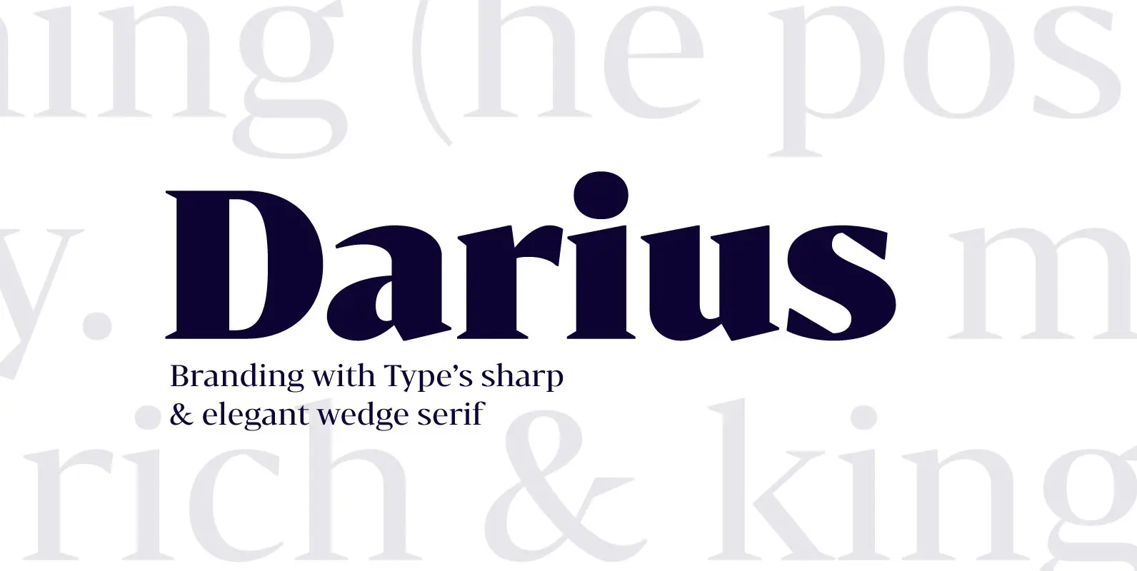
Bw Darius Font
Bw Darius is an elegant wedge serif typeface, halfway between the transitional and didone genres, with a sharper approach to terminals without falling on the stiffness of the didones. The wide skeleton, modern proportions and high contrast, all contribute to
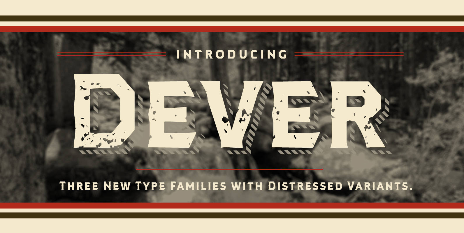
Dever Font
Dever’s brute, industrial lines are rounded up in this new typeface from Jeremy Dooley. Dever combines plenty of inspirations. It’s the flair of the Wild West melded with a shout out to the sign painters and package lettering artists of
Chalice Font
Chalice is a new original Canada Type family inspired by two different engraving eras and locations: Medieval England and 19th century Russia. Chalice’s construct is geometric at heart, though the wedge serifs and their contribution to the overall idiosyncrasies of
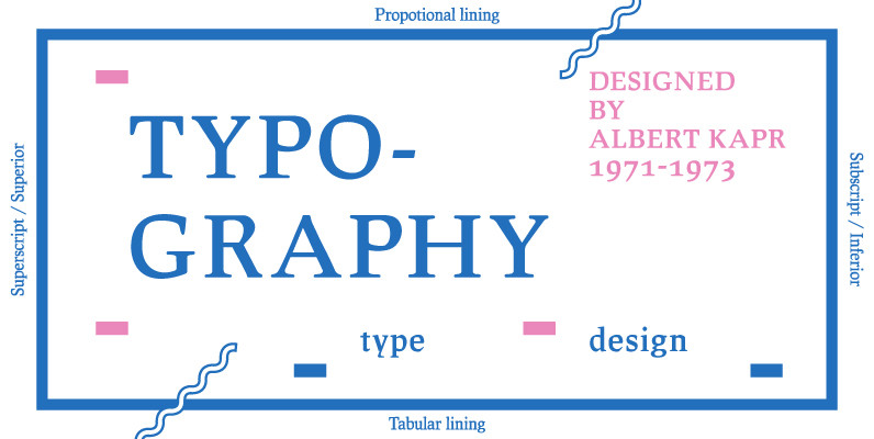
Leipziger Antiqua Font
The original typeface was designed by Albert Kapr between 1971 and 1973 for Typoart in Dresden. Kapr was the font designer and teacher as well as book author on type design of former East Germany. He also was an expert
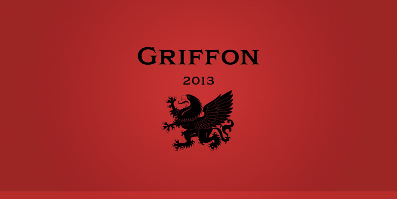
Griffon Font
Griffon, titling face with influence from classic letterforms, inspired by retro faces in the early 20th century. This font family was all redesigned from scratch and now released ranging in 5 weights with small caps from Light to Bold. The
