Tag: western
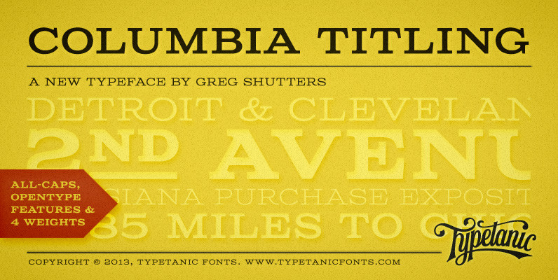
Columbia Titling Font
Columbia Titling is an titling-caps display family based on wide Clarendon-style wood type and industrial signage design from the late-19th and early-20th Century. Columbia Titling includes a small set of OpenType features, including both tabular and proportional figures, special superscript
Estro Font
Estro was originally designed by Aldo Novarese in 1961 for the foundry Nebiolo. Estro can maybe be classified a combination of Egyptienne and script. Ralph M. Unger redrew and digitized this font exclusively for profonts in 2003. His work is
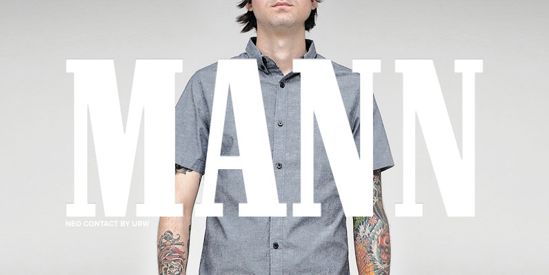
Neo Contact (Marlboro) Font
Neo Contact is an egyptienne style serif released by URW, most famous for its use on the Marlboro cigarette packaging. Contains language support for West, East, Turkish, Baltic, and Romanian. Published by URW Type Foundry GmbHDownload Neo Contact (Marlboro)
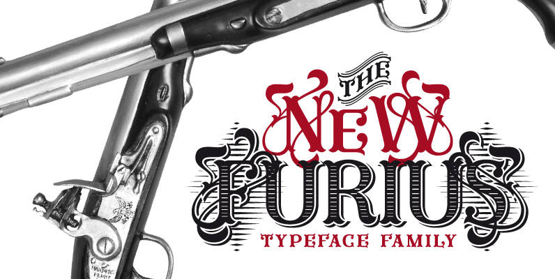
Furius Font
Furius is a display typeface inspired by the split serif style of woodcut or chiseled letters found in roman inscriptions and later popularized by the western genre in the United States. Created as a display typeface, Furius combines a host
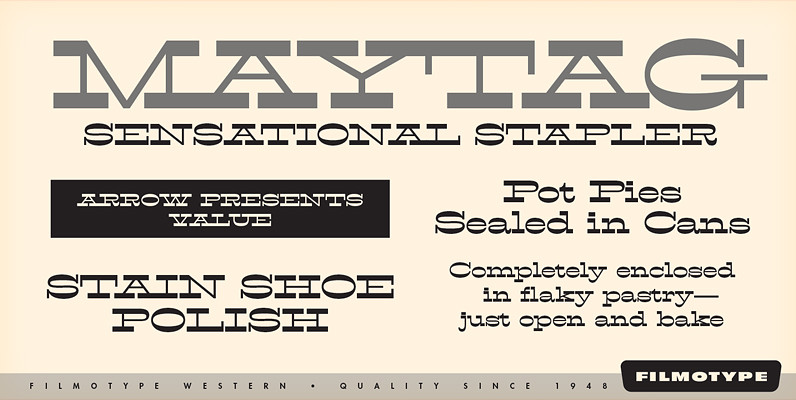
Filmotype Western Font
Inspired by French Antique reverse-stress types of the 1880s, Filmotype Western was released in 1955 to expand its Flat Serif category. Popular in broadsides, circus posters and advertisements at the turn of the 19th century, Filmotype Western will add old

Santiago Font
Santiago is a western wanted poster influenced typestyle with a clean and friendly feel to it. Almost comic like in its simple and clean appearance, with caps vs. smallcaps settings, and a variety of weights and widths from condensed to
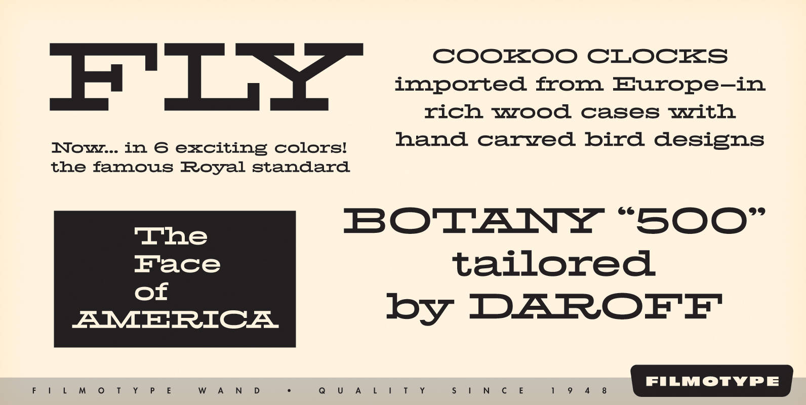
Filmotype Wand Font
Filmotype Wand was introduced in 1955 as part of the Flat Serif category. Inspired by smart slab serifs including Hellenic Wide popular in American television westerns and in heavy use in corporate letterhead and store packaging, Filmotype Wand takes a
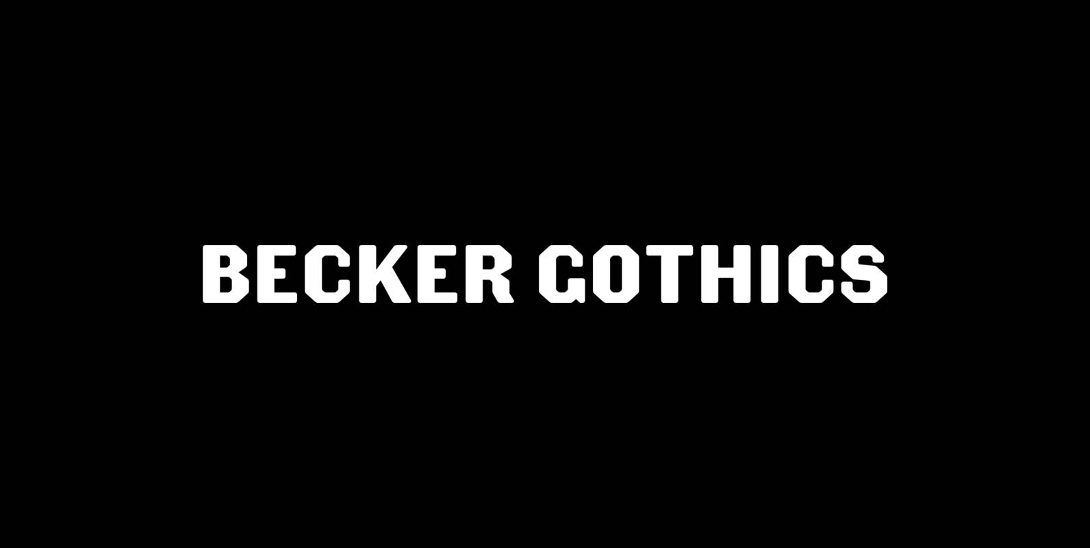
Becker Gothics Font
The Becker Gothics pay homage to the nineteenth century American lettering master George Becker. Designer James Puckett has given new life to the ingenious gothic alphabets found in Becker’s 1854 lettering manual Ornamental Penmanship. Use this quintet of typographic voices
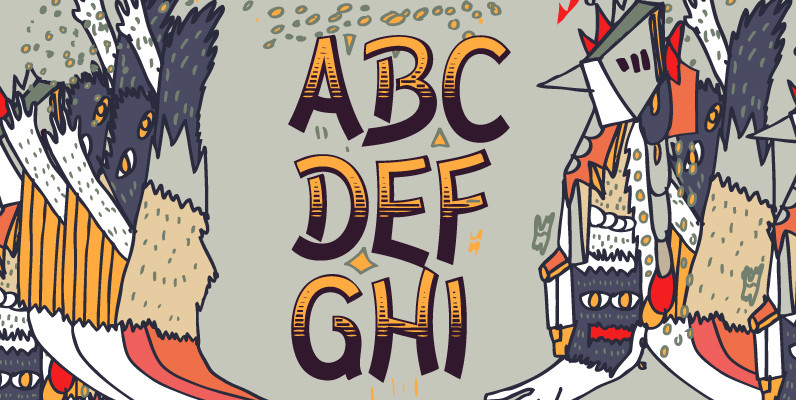
El Paso Pro Font
In the 1970s, Face Photosetting in London was known as the preeminent typesetting house in London. Steve worked in the studio in Newman Street and Hanway Place. El Paso Pro is a family of typefaces based on a unique single
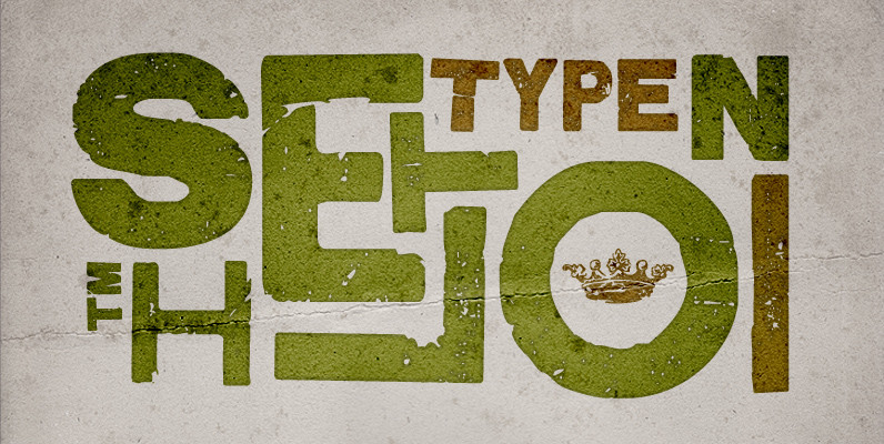
Shelton Font
Shelton is a Typeface with a eroded, printed look. The letters seem to be from different alphabets to support the wood type feeling. Every letter has an alternate character. Shelton has a wide language support and also contains arrows and
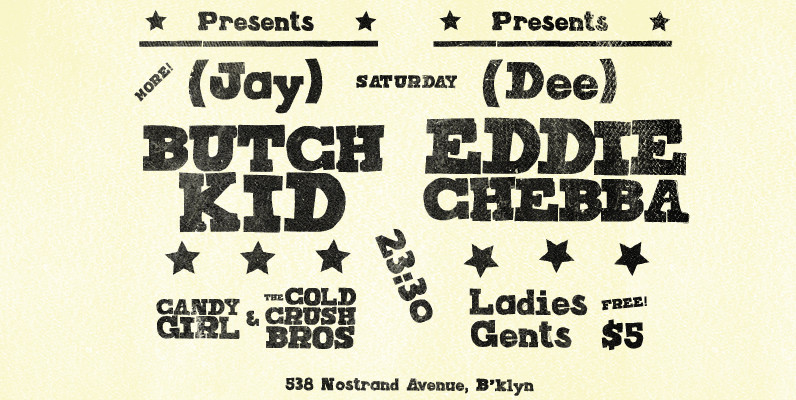
Joseph Font
Joseph is a brand new slab-serif face designed by TOMO. With a wood type look – letterpress print technic, this fatty come in handy when is time to design an informal —yet strong—looking communication piece. Ideal for promotion-matter. Published by

Dobra Slab Font
Dobra is a very geometric and robust typeface with Sans and Slab Serif companions, specially suited for magazines and newspapers, although it works great as a corporate typeface. With five weights ranging from Light to Black with matching italic, available
Kodiak Font
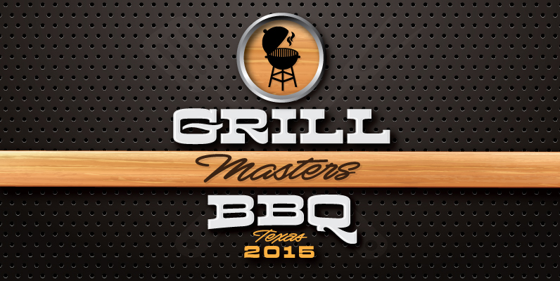
Kodiak was designed by 40+ year sign painting veteran, Brian Grant, and is loosely based on the works of many great sign painting masters. Brian and Charles Borges de Oliveira teamed up to bring this beautiful sign painters classic to
Sergio FY Font
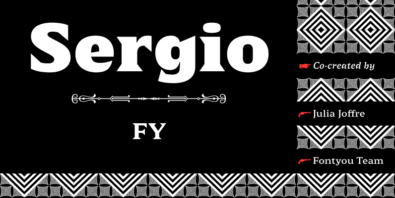
Sergio FY is an antique latin font family inspired by a 19th century wooden type font, found in an italian print – Gazetta Musicale di Milano, 10 Guigno 1897. This typeface is characterized by its large, sharp, and triangular serifs,
Plathorn Font
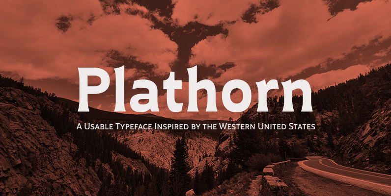
That’s right, folks. When the West called, Jeremy Dooley reached up like Pecos Bill, grabbed it by the reins and pulled it in, then using its wide, roaming elements to design this functional font that still has an unbroken spirit
