Tag: wide
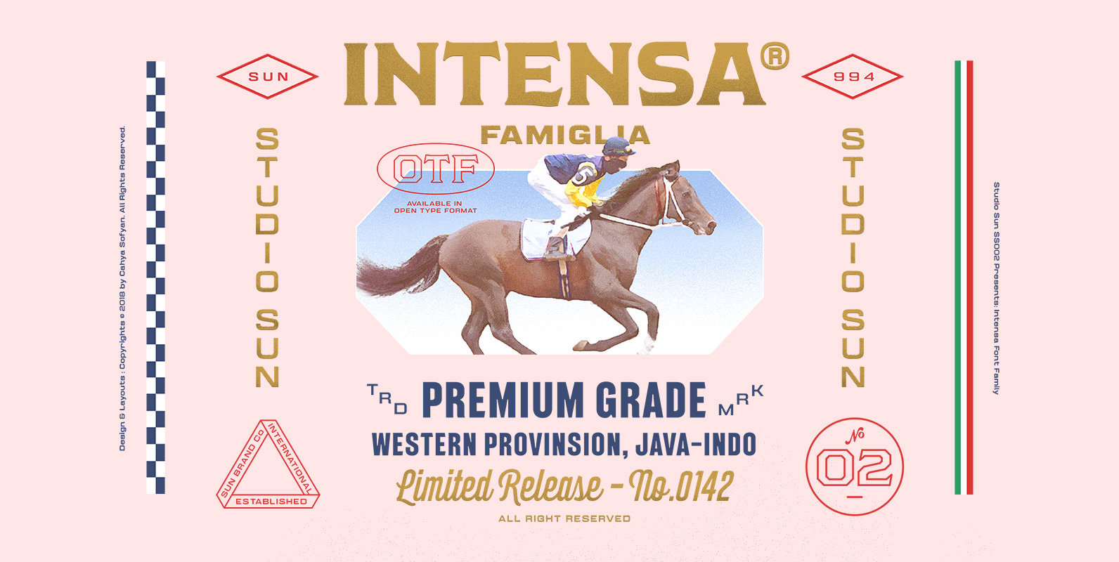
Intensa Font
Intensa Font Family is a display typeface, inspired by the revolution of auto racing in the early 60s (Post-World War II), The 1960s saw some of the most beautifully futuristic race cars the world has ever seen, and many of
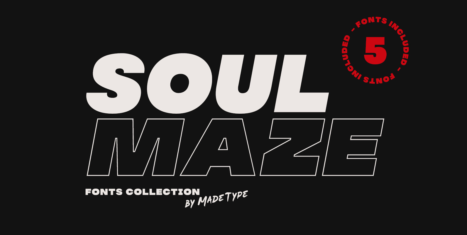
MADE Soulmaze Font
MADE Soulmaze is a sans serif font design published by MadeType Published by MadeTypeDownload MADE Soulmaze
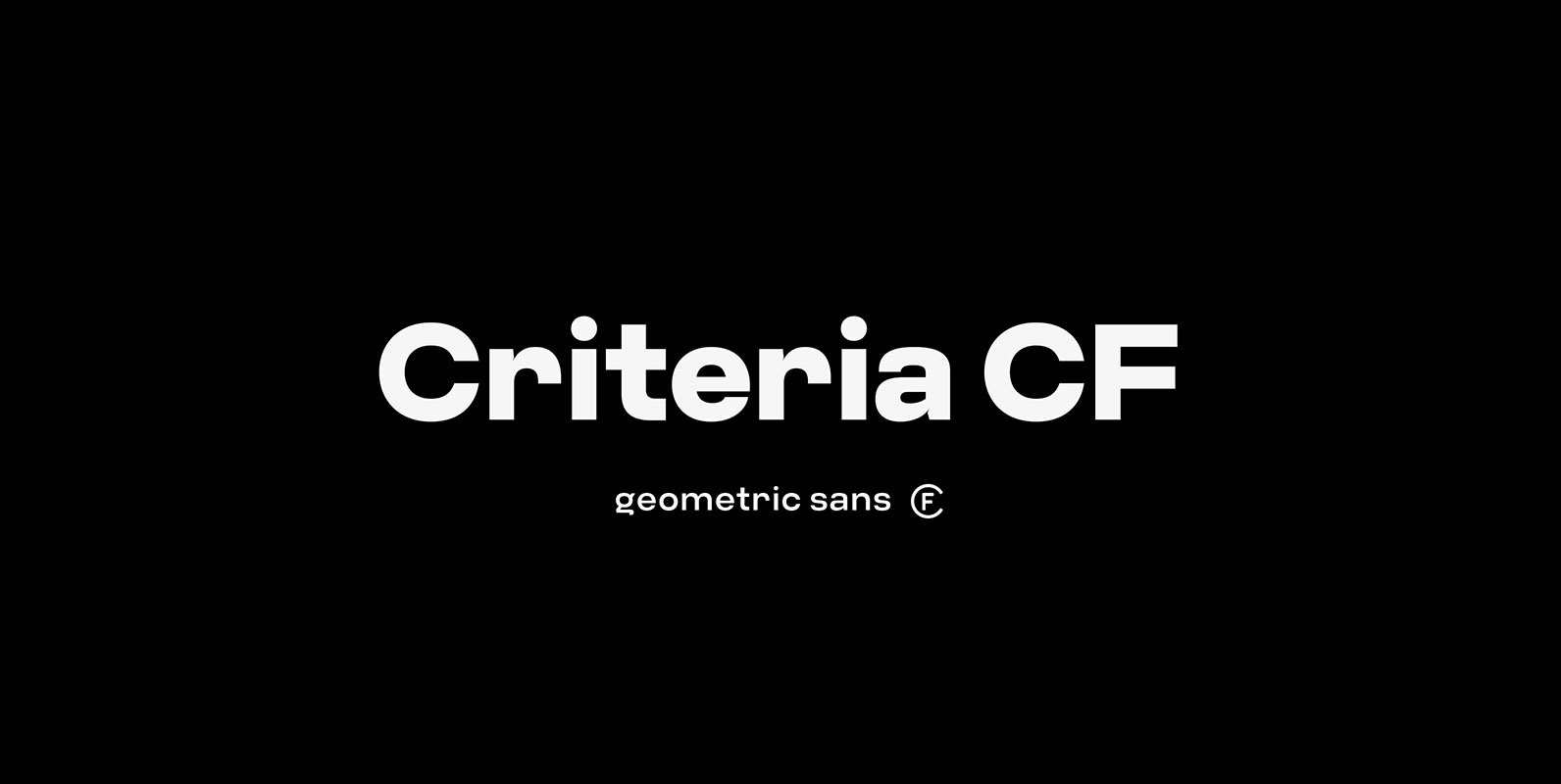
Criteria CF Font
Criteria CF is a geometric sans built with simple, efficient construction. Straight lines and clean circles combine with a tight vertical design that allows for cleanly-stacked lowercase text, striking headlines, and bold word marks. Hints of Swiss style and unconventional
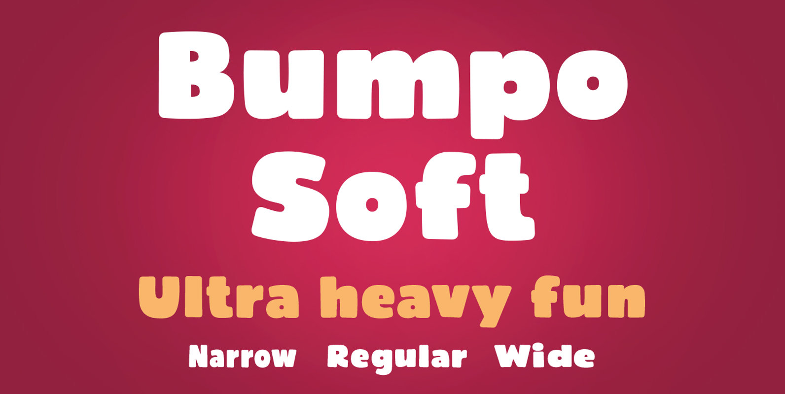
Bumpo Soft Font
Bumpo Soft is a chunky and a fun display typeface family with rounded edges. It is the softer version of Bumpo. With an extra heavy but friendly personality, Bumpo Soft works well for posters, food packaging, children’s products and books,
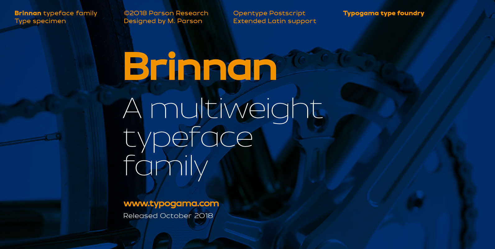
Brinnan Font
Brinnan is a wide, contemporary sans serif typeface that was conceived as a branding and editorial solution. With it’s ten weights, ranging from an elegant Thin weight to a solid and dense Black weight, this family was designed as a
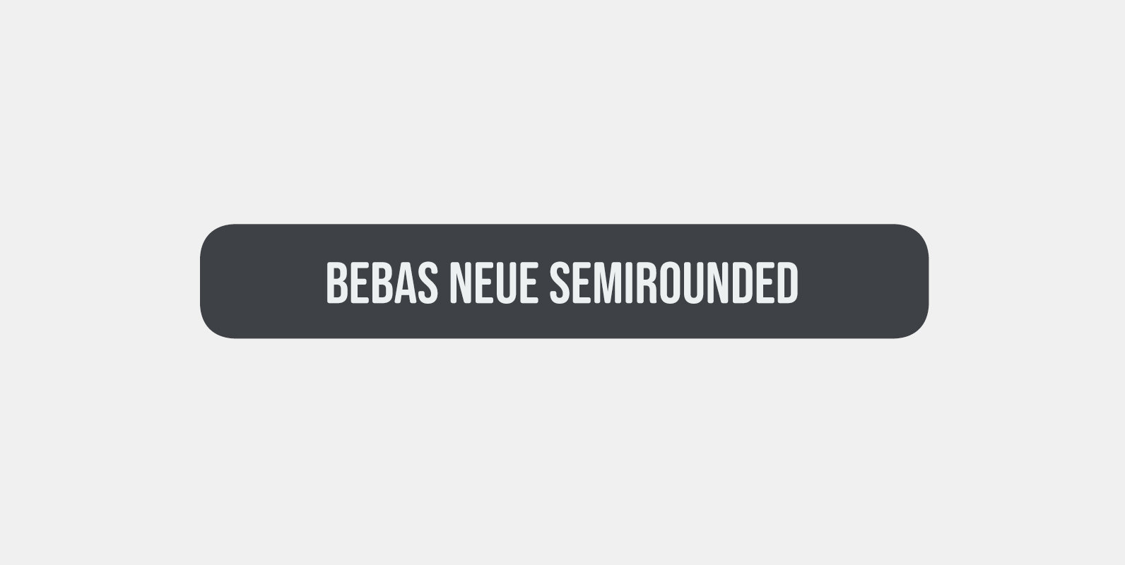
Bebas Neue SemiRounded Font
Bebas Neue SemiRounded is Bebas Neue with rounded corners. As you know, Bebas Neue is the most widely used free font recently. The basic theory and proportion are same as Bebas Neue but rounded shape gives a warm, soft and
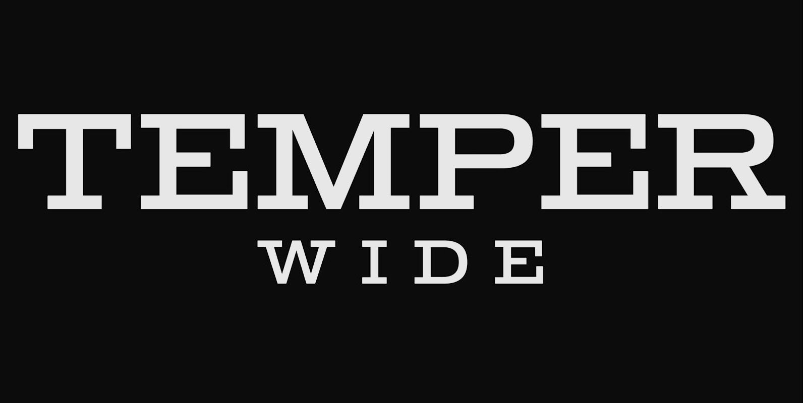
Temper Wide Font
Temper Wide was designed in 2018 by type designer Jeschke in Berlin. The font consists of many cuts from light to bold and is formally based on its predecessor, Sequel 100. A characteristic feature of the Temper Wide is the
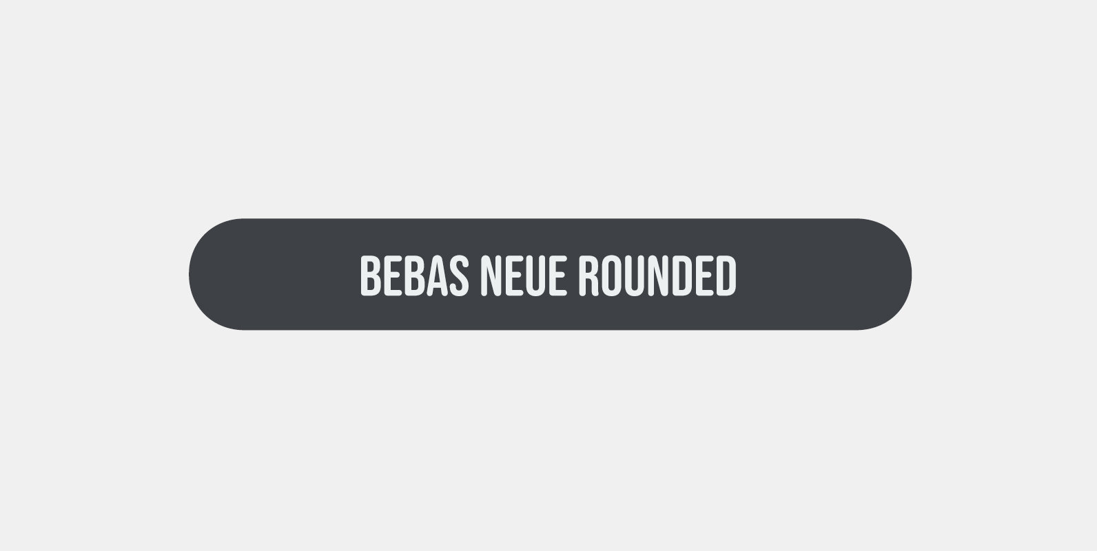
Bebas Neue Rounded Font
Bebas Neue Rounded is the Bebas Neue with rounded corners and terminals. As you know, Bebas Neue is the most widely used free font on the market. This rounded version is a new style where the basic theory and proportion
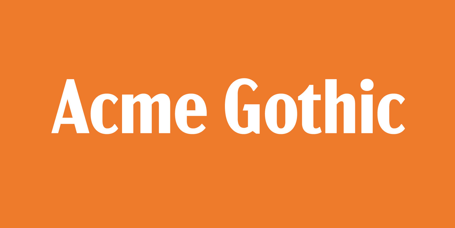
Acme Gothic Font
Acme Gothic (2018) is based on the thick and thin gothic lettering style popular in the U.S. in the first half of the twentieth century. There have been typefaces in this genre before, but they were either too quirky (Globe
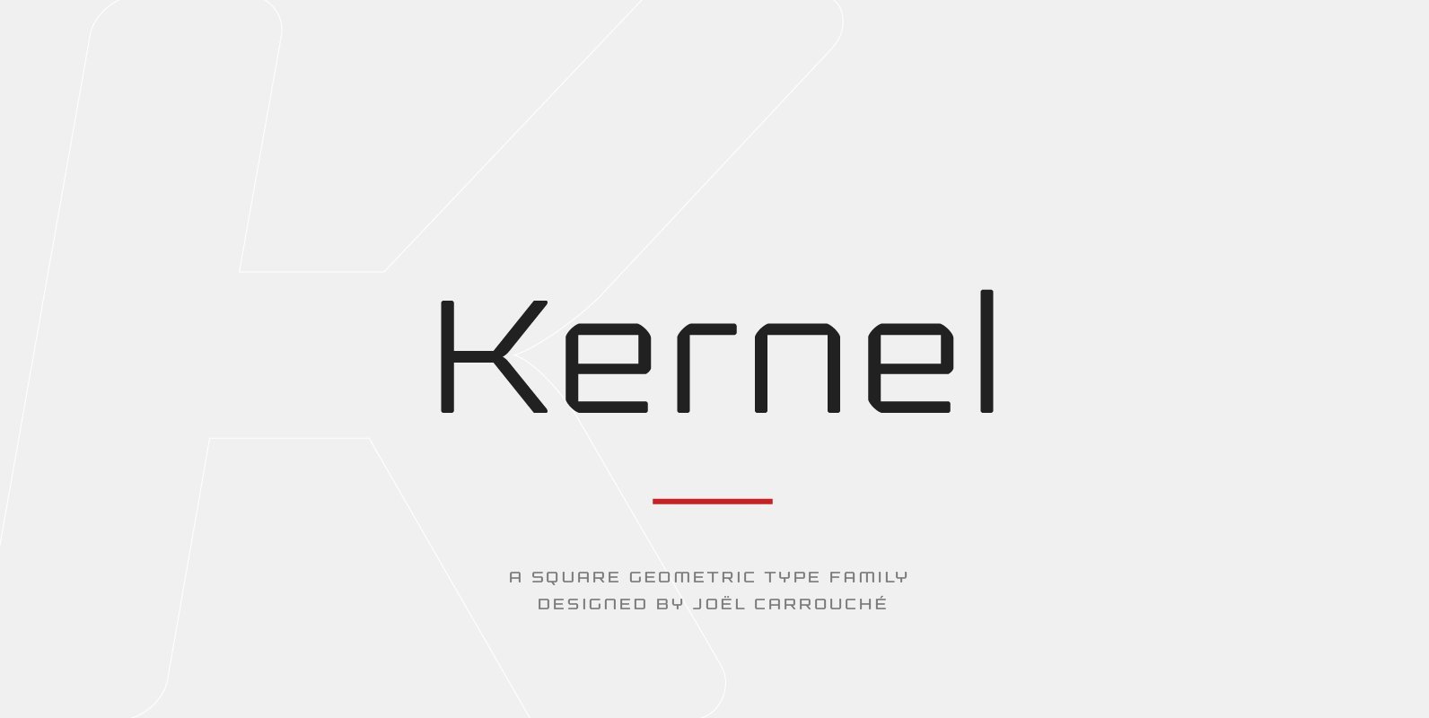
Kernel Font
Kernel is a square geometric type family in six weights with matching obliques and small caps. The design mixes slightly rounded terminals and shoulders with square counterforms, giving the shapes a strong masculine and futuristic look, great for applications like
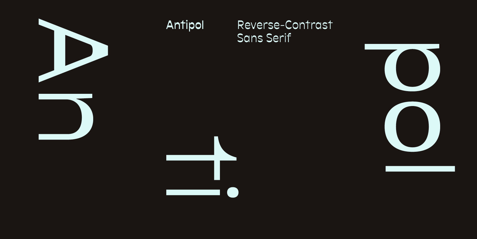
Antipol Font
Antipol is a Sans Serif design that reverses the conventions of a regular Latin Sans Serif. With a weight emphasis on the horizontals and its vertical terminals Antipol radiates a 1970s charisma known from the like of Antique Olive. Its
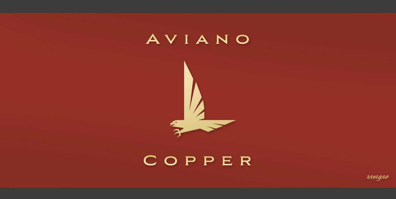
Aviano Copper Font
The retro-inspired design of Aviano Copper echos the bold style of America’s Gilded Age. Inspired by the copper-inscribed intaglio printing designs of the early 20th century, the powerful, wide character shape of this font walks softly across your page while
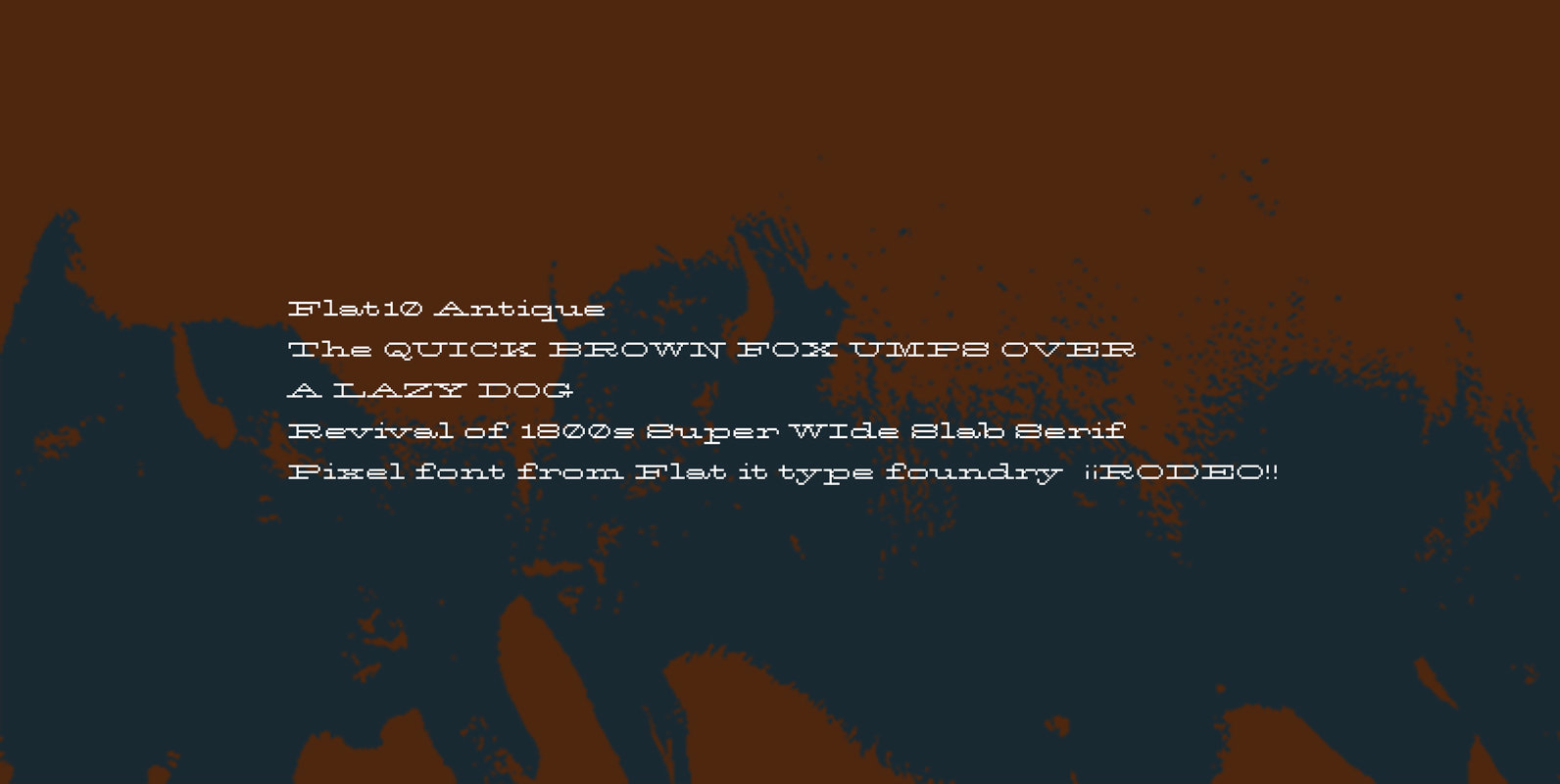
Flat10 Antique Font
This 8-bit pixel font is designed with respect for 80s game designers and the pixel font pioneers in middle 90s. Use at size 10 pixels or multiples of 10 and anti-alias off is recommended. Published by Dharma TypeDownload Flat10 Antique
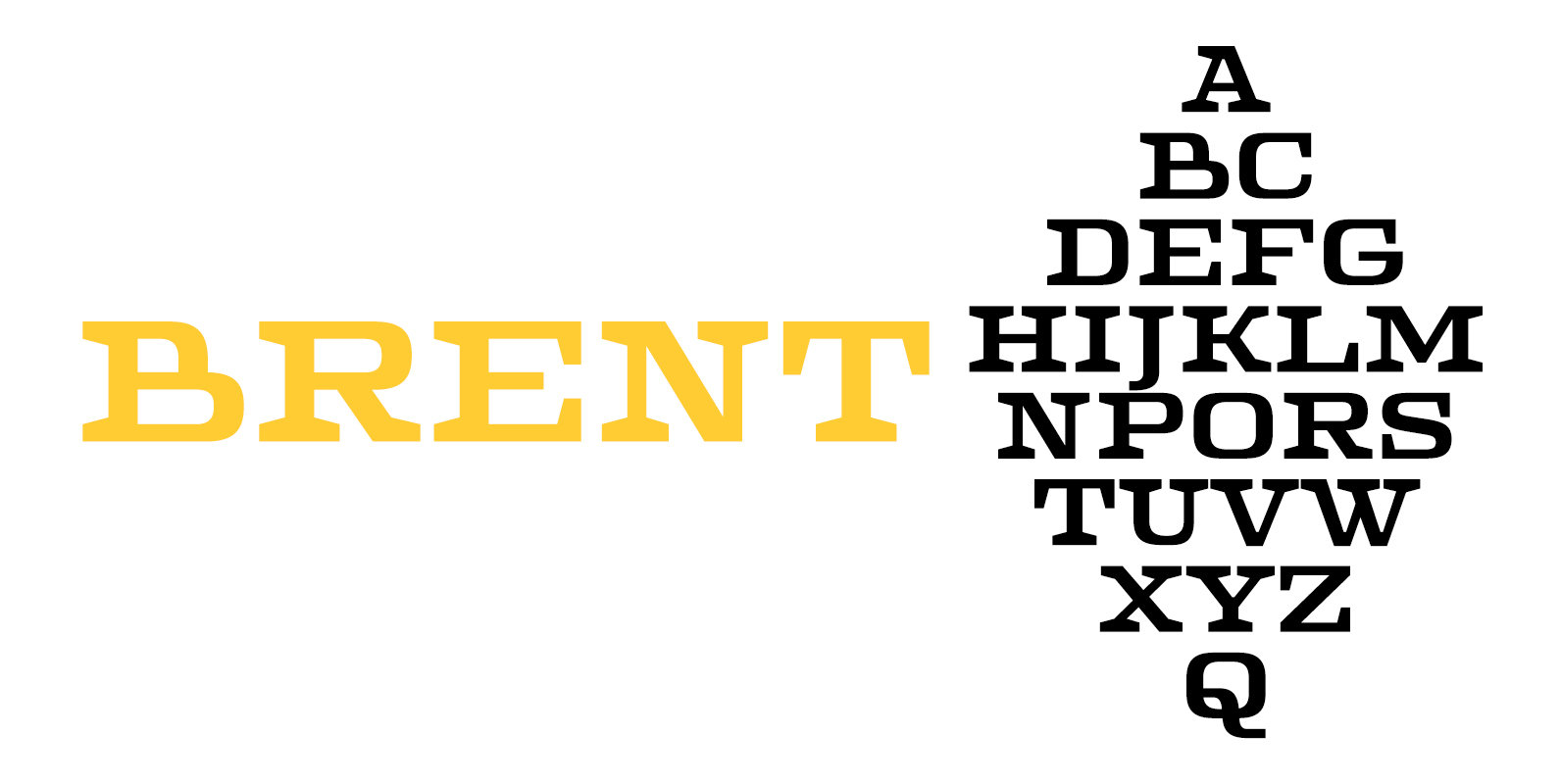
Brent 4F Font
Brent 4F is a serif font design published by Sergiy Tkachenko Published by Sergiy TkachenkoDownload Brent 4F
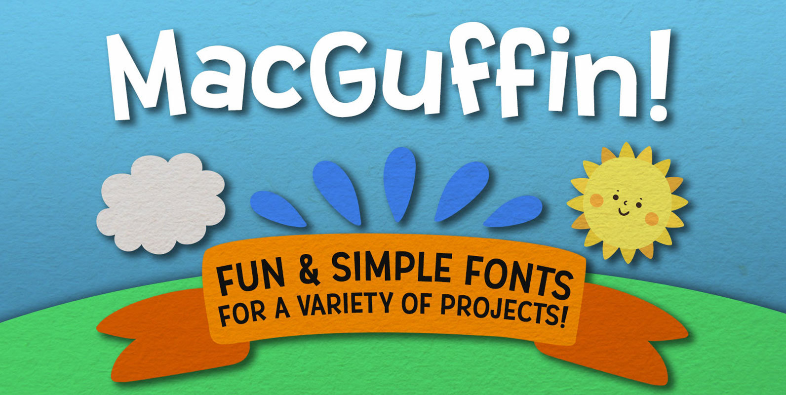
MacGuffin Font
Simple, clean, and fun — MacGuffin is like if Dr. Seuss and a highway sign got put in a blender and came out in font form. The letters are all crisp, sharp, and smooth; perfect for any crafting project, logo,
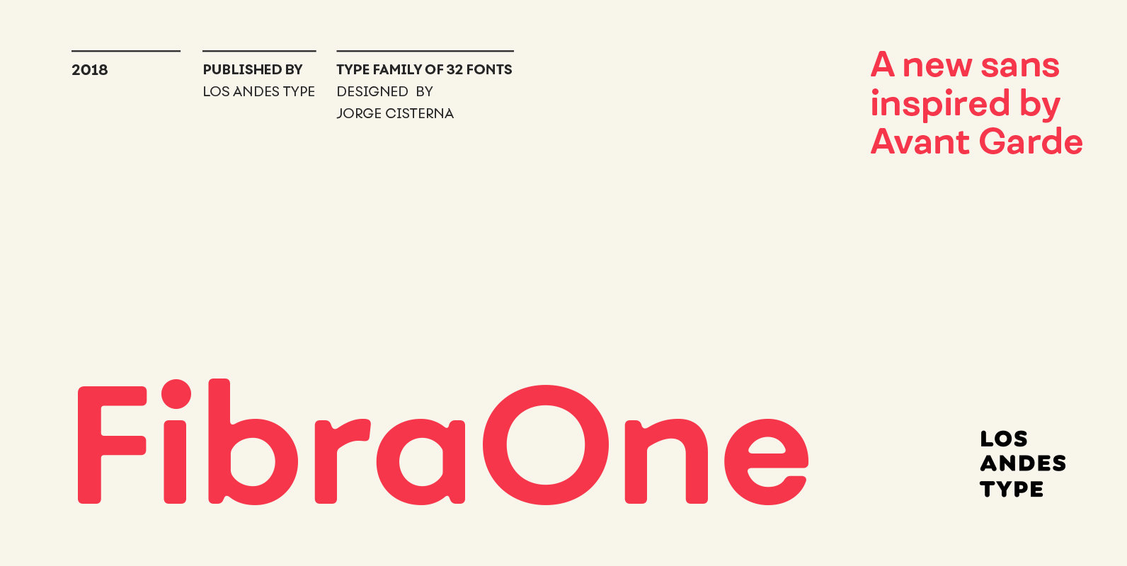
Fibra One Font
Fibra One looks like a “soft” version of the Fibra font, but it is actually more than that—the second part of its name suggests that it is a reinterpretation of the original typeface. While this new version maintains the overall
