Tag: wide
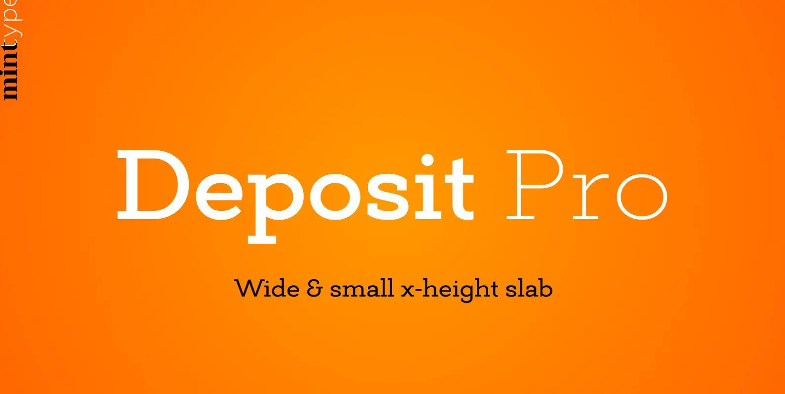
Deposit Pro Font
Deposit Pro is a wide slab-serif family with low x-height. In both headlines and paragraph text it creates a serious yes friendly texture, making it particularly suitable for corporate communication design. Deposit Pro consists of 16 styles (8 weights and
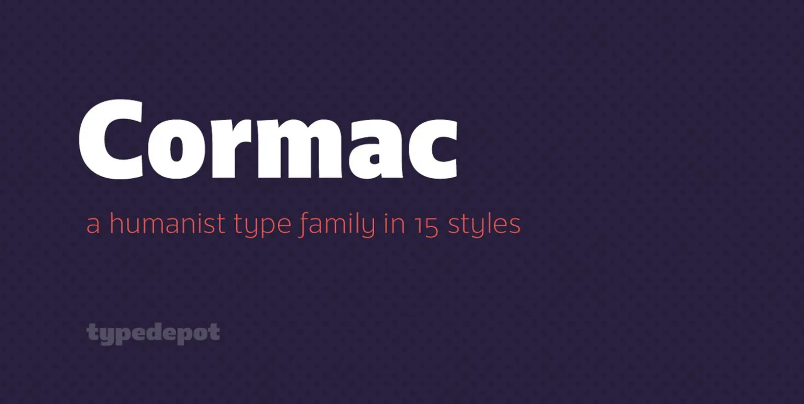
Cormac Font
Cormac is a humanist typeface characterized with it’s large x-height and slightly flared stems. The word that best describes our ideas in the beginning of the project is “simple” – the idea behind it was to strip the letter forms
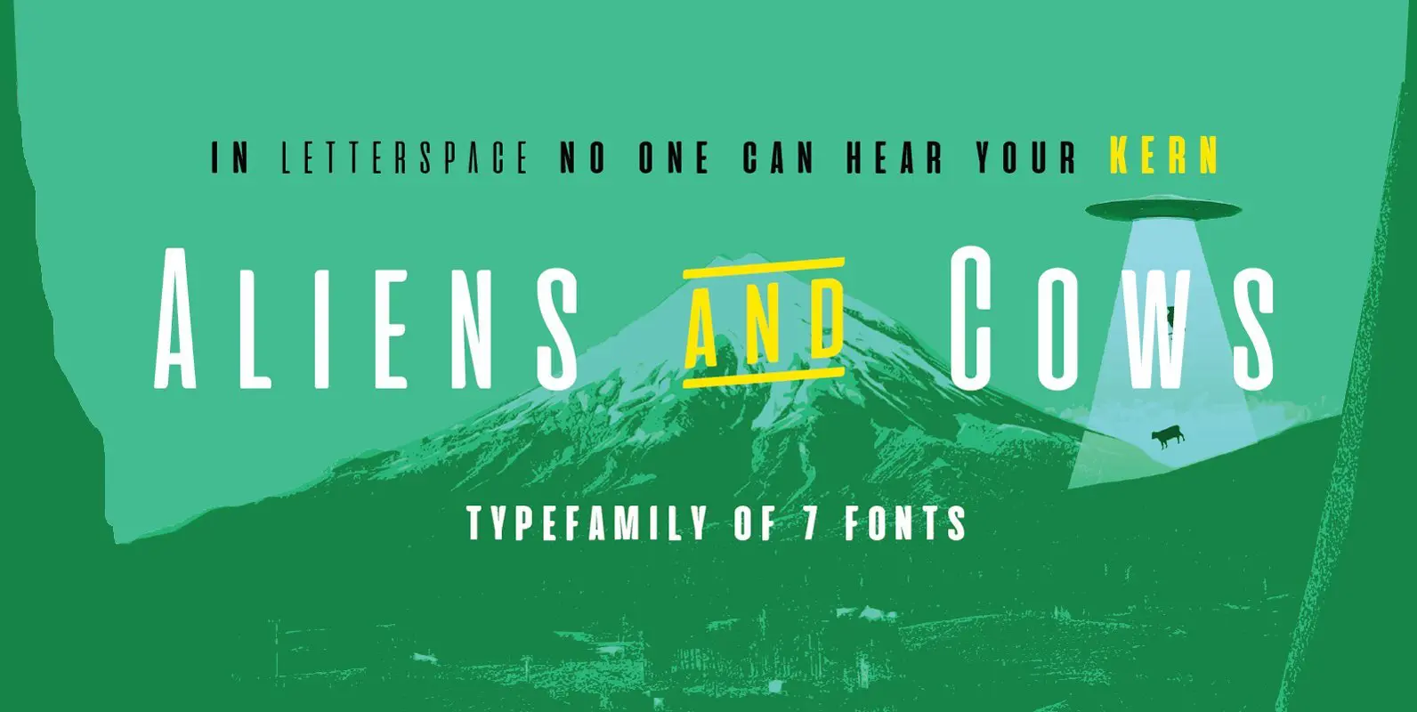
Aliens and Cows Font
Aliens and Cows is an ultra condensed sans serif display typeface designed by Francesco Canovaro. Inspired by the title cards of 1980’s science fiction movies, it features thin letterforms with a ultra wide spacing – perfect for minimal logo design
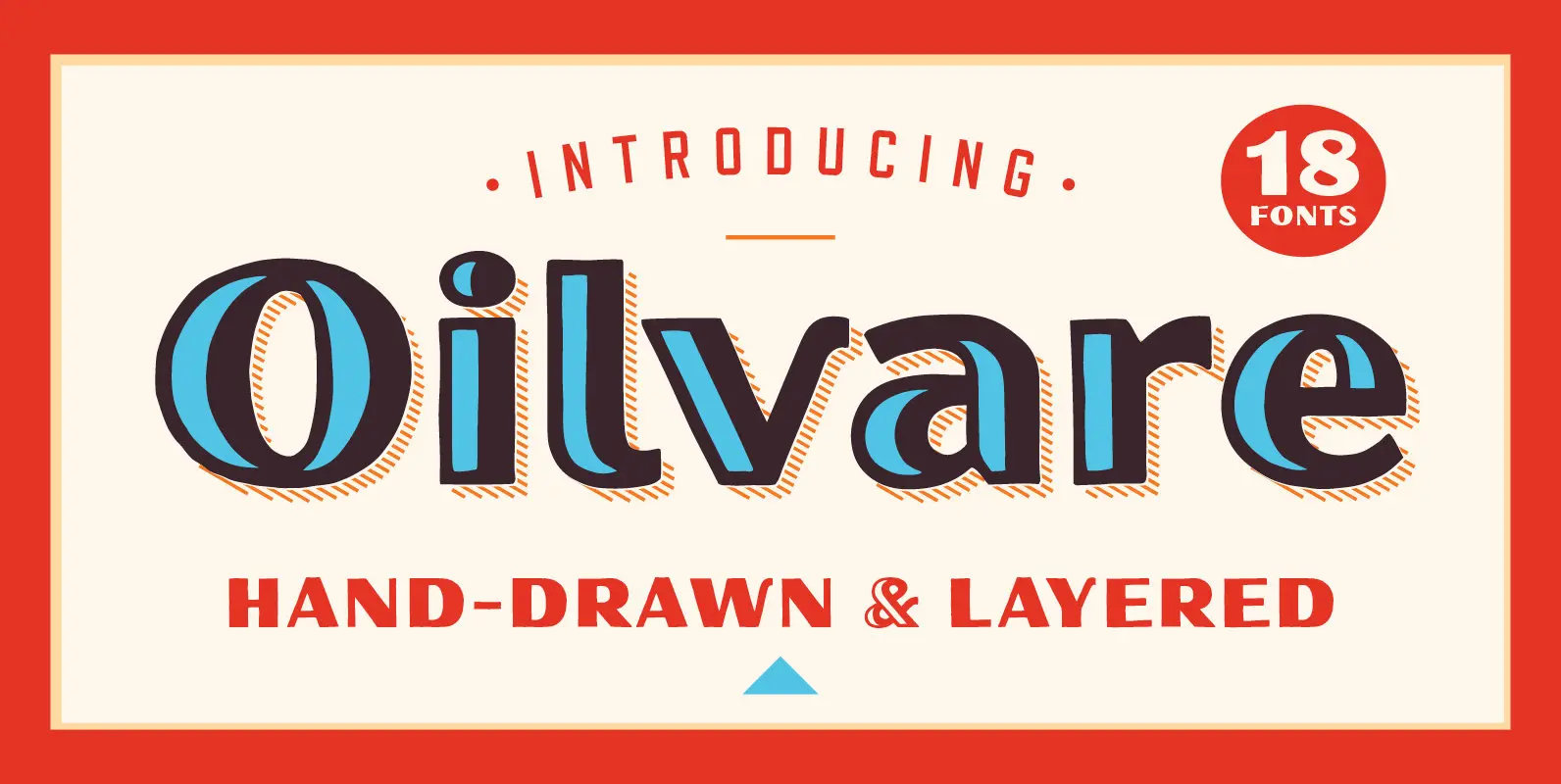
Oilvare Font
Oilvare is a hand-drawn, layered typeface family inspired by vintage painted signs and oil cans. While sturdy, it also has a softer side—wide proportions, oval-inspired forms, curled angle strokes (see characters like the K and V), and a medium contrast
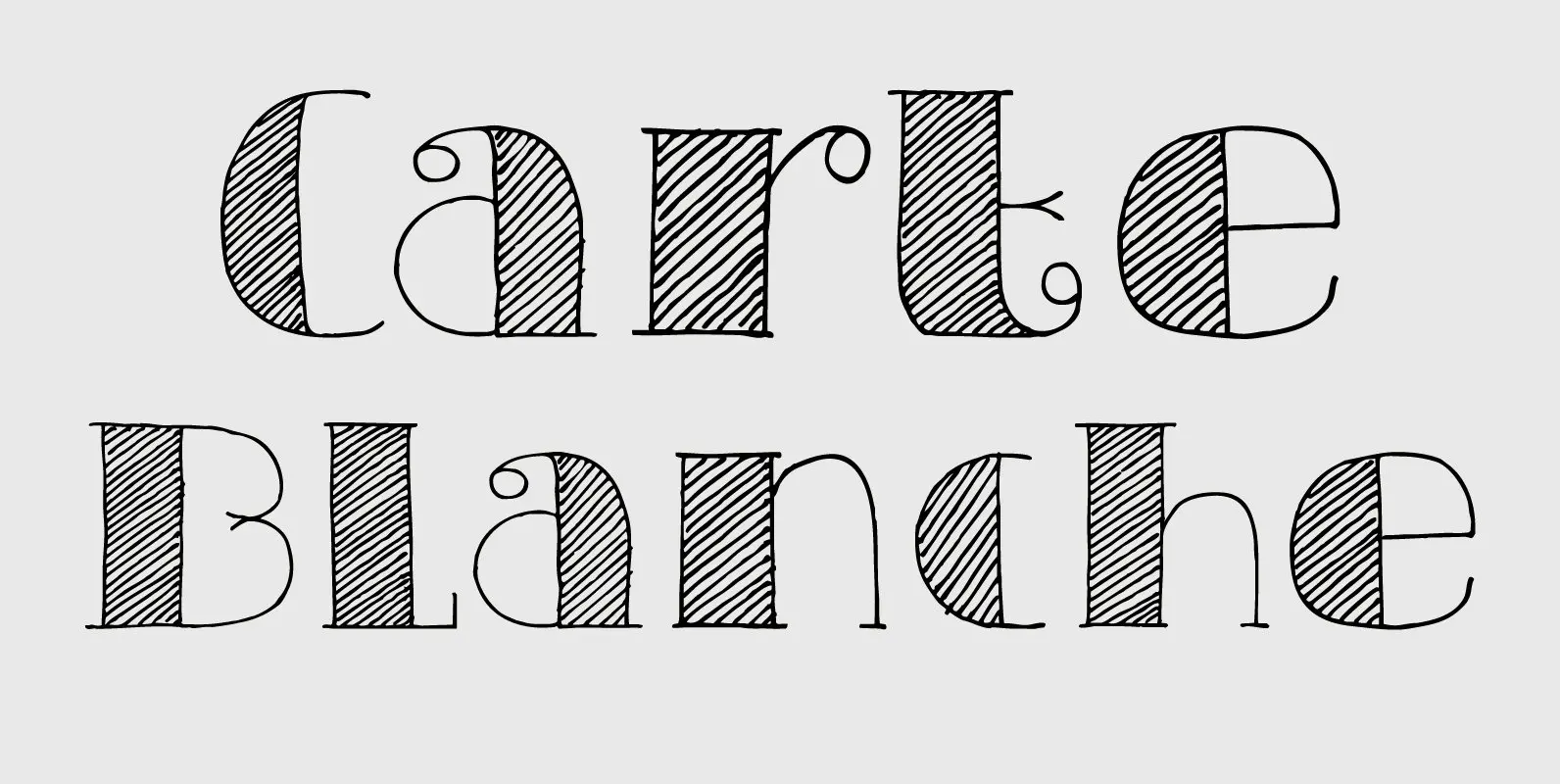
Carte Blanche Font
Carte Blanche literally means ‘Blank Ticket’. Yeah, yeah, it is also a very 007-ish catchphrase, but I wanted to give this elegant font a ‘stylish’ name and Carte Blanche popped up. All glyphs were hand drawn on a rather expensive
Design System Font
Design System is a great type system consisted of 5X7X2=70 font styles from 70s-style simple square sans to the widest style of all time that are best for titles, logo and text. Their simple form does not limit the target
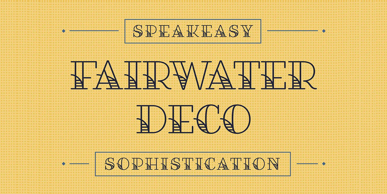
Fairwater Serif Font
Fairwater’s aesthetic derives from the simplified, forgiving letterforms of tattoo lettering – and the pictorial themes that informed early-to-mid 20th-century naval tattoos that evokes 20th-century craftsmanship, maritime themes, and colorful, salty personalities. 386 Glyphs and 26 Stylistic Alternates View the
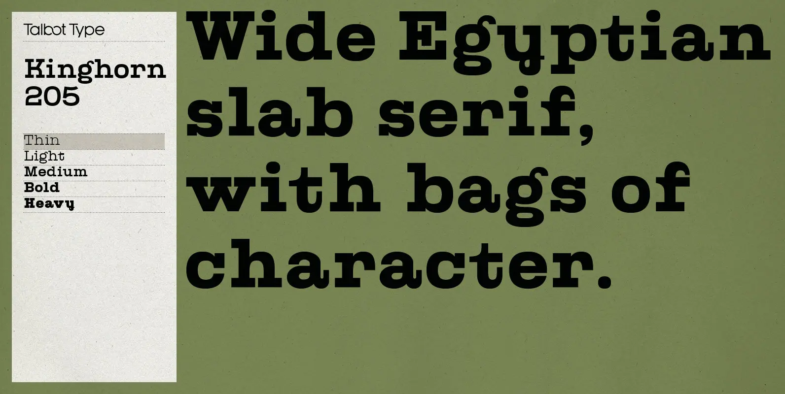
Kinghorn 205 Font
Kinghorn 205 is an Egyptian style slab-serif. The strokes are all of a roughly equal weight for an even, geometric look. Although original Egyptian slabs date from the early 19th century, the even look gives the font a balanced, contemporary
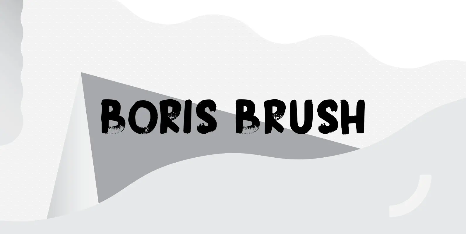
Boris Brush Font
Boris is my son: he was born on January 7th and he is as cute as can be. Boris Brush font is a very loud, very useful brush typeface, which I created using some fine-haired brushes and black paint. It
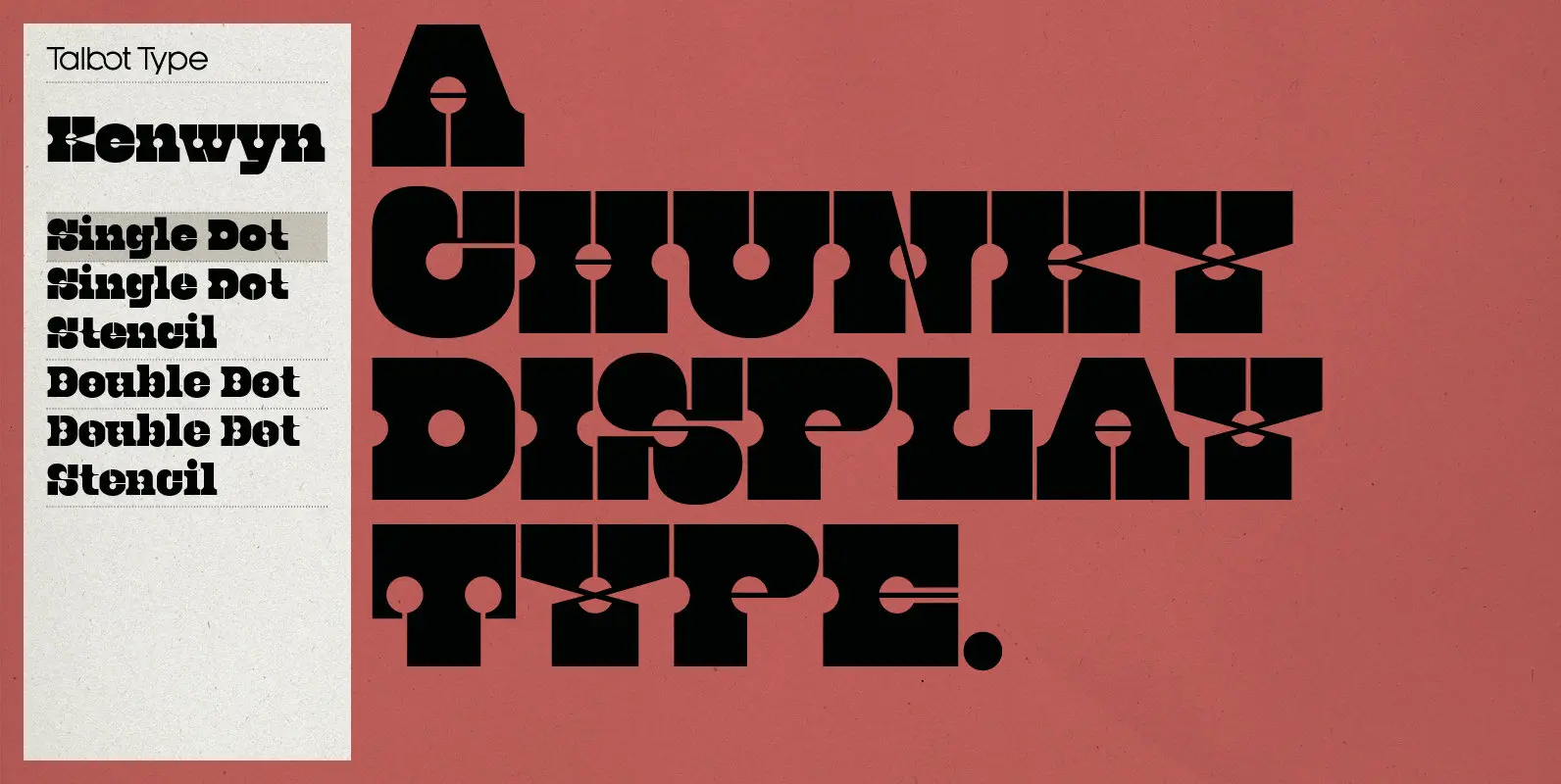
Kenwyn Font
Kenwyn is a bold, geometric, Egyptian style slab-serif display font. It comes in two variations — Single Dot and Double Dot — each with an accompanying Stencil variation. Essentially a blend of circles and squares, Single Dot features a circular
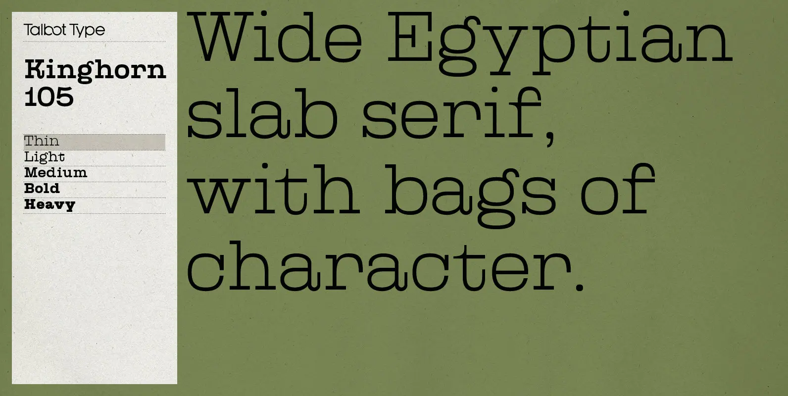
Kinghorn 105 Font
Kinghorn 105 is an Egyptian style slab-serif. The strokes are all of a roughly equal weight for an even, geometric look. Although original Egyptian slabs date from the early 19th century, the even look gives the font a balanced, contemporary
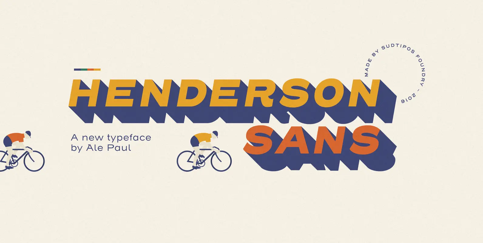
Henderson Sans Font
The first thought that crosses a type designer’s mind upon seeing a slab serif is: I wonder what it would look if it was serifless. And so, after building Henderson Slab, I followed my instincts and gave it a sans
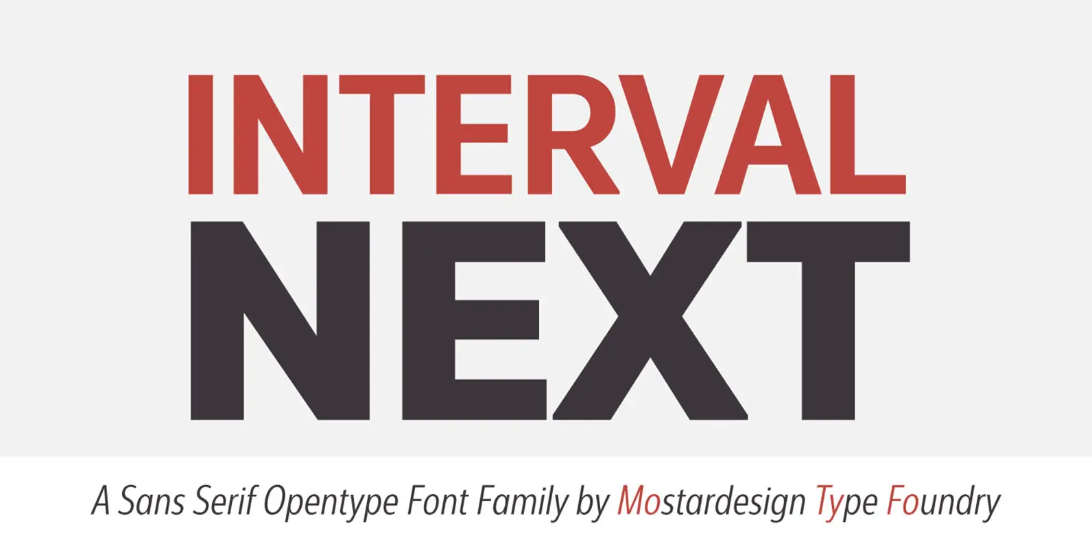
Interval Next Font
Interval Next is a modern sans serif font family that is the successor of the successful Interval Sans Pro. Designed by Olivier Gourvat, Interval Next typeface consists of 16 fonts in 8 weights — Ultra Light, Light, Book, Regular, Medium,
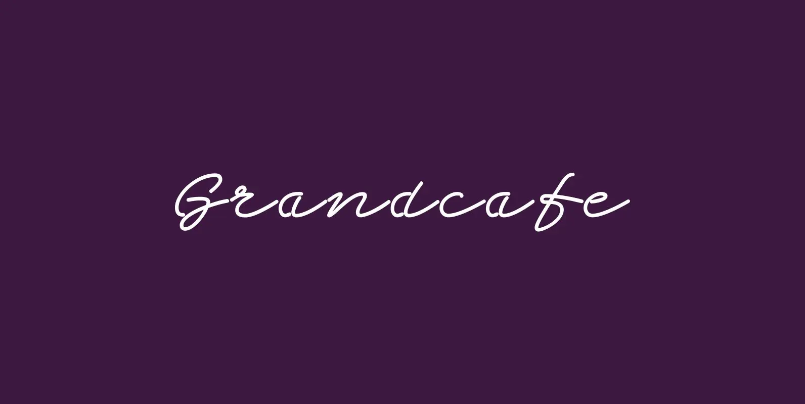
Grandcafe Font
“Grandcafe” was inspired by neon lettering dating back to the fifties. The glass tubes made long loops necessary so a whole set of new typefaces in neon-tubing developed. My version has a very elegant touch to it. Published by Wiescher
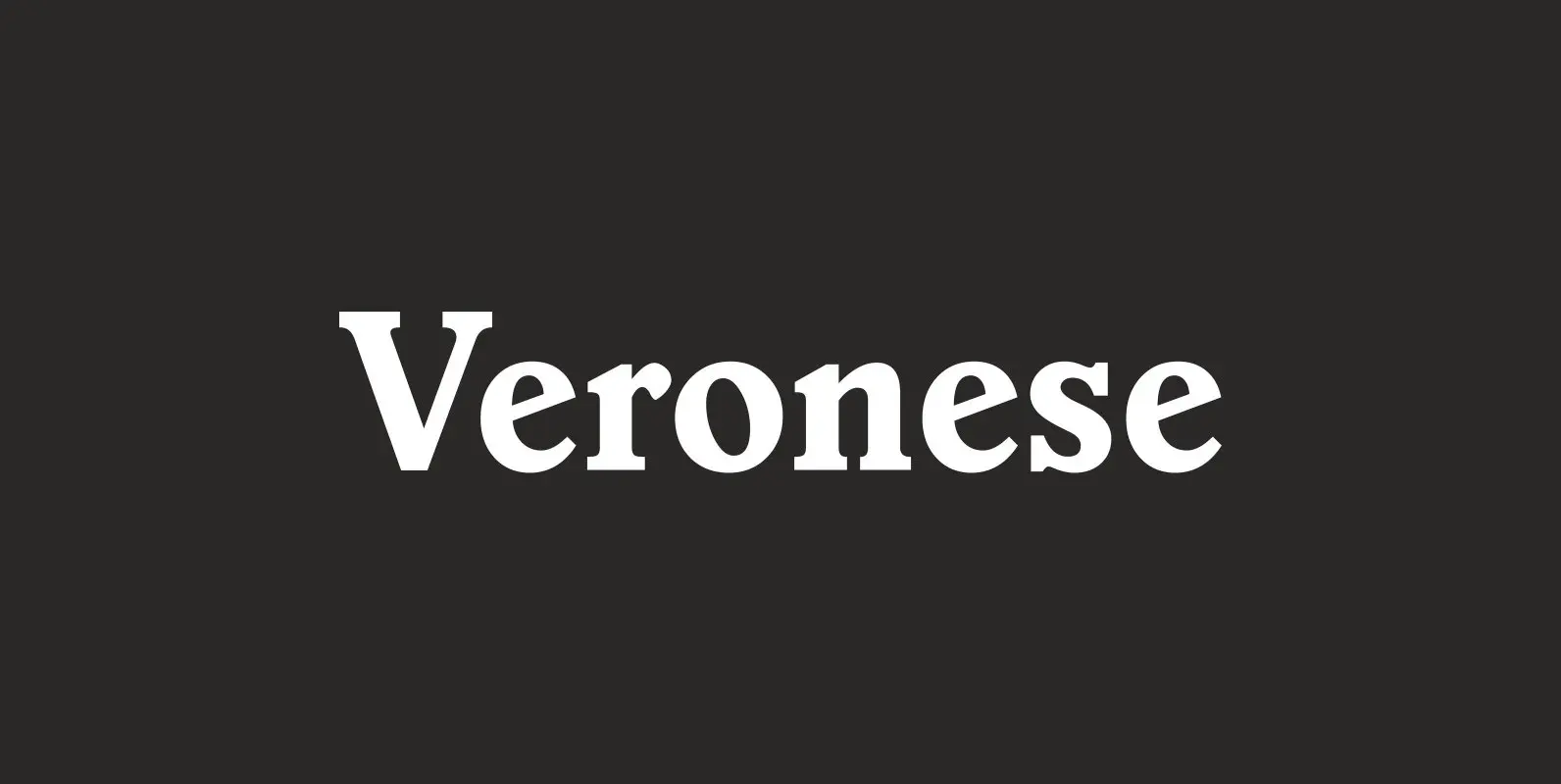
Veronese Font
Designed by Steve Jackaman, Veronese is based on the early original Monotype design, you can definitely see the influence of Italian Old Style, Jenson and Morris Golden Type. Published by Red RoosterDownload Veronese
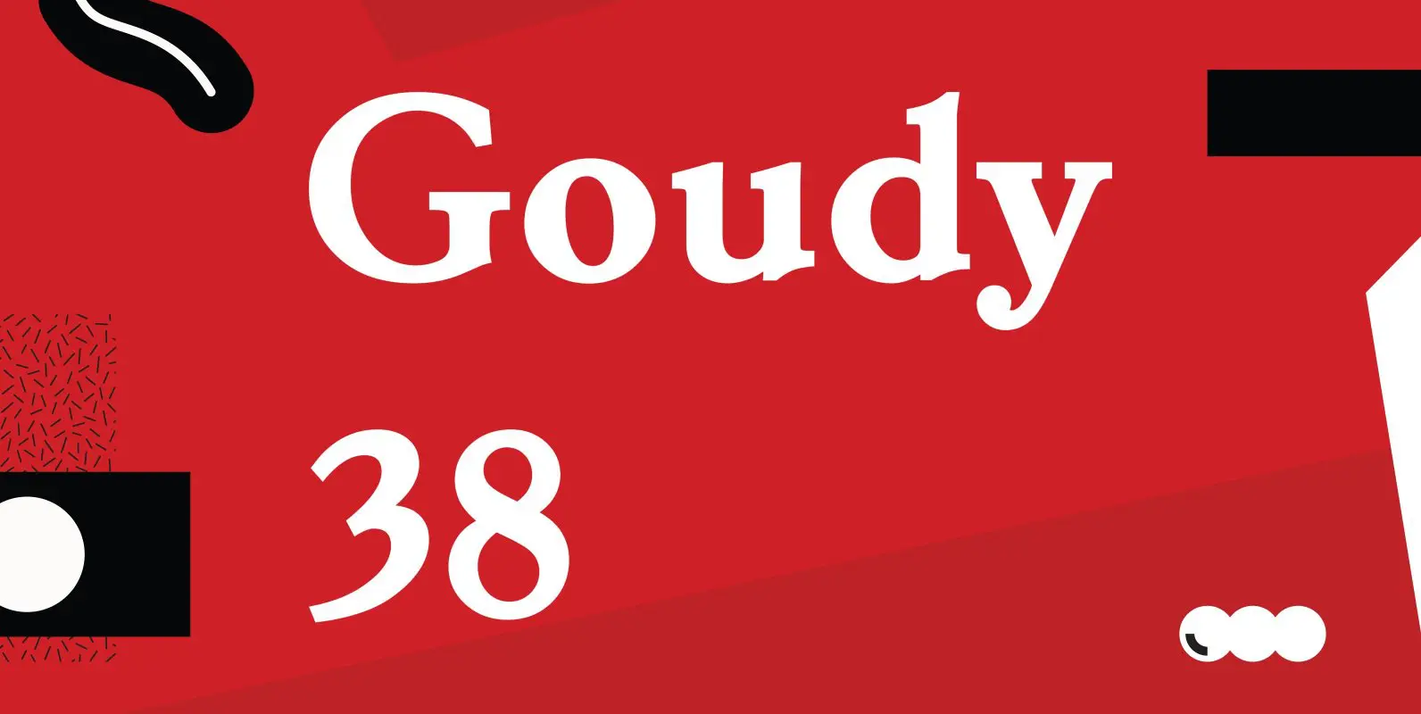
Goudy 38 Font
Designed by Les Usherwood. Digitally engineered by Steve Jackaman. Originally designed by Frederick Goudy for the original Life magazine, circa 1908. The typeface was used almost exclusively for their advertising and was often known as Goudy Gimbel; but the typeface
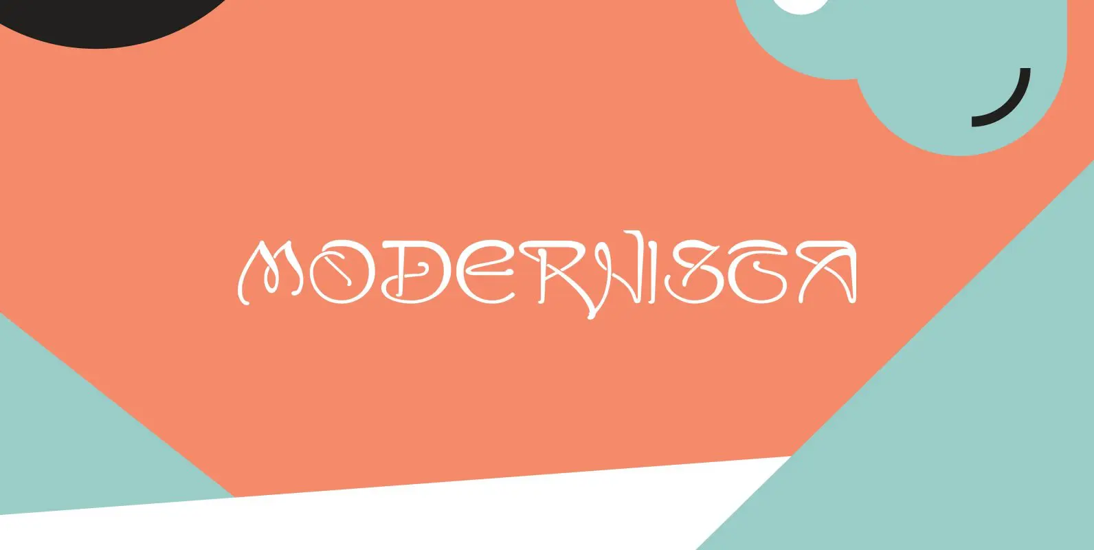
Modernista Font
“Art Nouveau” happened over Europe under different names. They called it “Jugenstil” in Germany, “Le style moderne” in France, »Sezessionsstil« in Austria and Eastern Europe, “Stile Liberty” in Italy and “Modernista” in Spain. “Jugendstil” in Germany is what started modern
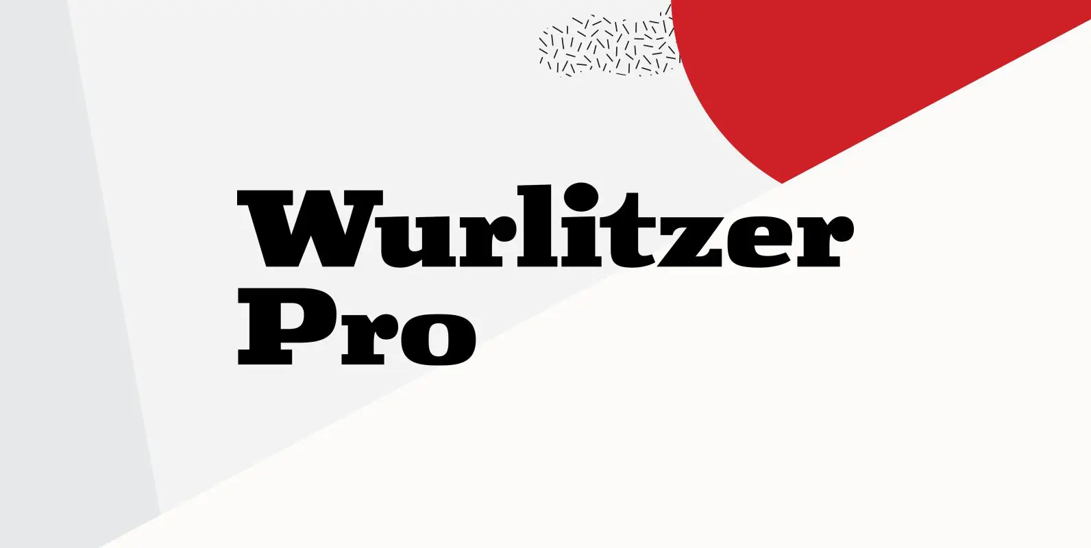
Wurlitzer Pro Font
Designed by Steve Jackaman & Ashley Muir. This design was inspired by an early 20th century woodtype. Wurlitzer contains all the high-end features expected in a quality OpenType Pro font. Published by Red RoosterDownload Wurlitzer Pro