Tag: wide
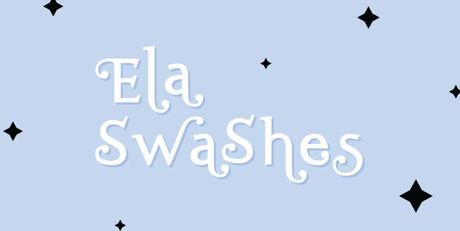
Ela Swashes Font
“Ela Swashes” are not meant to and can not be used as a standalone typeface. Swashes are a set of many different embellished letters to be used together with Ela Demiserif fonts of corresponding weights. Published by Wiescher DesignDownload Ela
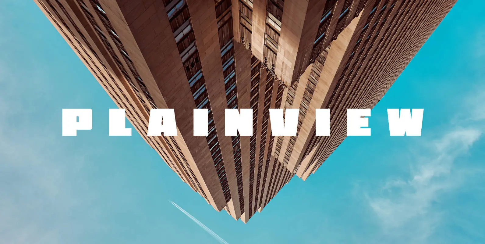
Plainview Font
My latest and greatest, the widest and flyest. Plainview is large and in charge, crystal clear in ALL CAPS and lowercase. It contains glyphs for most latin-based European languages, and over a dozen stylistic alternates depending on your mood and
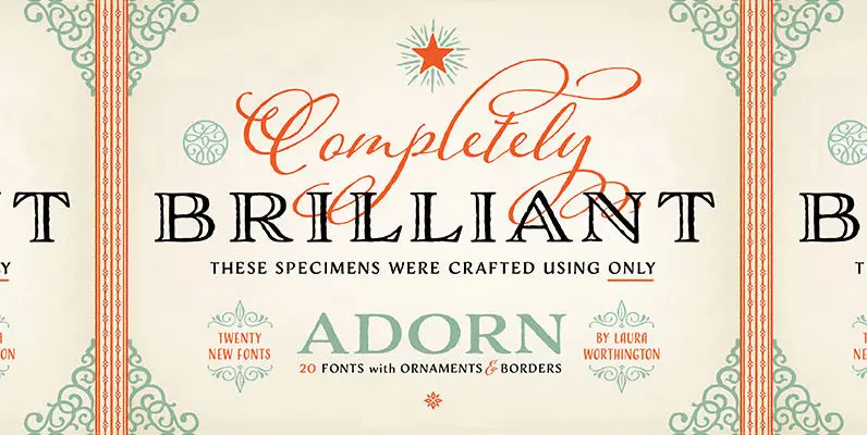
Adorn Collection Font
What can be more lovely than a wedding, an intimate invitation, a gift from the heart? One whose presentation uses the warm and welcoming family of typefaces, Adorn. With a modern and sometimes quirky twist on the staid, almost corporate
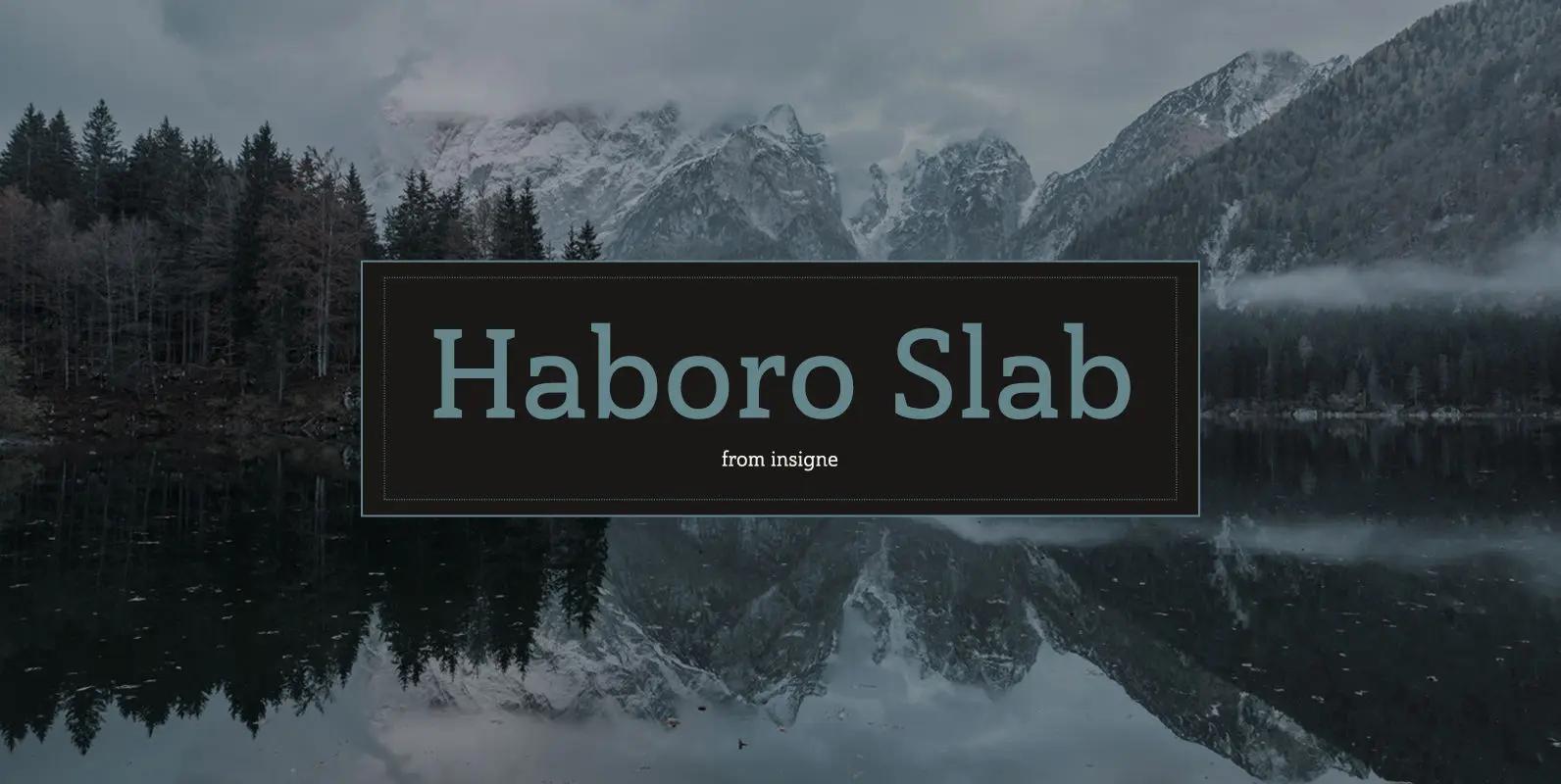
Haboro Slab Font
Haboro Slab. It’s a nose-to-the-grindstone kind of font like the first of its family. This slab serif pushes through the clutter powerfully in editorial and corporate work such as business websites and software. The Haboro hyperfamily as a whole is
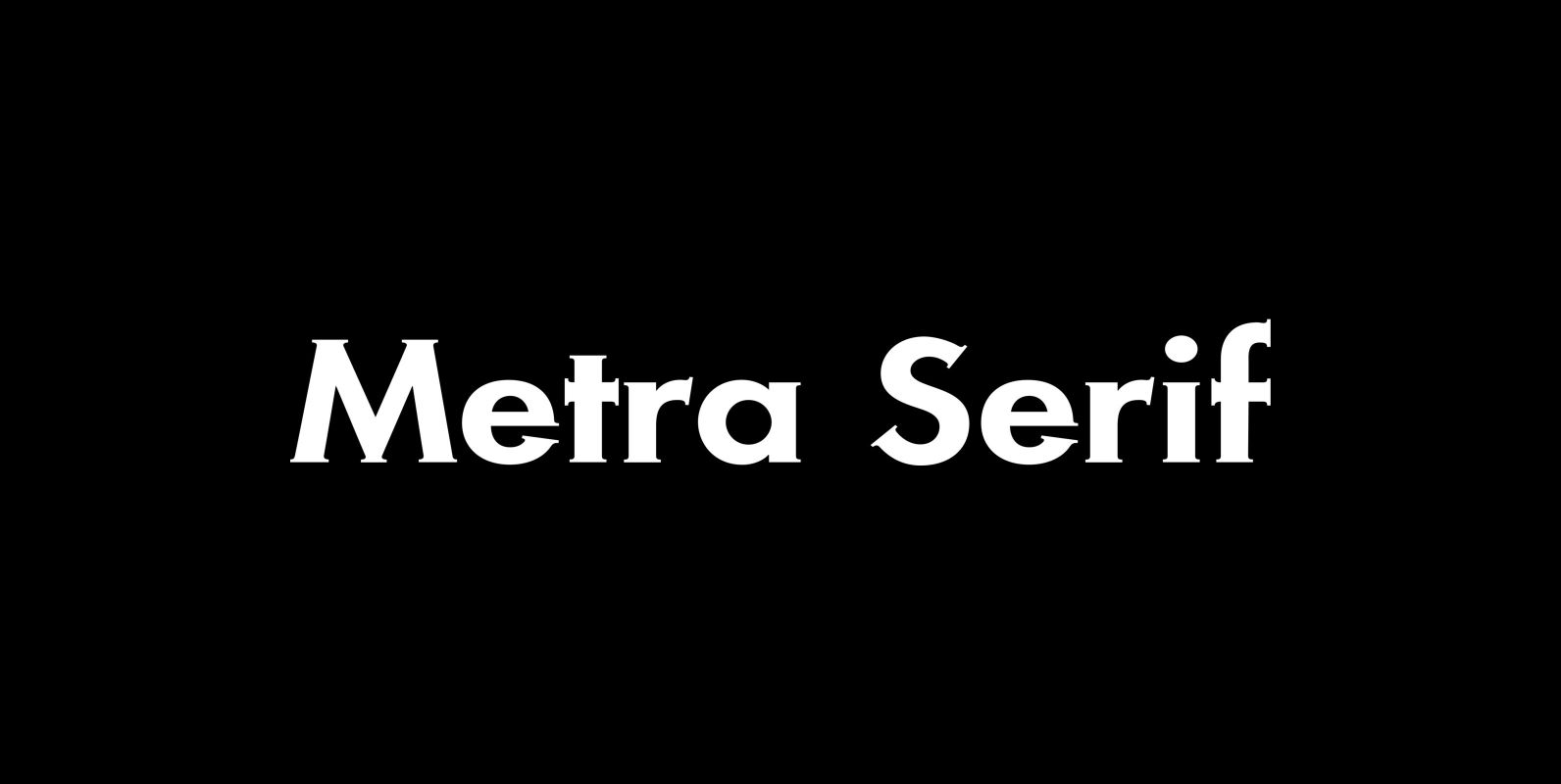
Metra Serif Font
“Metra” has the clarity of a classical Sans font and the charm and elegance of a Gothic Copperplate. I designed it because for some purposes one needs a Serif with that cool “Sans” look. I sell the font in 5
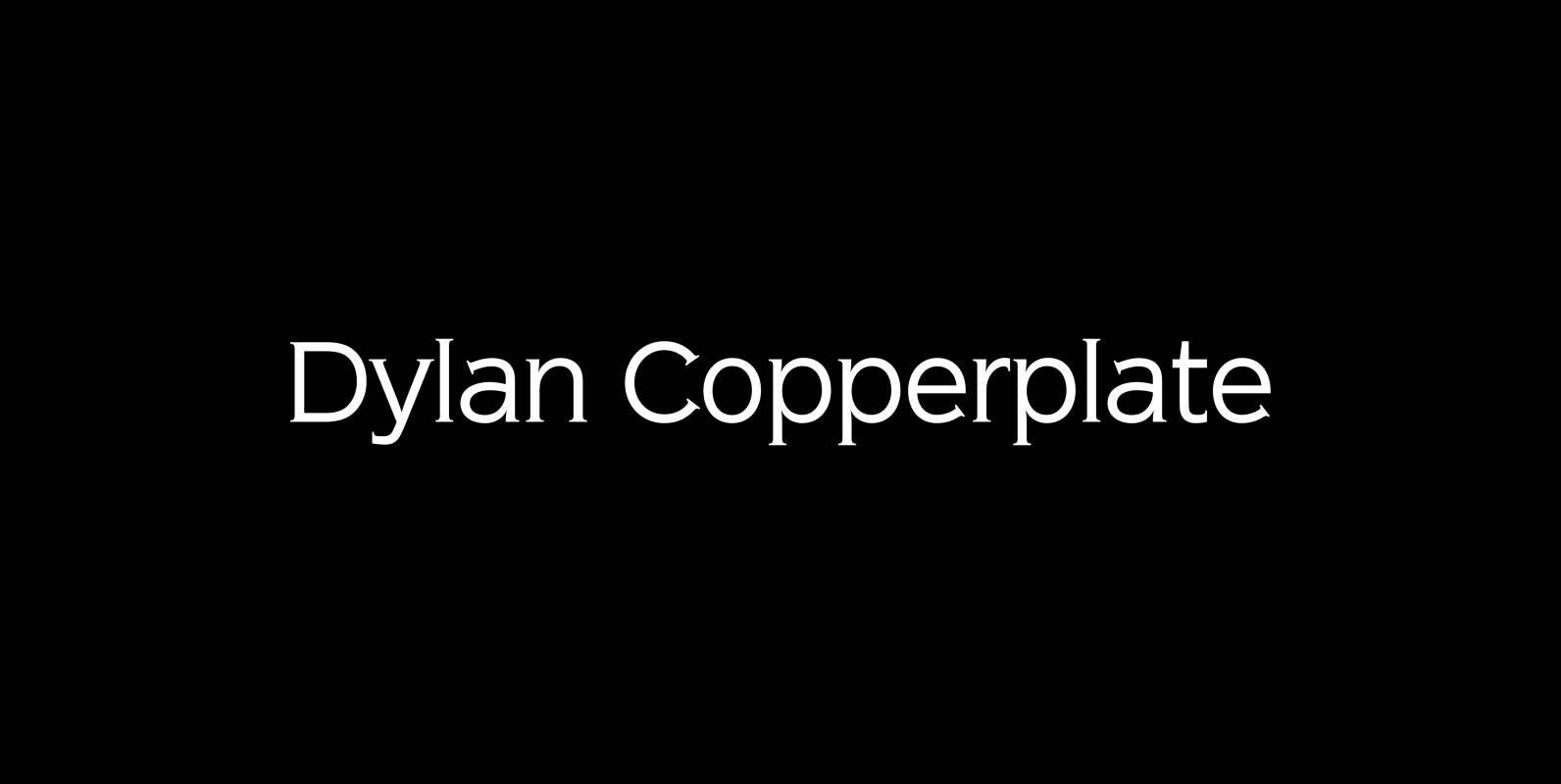
Dylan Copperplate Font
Dylan Copperplate is my newest addition to the ever growing family. The small flicks of the burin add an elegant touch to the solid font-design. Very handsome and useful for all kinds of invitations and business-cards as well as for
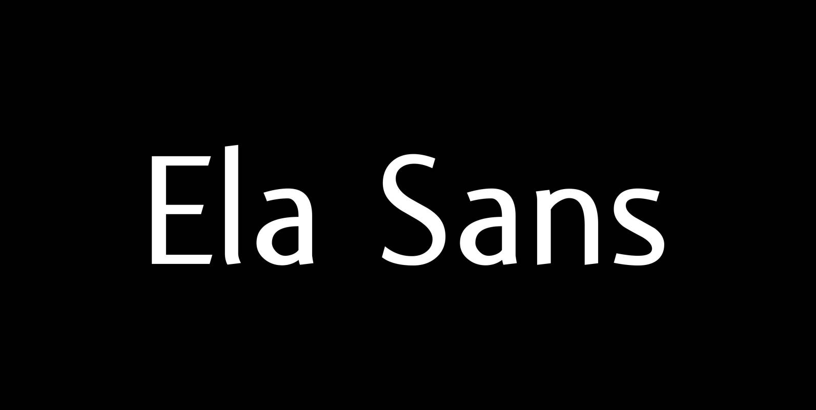
Ela Sans Font
“Ela Sans” is the sister of the typeface I originally designed for the business of my second wife and mother of my two sons, her name is – of course – Michaela. Ela – the typeface – is suitable for
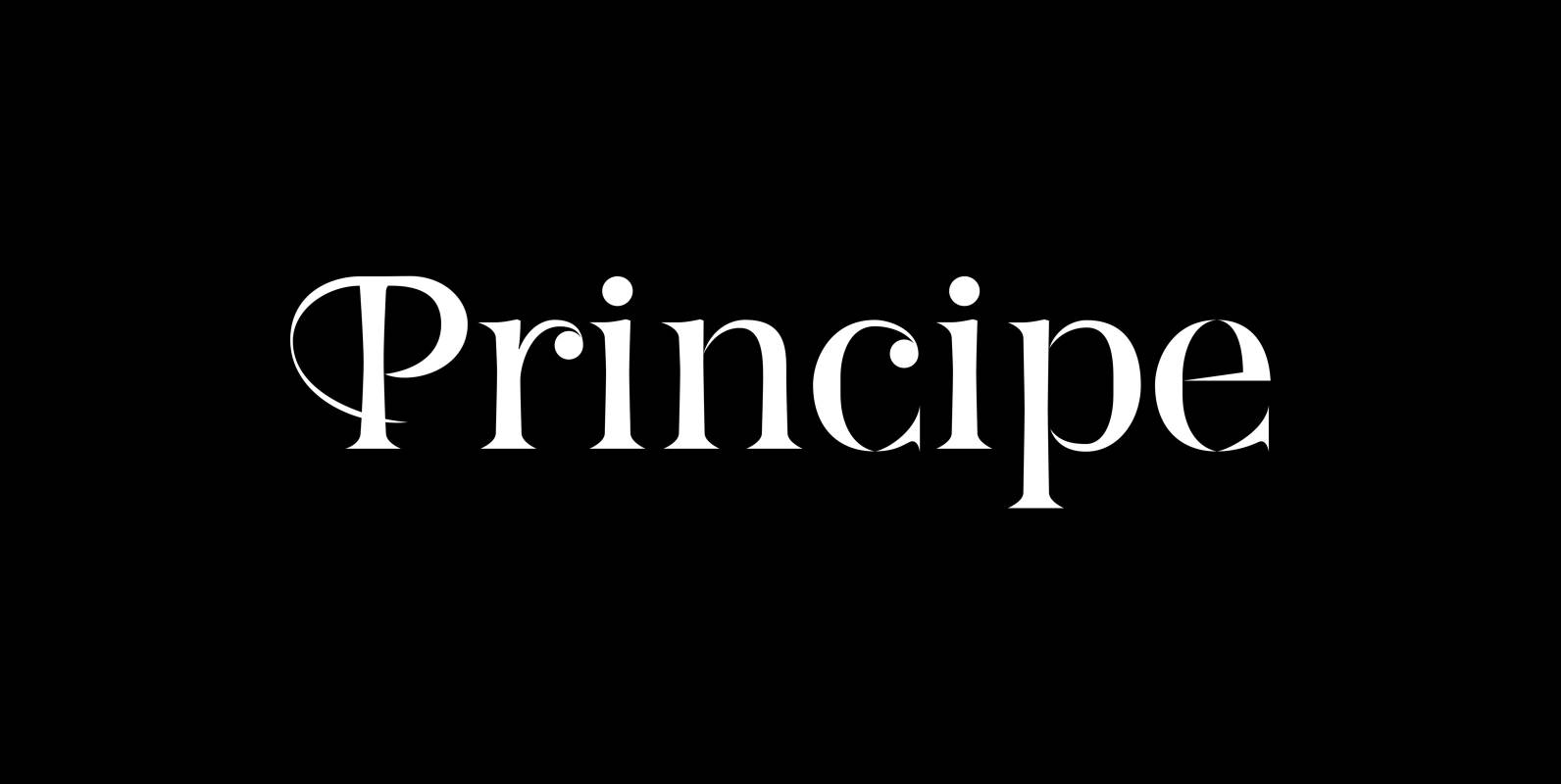
Principe Font
“Principe” is the Bodonian idea driven to the limit by abolishing most of the hairlines! The shape is completed only by the eye of the reader. This gives room for elegant embellishments and makes for a surprisingly new look to
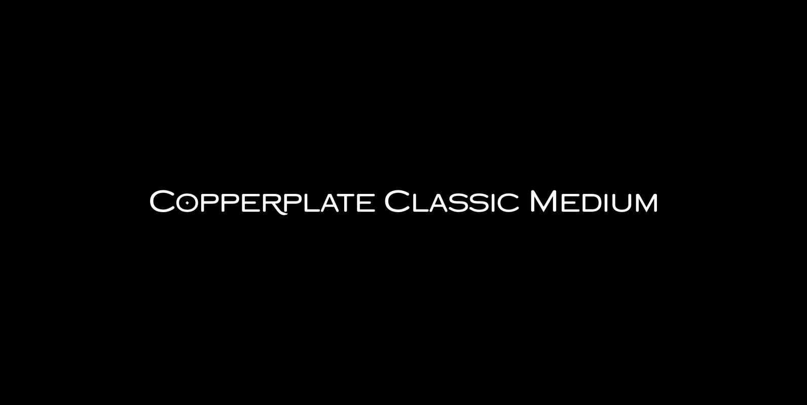
Copperplate Classic Medium Font
“Copperplate” was the classic nineteenth century engravers typeface, consisting of capitals and small caps only. Among others (for example Deberny & Peignot) F. W. Goudy’s cut for ATF around 1901 is probably the most widely known. Copperplate typefaces are traditionally
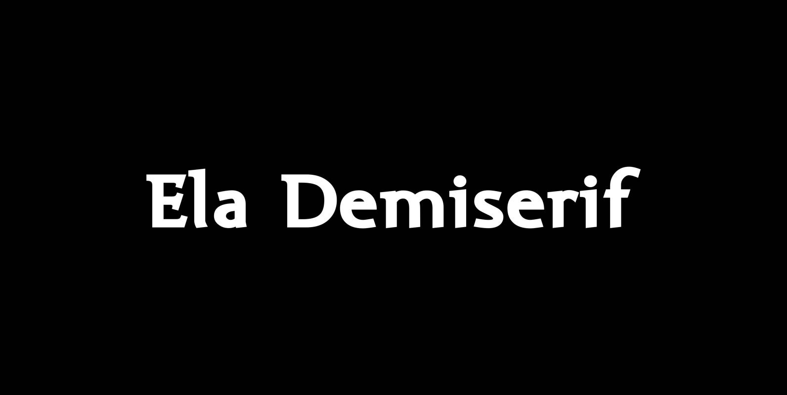
Ela Demiserif Font
Ela Demiserif is the typeface I originally designed for the business of my second wife and mother of my two sons; her name is, of course, Michaela. Ela – the typeface – is suitable for magazines, newspapers, posters, advertisements, books,
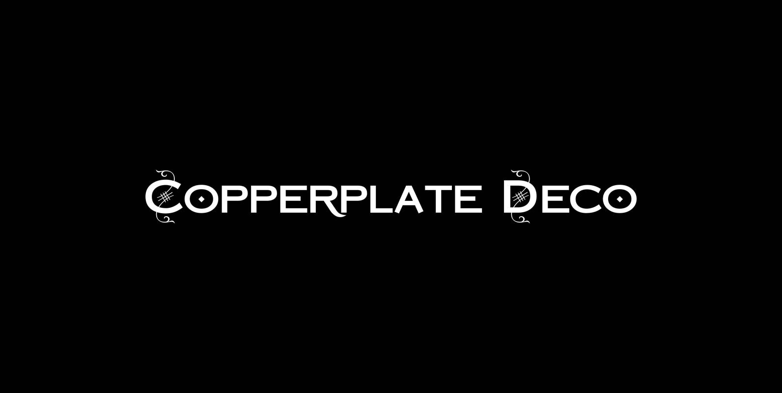
Copperplate Deco Font
“Copperplate Deco” is my sparingly decorated version of my Copperplate fonts. They can be used as stand alone fonts. Published by Wiescher DesignDownload Copperplate Deco
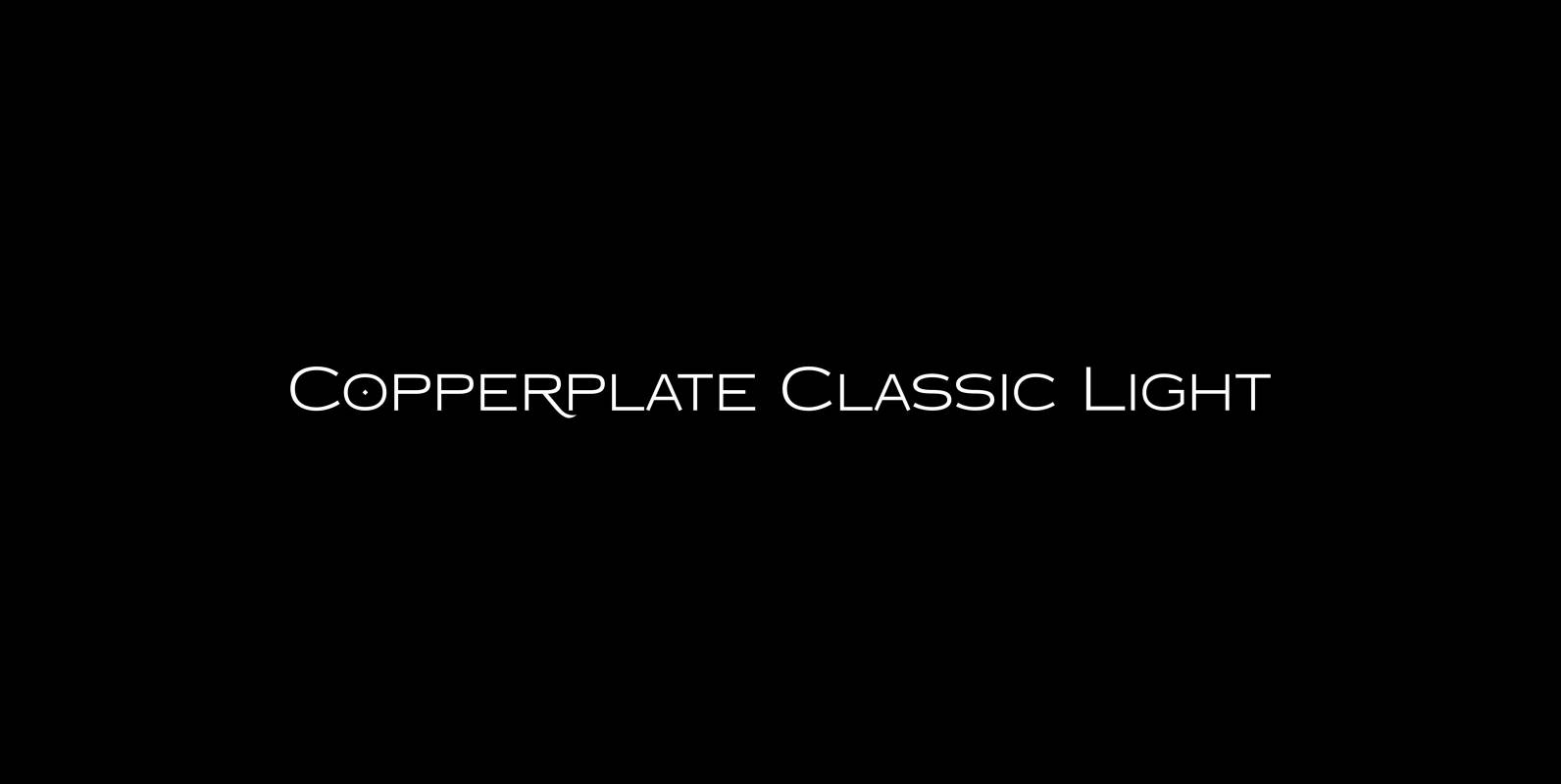
Copperplate Classic Light Font
“Copperplate” was the classic nineteenth century engravers typeface, consisting of capitals and small caps only. Among others (for example Deberny & Peignot) F. W. Goudy’s cut for ATF around 1901 is probably the most widely known. Copperplate typefaces are traditionally
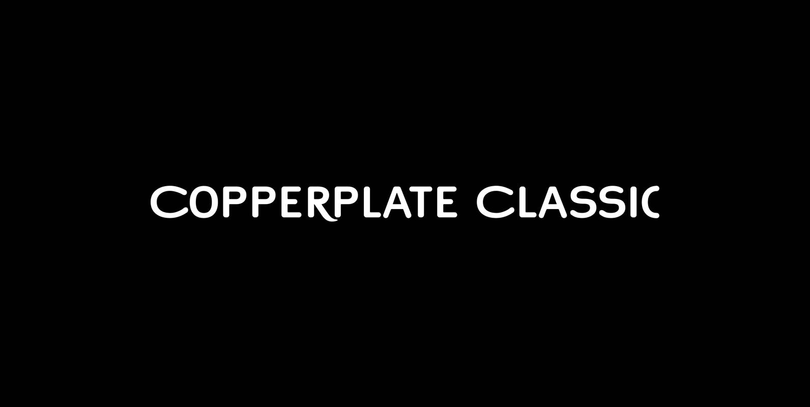
Copperplate Classic Font
“Copperplate” was the classic nineteenth century engravers typeface, consisting of capitals and small caps only. Among others (for example Deberny & Peignot) F. W. Goudy’s cut for ATF around 1901 is probably the most widely known. Copperplate typefaces are traditionally
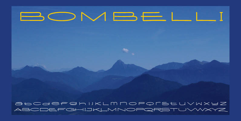
Bombelli Light Hand Font
Bombelli is a font that looks like it has been handwritten by a meticulous architect in one of those hand-drawn blueprints of the old days. I chose the name to honor one of my ex-bosses — a graphic designer-architect who
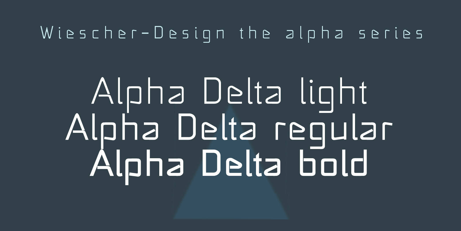
Alpha Delta Font
“Alpha Delta” the standard paperclip is the basic idea behind this font. By working on it, I changed it so that it doesn’t look too much like a paperclip any more. Published by Wiescher DesignDownload Alpha Delta
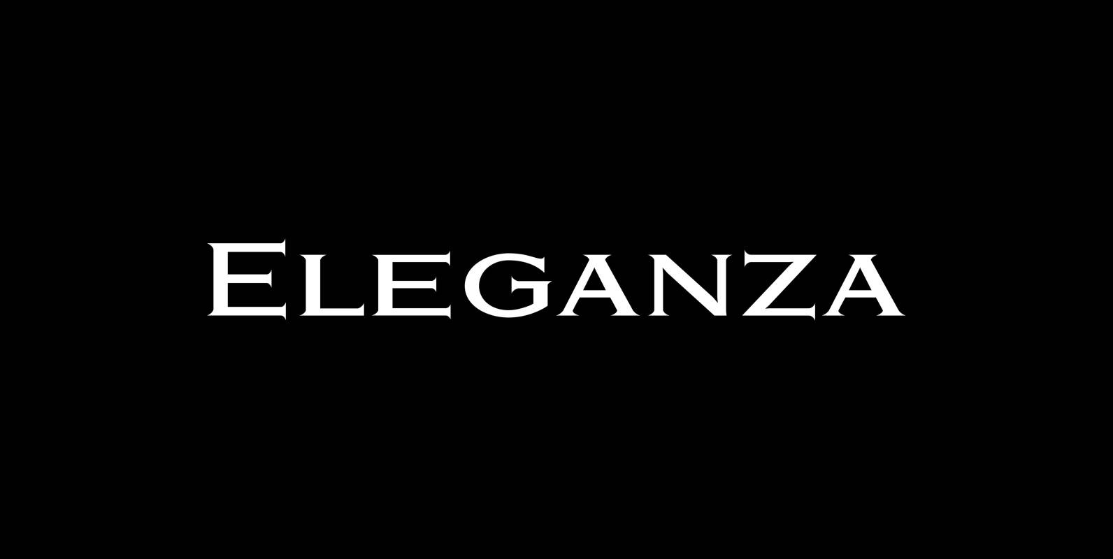
Eleganza Font
“Eleganza” is my most elegant typeface. At least that is what I think! I use it for business cards and everything that has to be elegant with that extra touch. The font comes in pairs for the price of one.
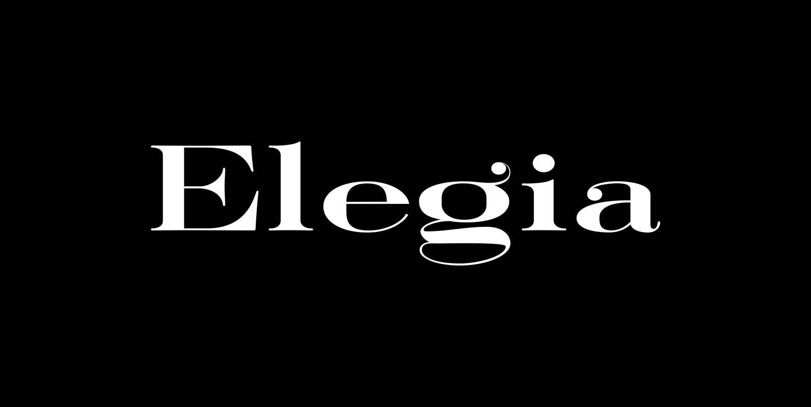
Elegia Font
I designed Elegia on a winter escape in beautiful and sunny Lisbon. That was a very elating experience, friendly people, a beautiful old town, perfect coffee and good simple cooking all that topped by extremely reasonable prices. Since I just

Supra Extended Font
Supra Extended – designed by Gert Wiescher in 2013 – is the extended version to this new sans typeface family of eight weights. The extended version is designed for sheer elegance and has no italics because they didn’t look nice