Tag: wide
Aloha Script Font
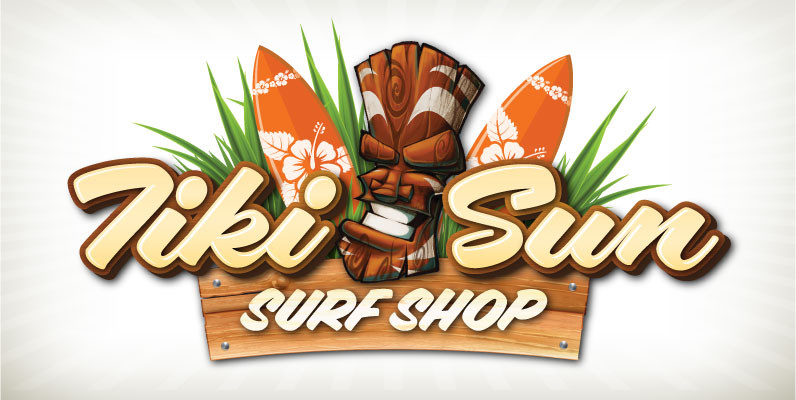
Aloha! Veteran Sign Painter Pierre Tardif and Lettering Artist Charles Borges de Oliveria have teamed up to bring you these fun to use brush fonts. Aloha Script comes in two flavors: Aloha Script and Aloha Script Casual. Both fonts contain
Crique Grotesk Font
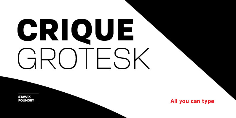
The Crique Grotesk This contemporary typeface is inspired from Neo-humanist and Geomatric industrial tone presented the late 2000s typeface. The font family is also composed of the normal width and display width in order to support the different applications on the delicate
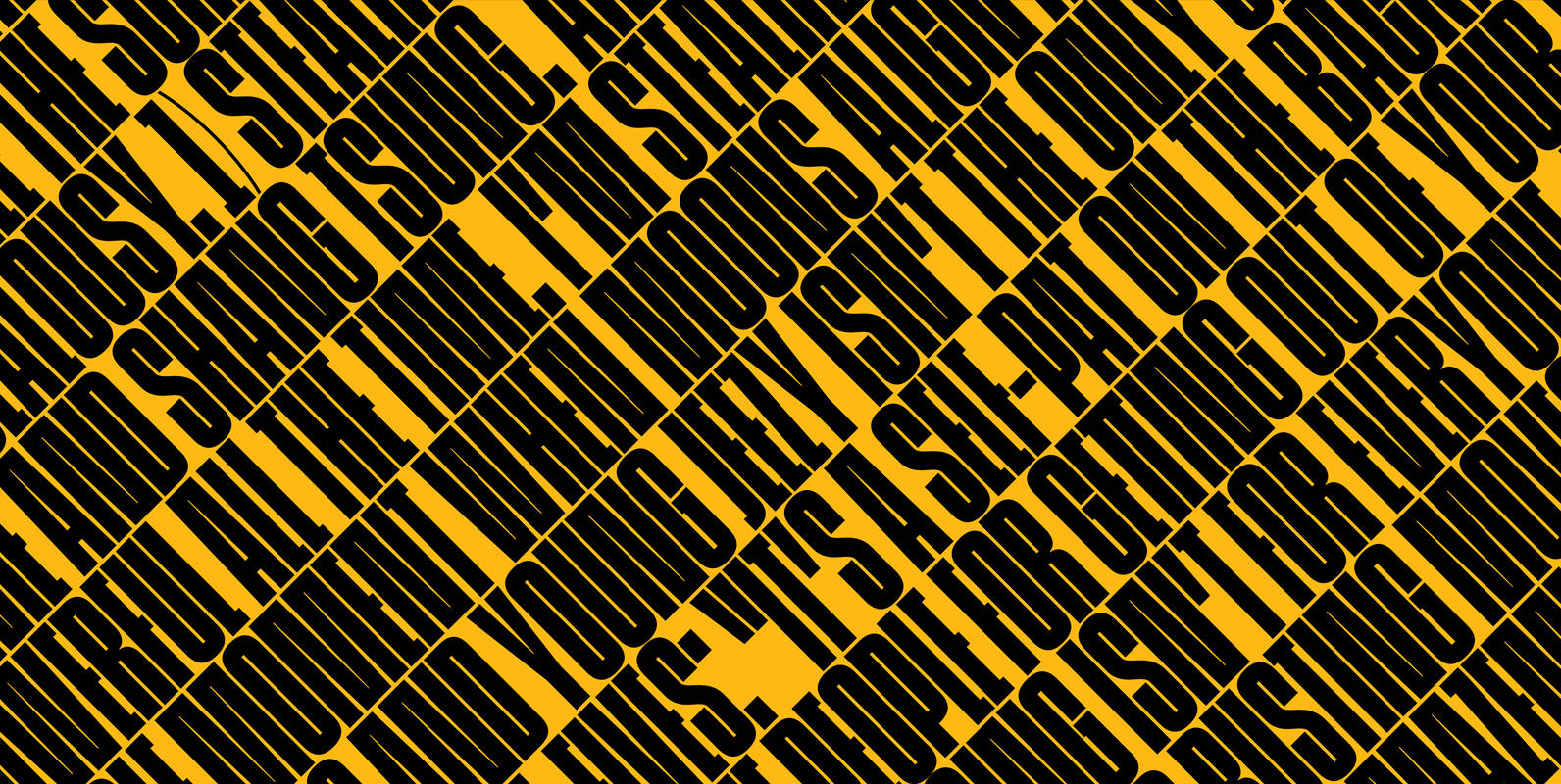
Cinderblock Font
If prisons are built with stones of law, then powerful words indeed are built with letters of Cinderblock–the World’s Tallest Typeface. Inspired by masonry and available in eight heights–each version growing approximately 25% taller than the previous–Cinderblock is a brand
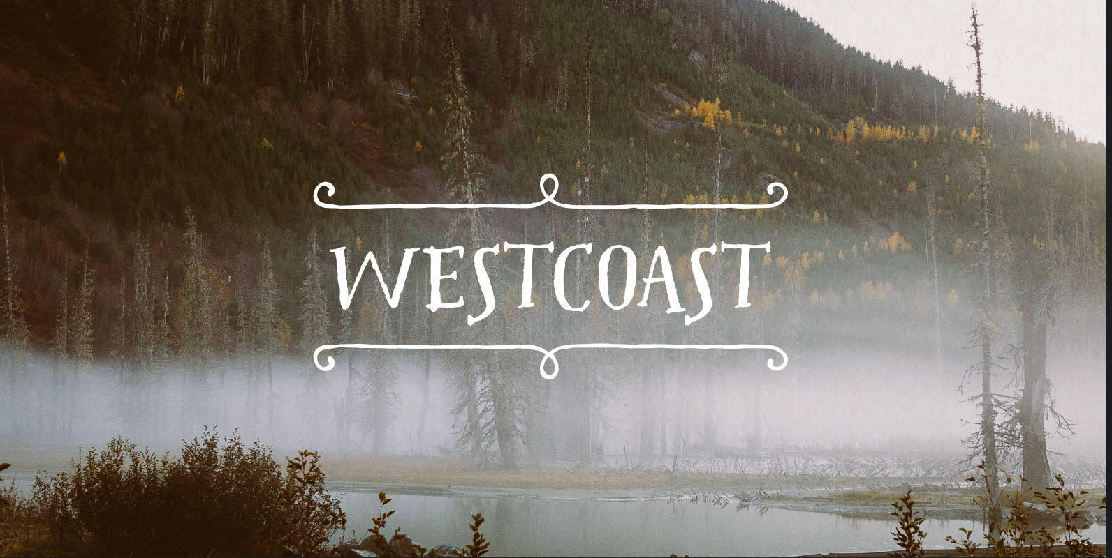
Westcoast Letters Font
Westcoast Letters is a fun hand painted headline font by Cultivated Mind. Westcoast Letters comes in comes in four font styles, extras, frames and page rulers. Westcoast Letters is a sister typeface to the ever popular Pacific Northwest font family.
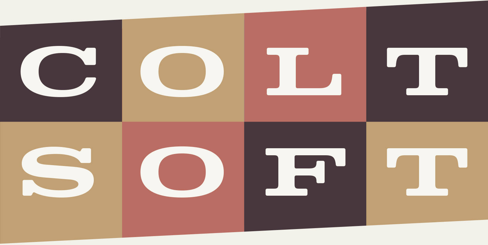
Colt Soft Font
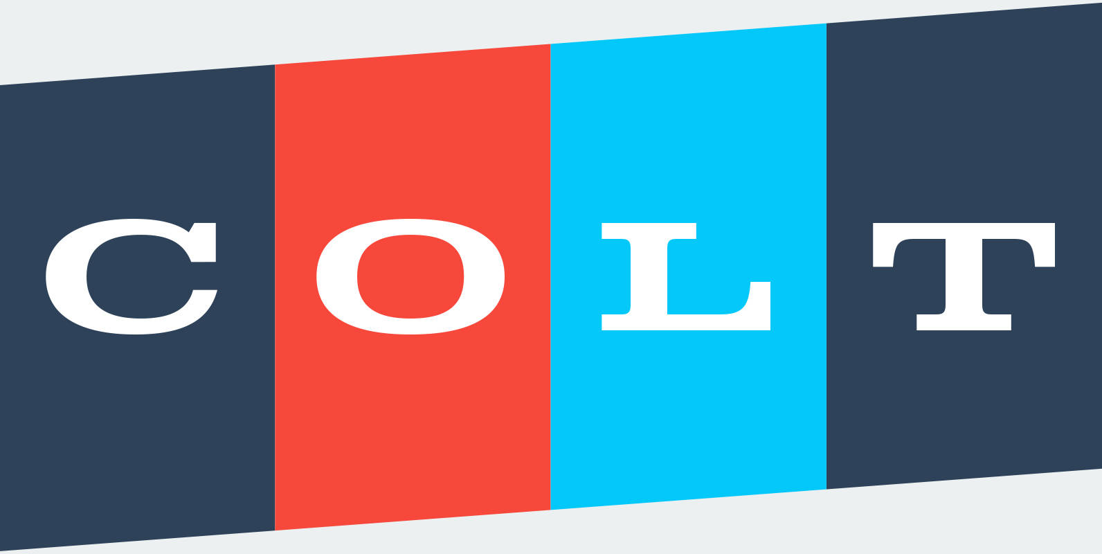
Expanding on the idea of Colt, Colt Soft takes the family closer towards the realm of its original inspiration—type on vehicles from the 60s. During the decade, hefty letters were often embossed into the back of truck tailgates. Because of
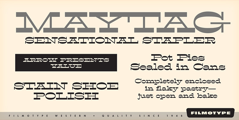
Filmotype Western Font
Inspired by French Antique reverse-stress types of the 1880s, Filmotype Western was released in 1955 to expand its Flat Serif category. Popular in broadsides, circus posters and advertisements at the turn of the 19th century, Filmotype Western will add old

Santiago Font
Santiago is a western wanted poster influenced typestyle with a clean and friendly feel to it. Almost comic like in its simple and clean appearance, with caps vs. smallcaps settings, and a variety of weights and widths from condensed to
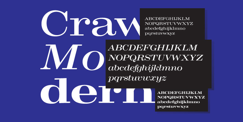
Craw Modern Font
Designed by Freeman Craw in 1958, Craw Modern is a serif font release by URW. Contains language support for West, East, Turkish, Baltic, and Romanian. Published by URW Type Foundry GmbHDownload Craw Modern
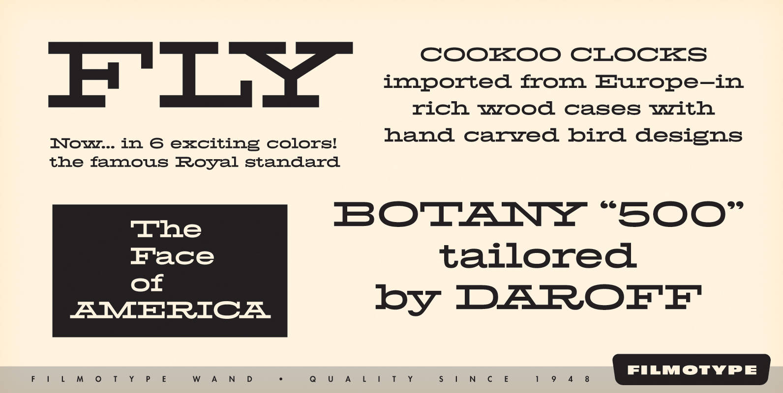
Filmotype Wand Font
Filmotype Wand was introduced in 1955 as part of the Flat Serif category. Inspired by smart slab serifs including Hellenic Wide popular in American television westerns and in heavy use in corporate letterhead and store packaging, Filmotype Wand takes a
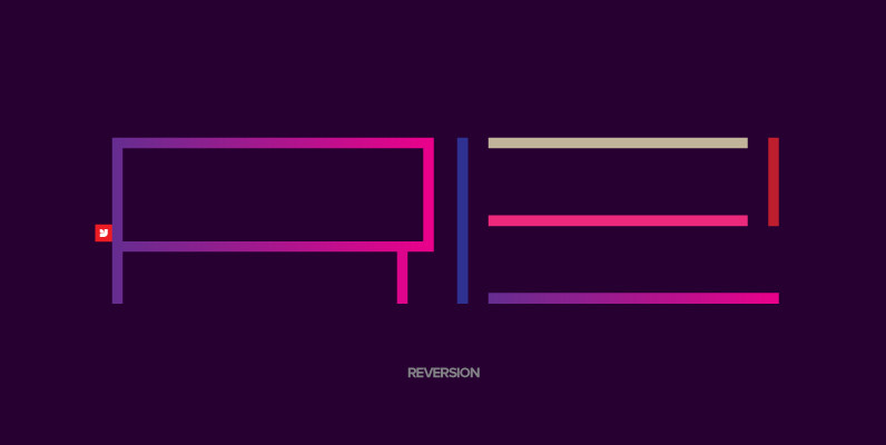
YWFT Reversion Font
YWFT Reversion is an interestingly wide and versatile display type design, perfect for a striking headline or an attention-grabbing poster or billboard. One of YWFT Reversion’s strengths is its ability to help any designer start custom lettering jobs with a
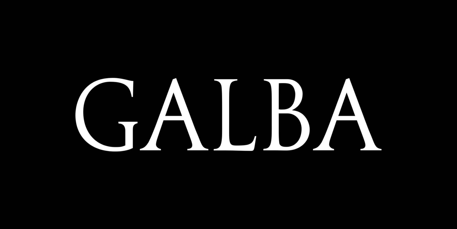
Galba Font
Galba is a font design released for the Mecanorma Type Collection. Copyright 2004 Trip Productions BV. Published by MecanormaDownload Galba
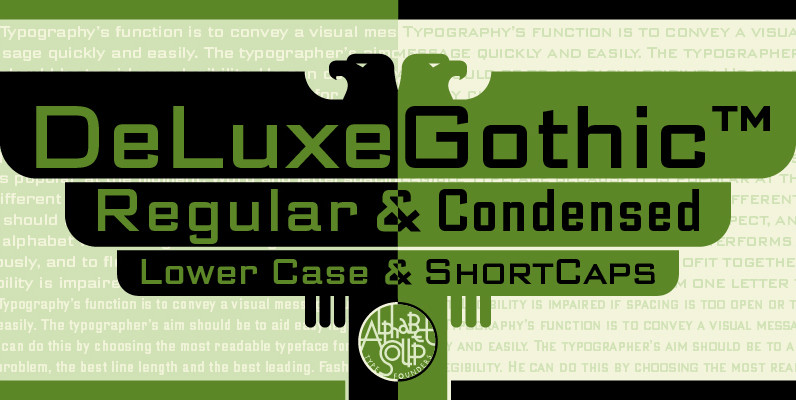
DeLuxe Gothic Font
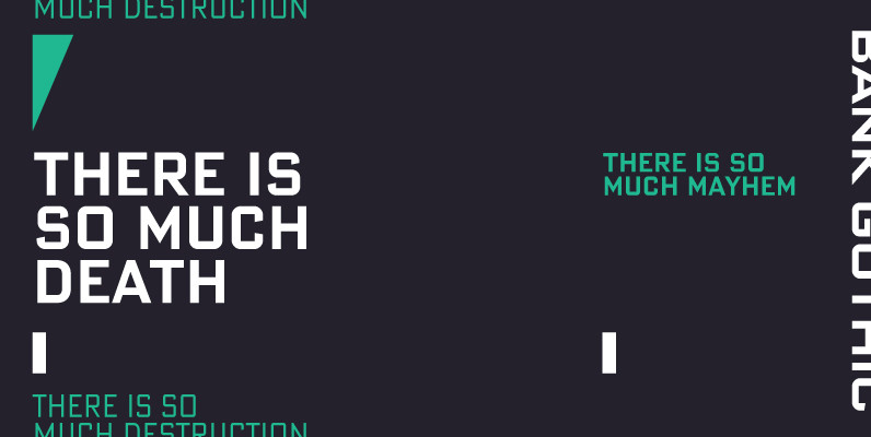
Michael Doret was always very aware of the fact that Morris Fuller Benton’s classic Bank Gothic, a longtime favorite of his, didn’t contain any lowercase characters. So he set out to remedy that by designing his all new DeLuxe Gothic,
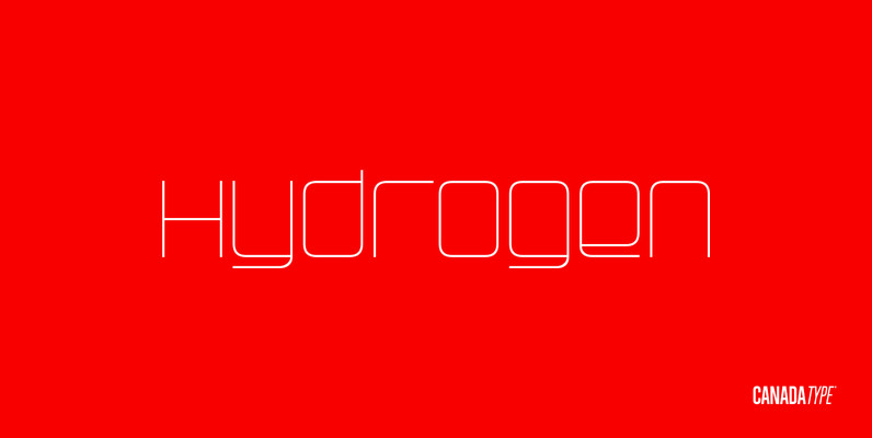
Hydrogen Font
Hydrogen is a clean geometric unicase family that expresses the mechanics, expansive technologies and conflicted ethics of the rapidly changing 21st century. Coupled with the right measure of Oxygen, Hydrogen becomes water, the ace of elements – rhythmic, dynamic, ever-flowing,
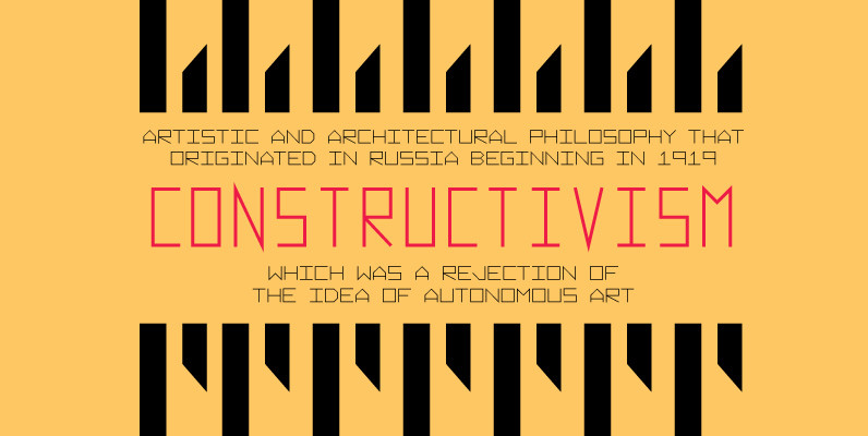
Vektori Font
Vektori family comes from those Atari games that had those distinct vector graphics with thin and precise straight lines. Contains 6 very diverse width styles, that make it easy to fit any type layout in need of some digital styling.
