Tag: woodtype
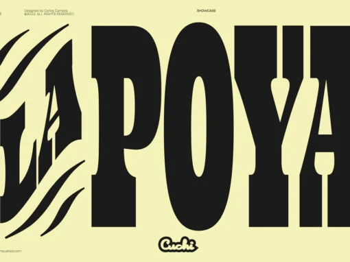
Lapoya Font
“LAPOYA” (meaning in english “the coolest”) is a large slab serif typeface family, with a certain Italian inverted contrast touch. Specially designed for advertising big shows and commerces, Lapoya has 36 variables and four axes, including a text and decorative
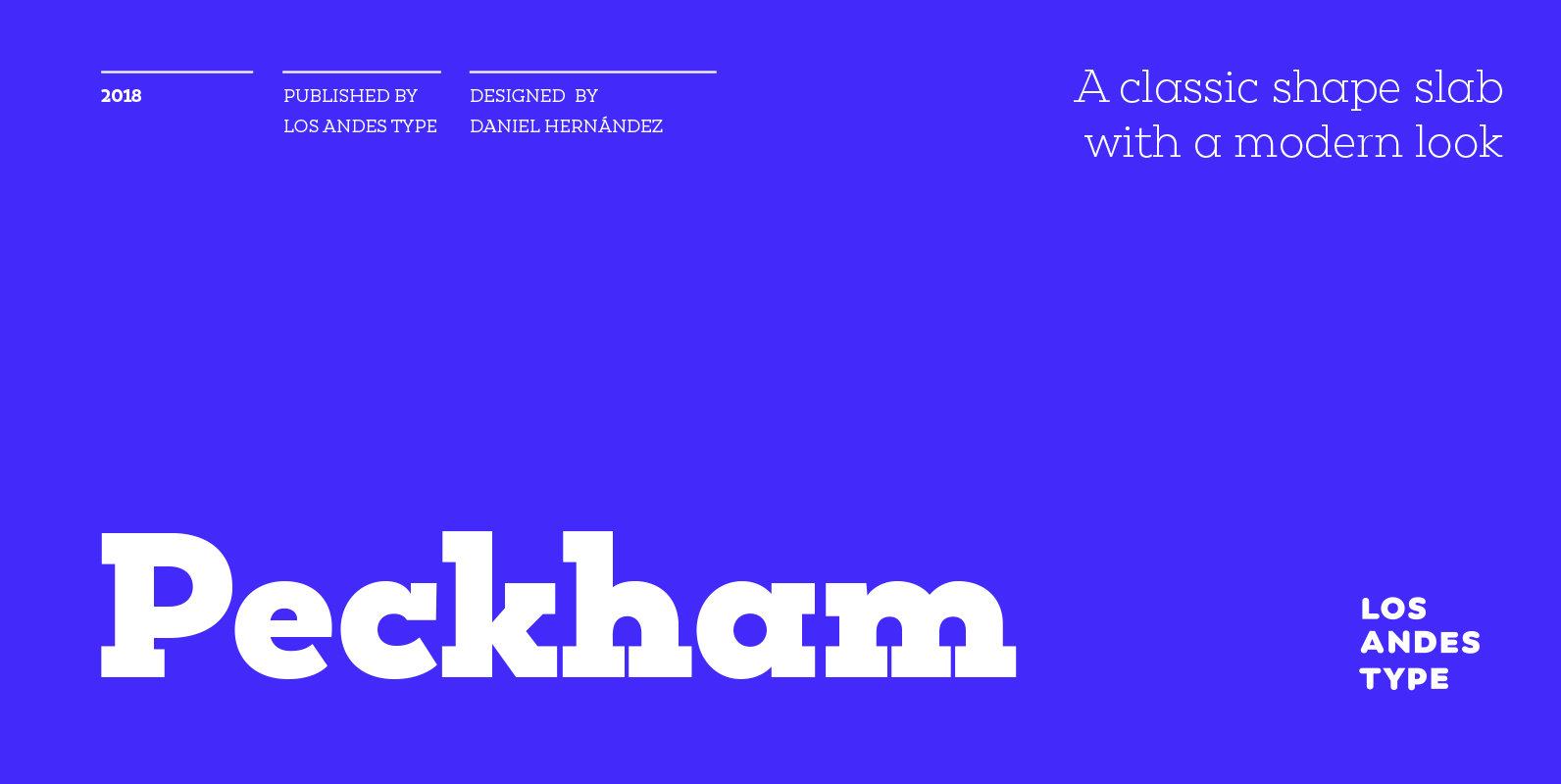
Peckham Font
Peckham, designed by Daniel Hernández, is a contemporary and versatile slab serif of 8 weights (and matching italics)—ranging from an elegant Thin to a heavy Black—with strong serifs that give it a playful look while preserving the overall geometric structure
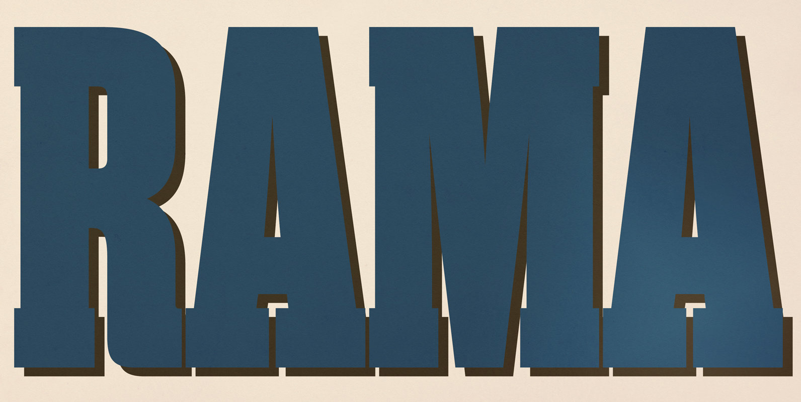
Rama Slab Font
Rama Slab is an antiqued slab serif designed inspired by 1800s-style wood type. All glyphs had been designed carefully to be retro-looking of the old time and to fill all with nostalgia. This condensed font family with 18 styles will
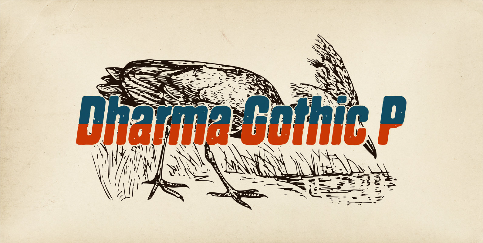
Dharma Gothic P Font
Dharma Gothic P font family is designed based on Dharma Gothic and a distressed offshoot from the original. The glyphs that damaged by printing the original had been tweaked by hand work with great care. This family contains basic Roman,
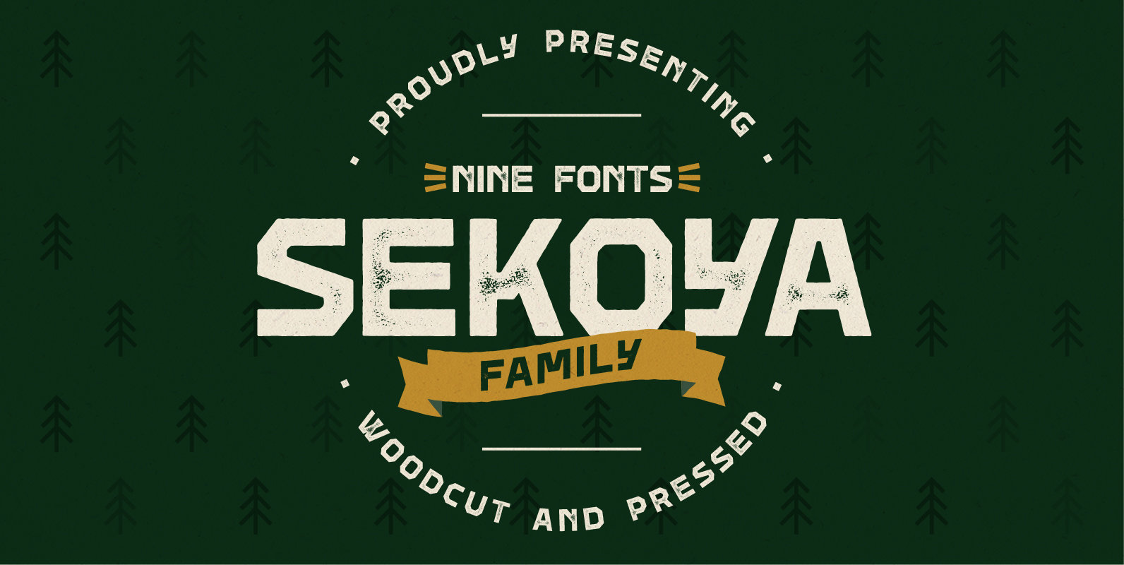
Sekoya Font
Sekoya is a font family inspired by handcrafted wood letters, wood stamps and nature. Woodcut is the clean and straight version of Sekoya. The Pressed font has a vintage stamp effect with optional texture. The family comes with light, regular
Dharma Gothic Font
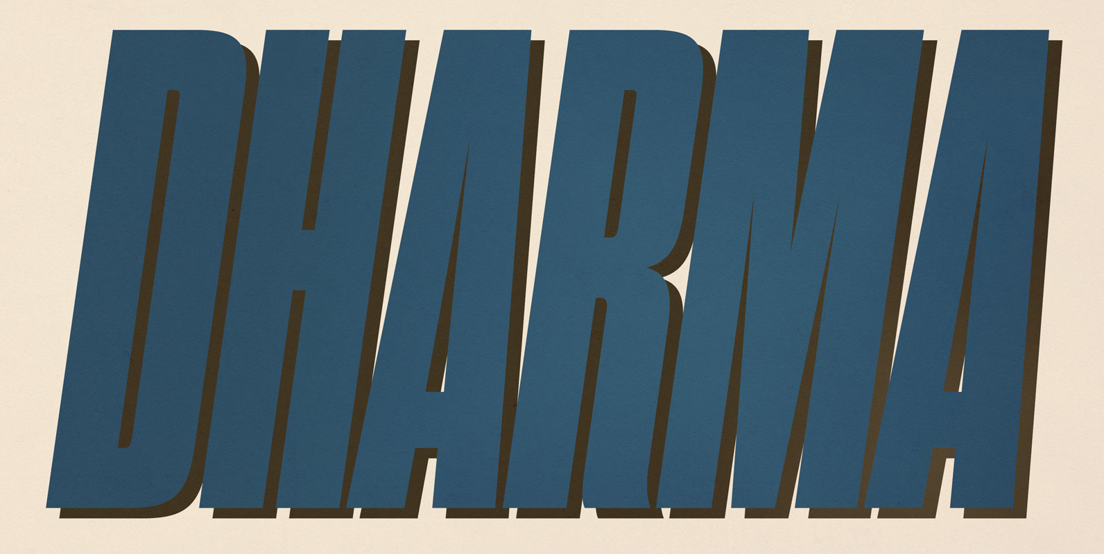
Dharma Gothic is an antiqued sans serif designed inspired by 1800s-style wood type. All glyphs had been designed carefully to be retro-looking of the old time and to fill all with nostalgia. This condensed font family with 42 styles will
Flat10 Antique Font
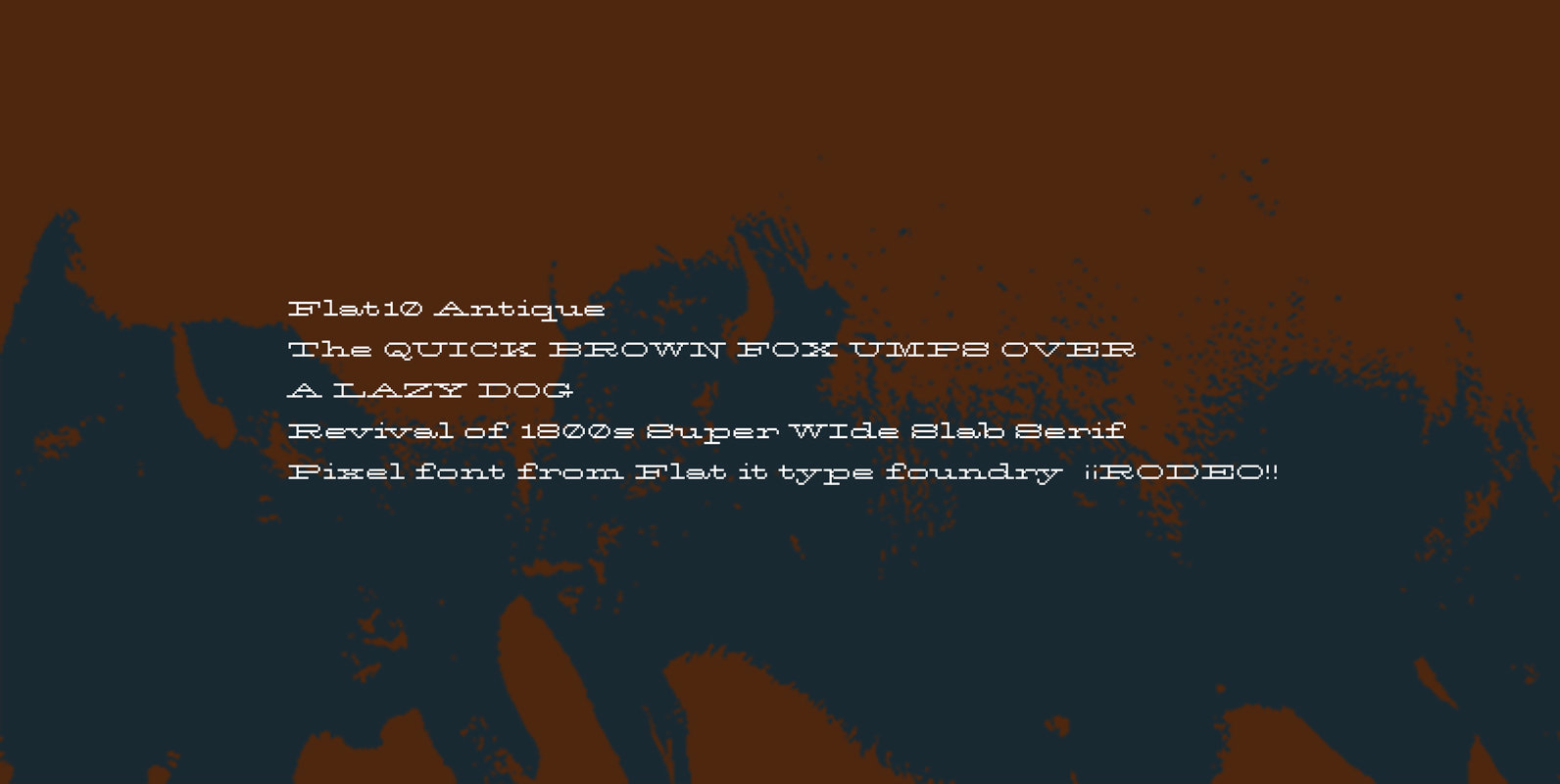
This 8-bit pixel font is designed with respect for 80s game designers and the pixel font pioneers in middle 90s. Use at size 10 pixels or multiples of 10 and anti-alias off is recommended. Published by Dharma TypeDownload Flat10 Antique
BIXA Font
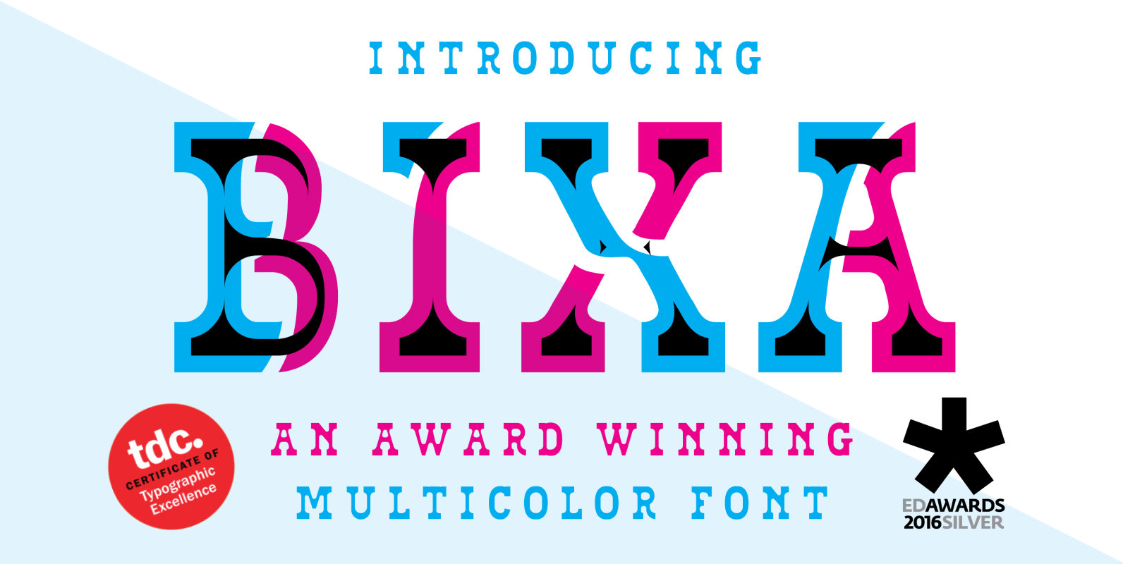
Bixa is a chromatic typeface designed for display use. Bixa comes in 13 different layers containing 11 weights for beautiful color combinations. Bixa was originally designed for the Typewood project in 2015. Read more about this project here: http://www.novotypo.nl/expo/Typewood.html In
Firebox Font
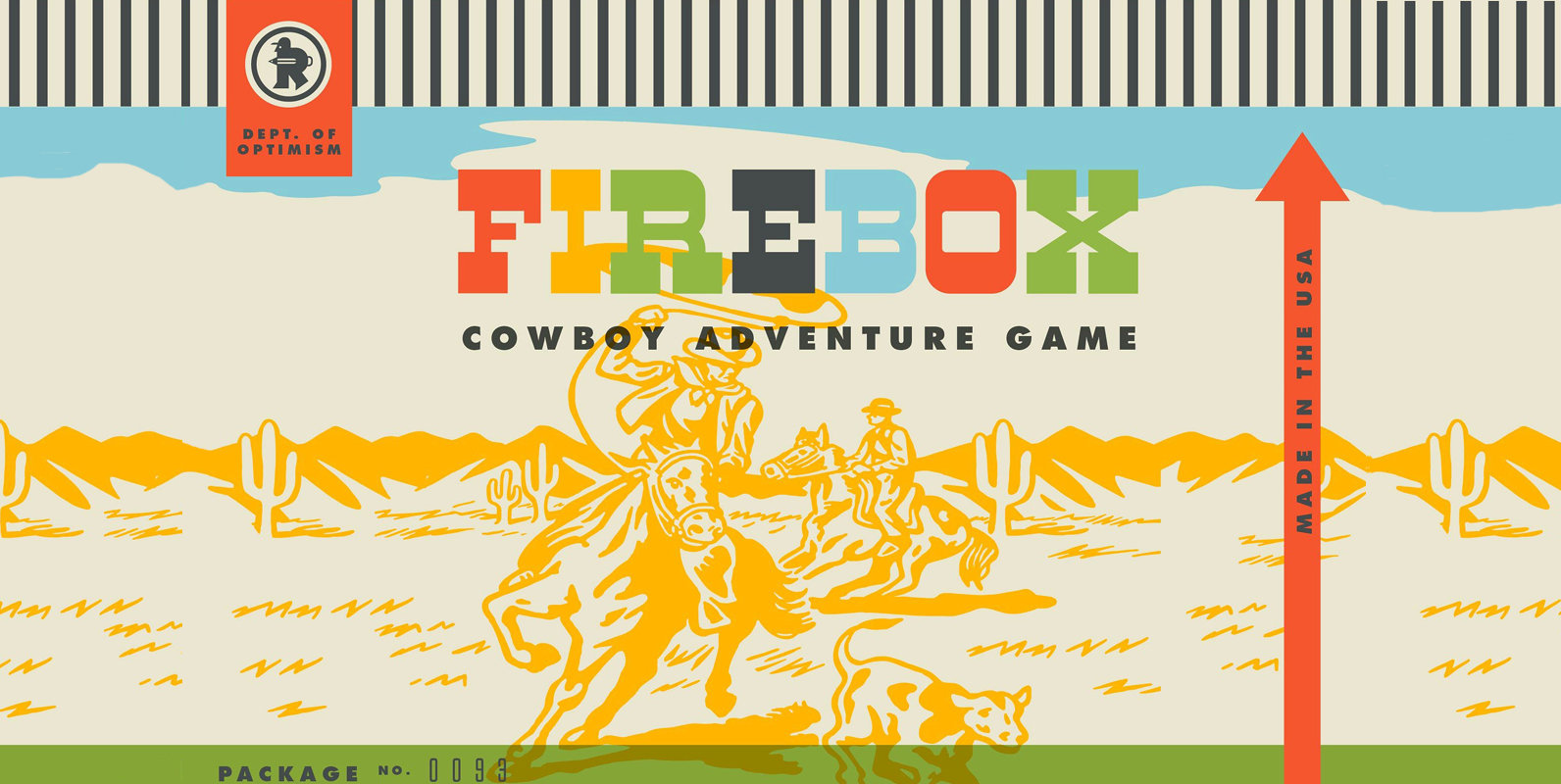
WHAT HAPPENED TO TINPLATED TOYS? In 1919, Louis Marx and Company began manufacturing eye-catching tinplated toys. Within a few years the bedrooms of American boys were filled with racecars, trains, and sports figures. Then towards the end of the 1950s
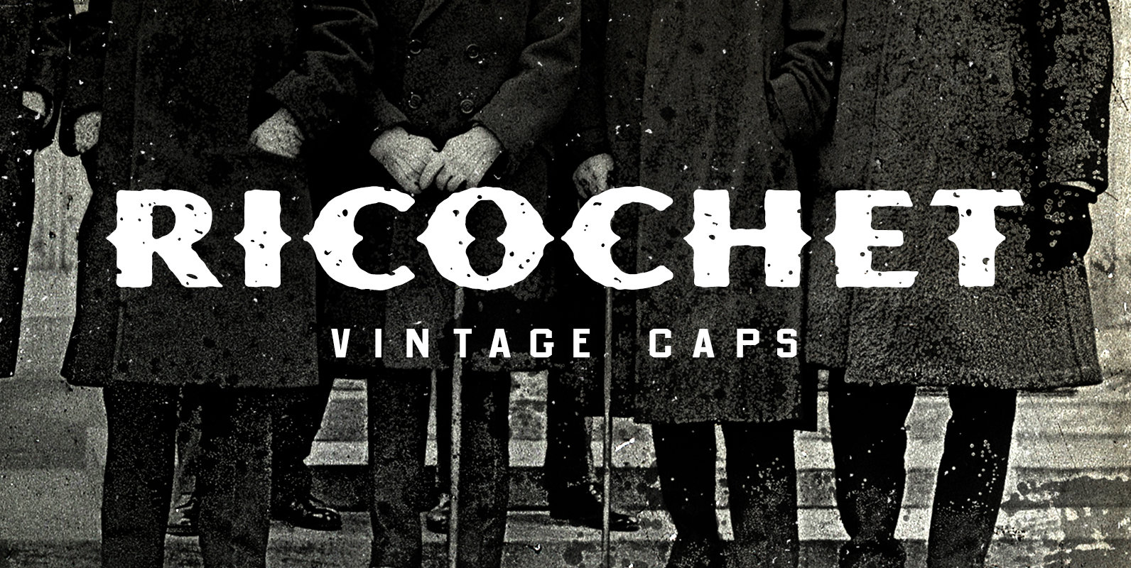
Ricochet Caps Font
Joe Carnegie lay sprawled out on the floor of Sanders’ Mercantile, a thin trail of blood trickling through the cracks of the worn floorboards. A hush filled the room, followed by a collective wince, as his clenched lungs gave one
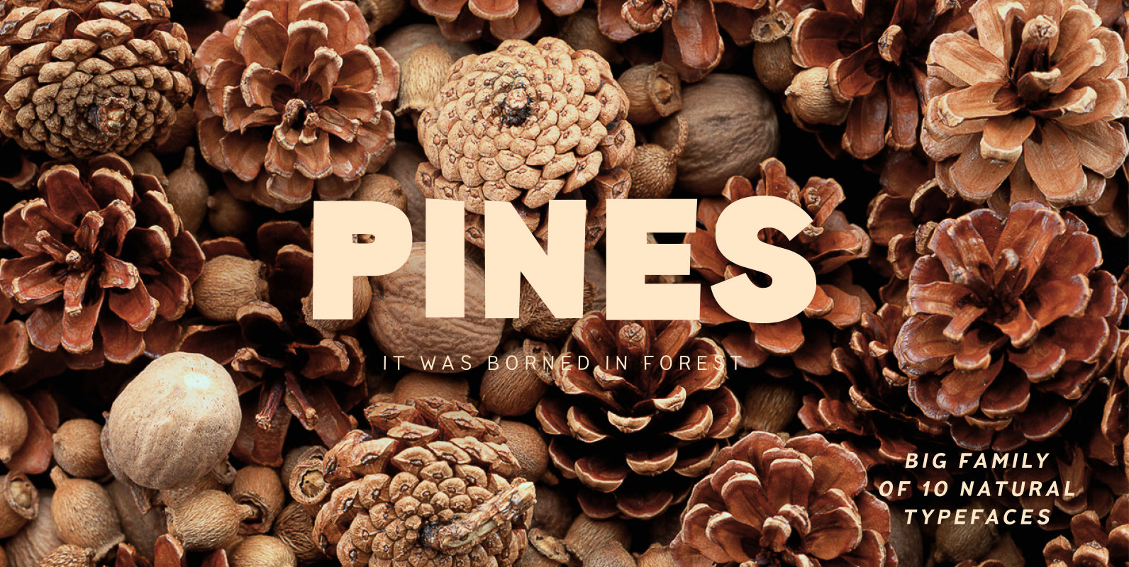
Pines Font
Imagine you’ve decided to cut letters out of paper thereby creating a modern sans-serif for a broad application range. What result would you get? We already know the answer! Pines is a font family that we’ve carefully cut out of
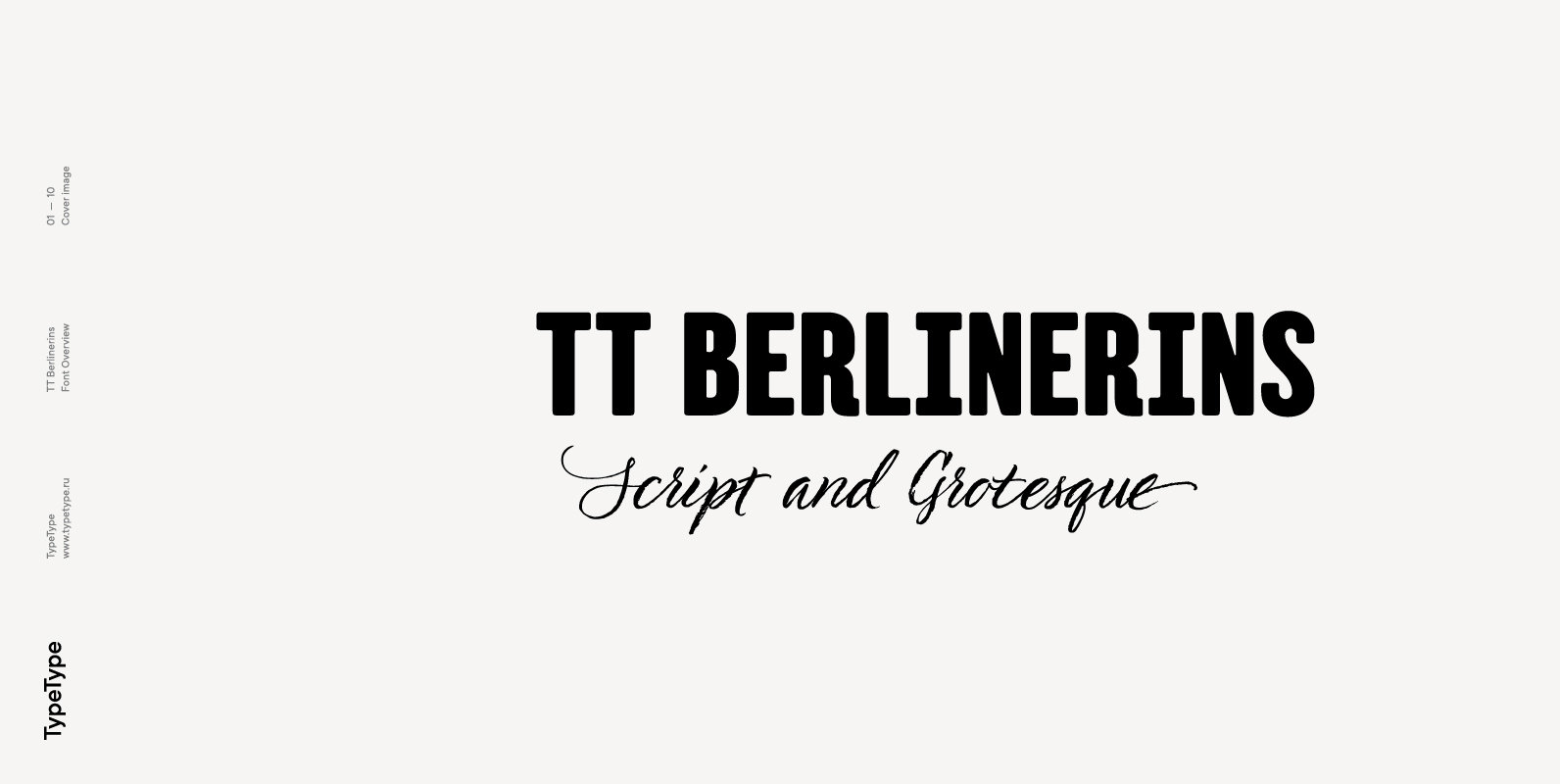
TT Berlinerins Font
TT Berlinerins is a contrast pair of typefaces which is basically our tribute to Berlin. Just like in the city itself where historicity and modernity are intertwined, the elegant script in our font family symbolizes the modern Berlin, and the
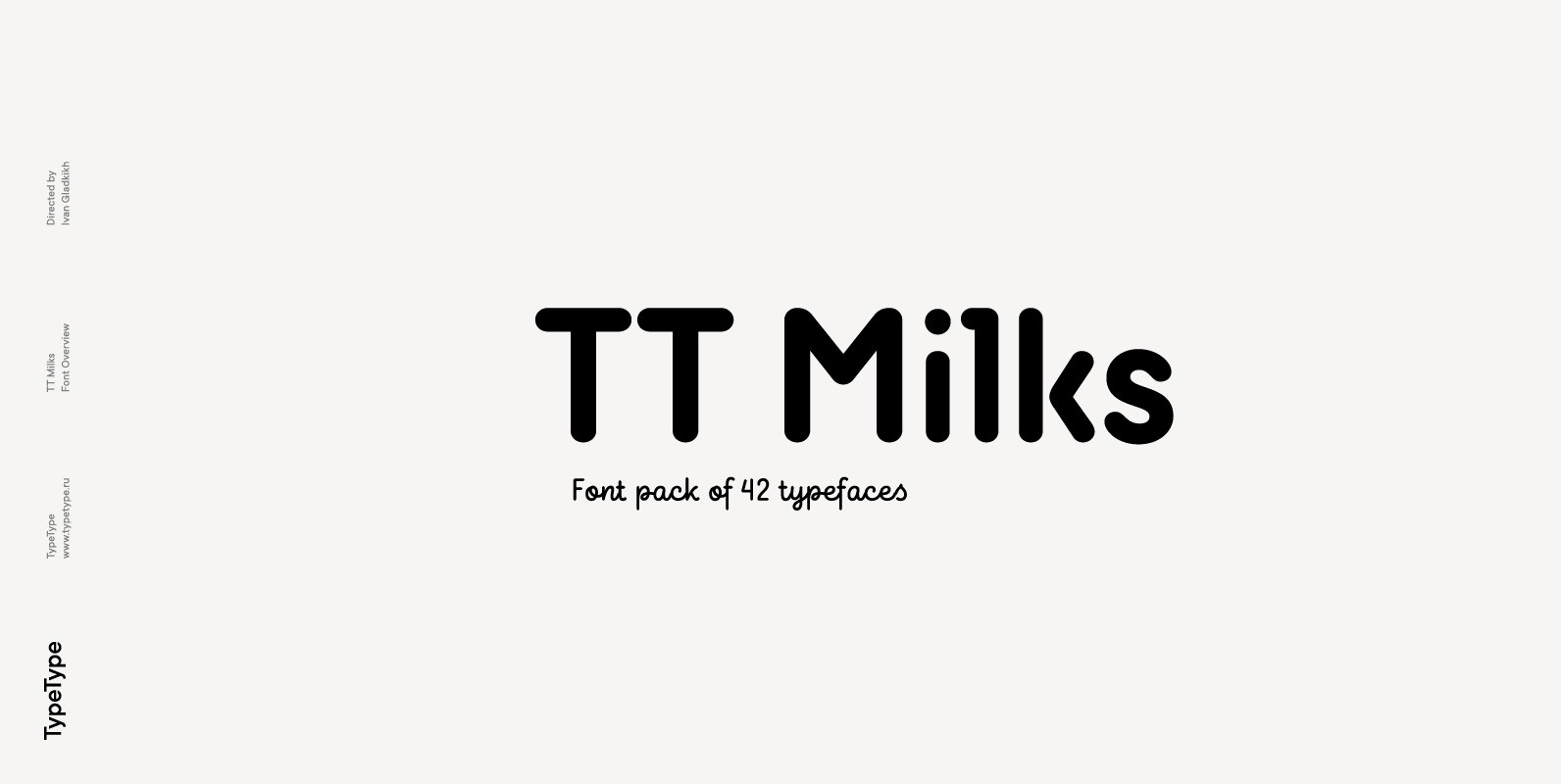
TT Milks Font
Initially the idea for TT Milks was to create a collection of typefaces to be used for packaging and branding of dairy products. We’ve started by creating a main sans-serif and a supporting script, worked on their compatibility, and created
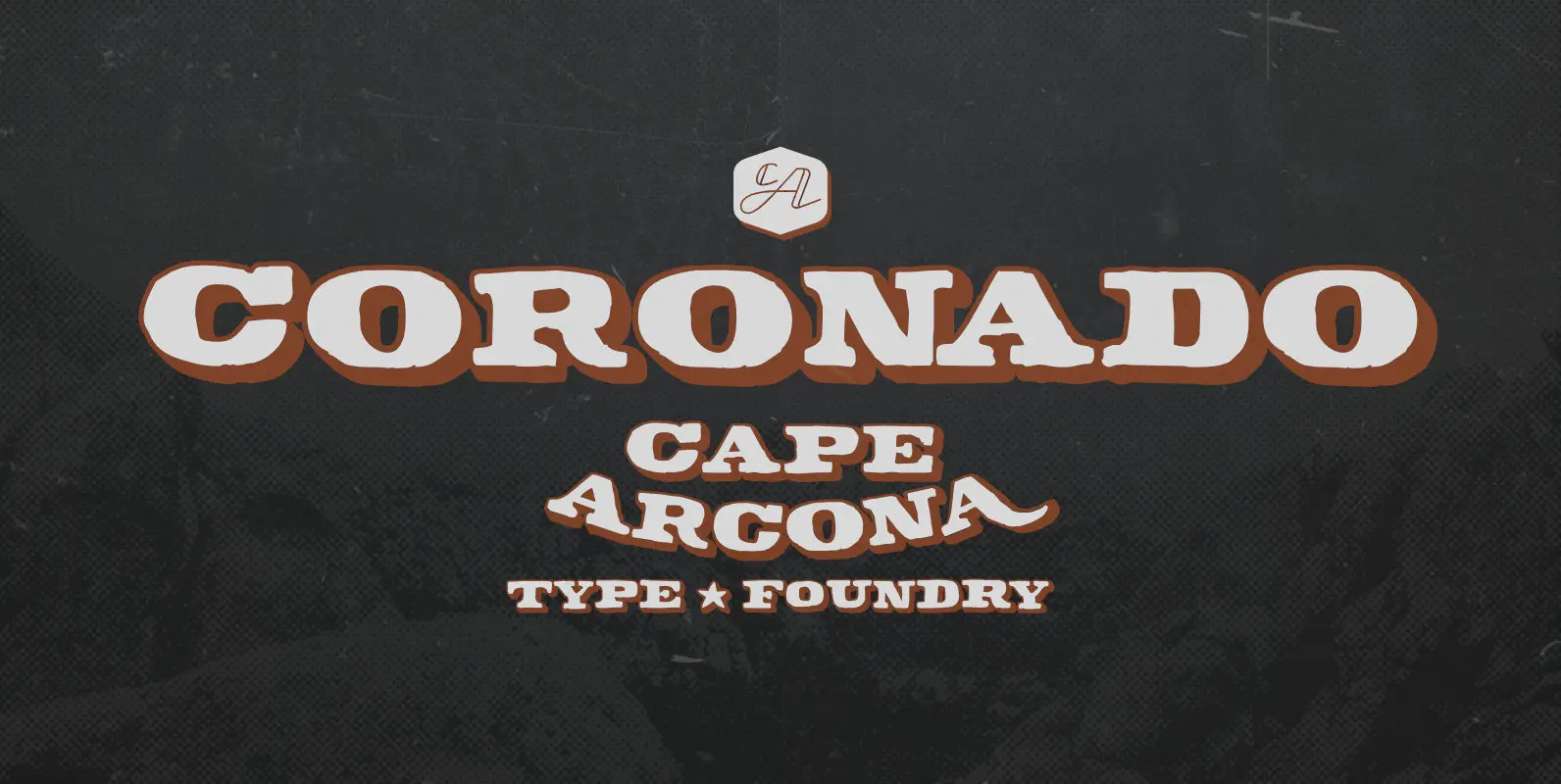
CA Coronado Font
As a display typeface CA Coronado is best for logotypes, titles and headlines. We thought about signage for wooden block houses in green forests, BBQs and western style bars. CA Coronado comes in two styles with ‘Regular’ and ‘Shadow’ style.

