Tag: workhorse

Gerlach Sans Font
As the foundry’s new flagship family, Gerlach Sans was named after the highest peak in Slovakia. Its functional design is enhanced by a few subtle ingredients, adding life and giving words a more playful voice. The family has eight weights
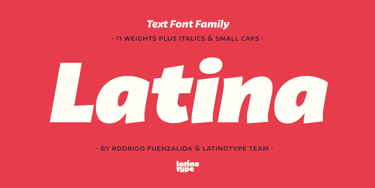
Latina Font
Latina is our first humanist typeface designed for use in continuous text. This font is based on calligraphy, but calligraphic features have been changed in order to make Latina a more neutral font. This prevents readers from losing their focus
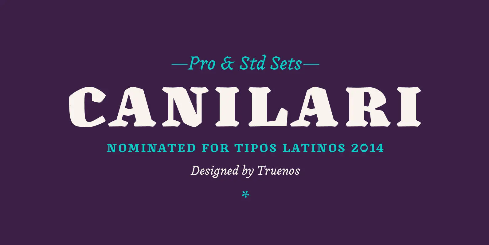
Canilari Font
Canilari is a post-modern type family inspired by contemporary serif typefaces. Its intense and consistent personality makes it a functional font for a wide range of uses: from continuous text in the most challenging environments to pithy, high-impact headlines. The
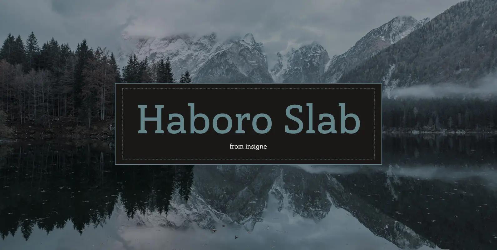
Haboro Slab Font
Haboro Slab. It’s a nose-to-the-grindstone kind of font like the first of its family. This slab serif pushes through the clutter powerfully in editorial and corporate work such as business websites and software. The Haboro hyperfamily as a whole is
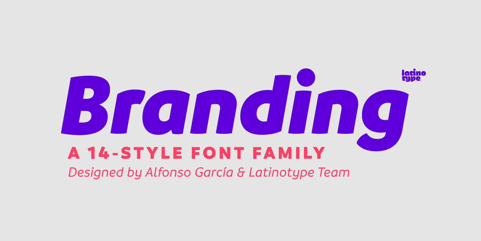
Branding Font
Branding, a modern typeface for modern needs! Branding, especially designed for meeting contemporary aesthetic and functional needs, is the interpretation of a modern typeface from the designer’s own perspective. This typeface encapsulates a wide range of nuances and combines, seemingly,
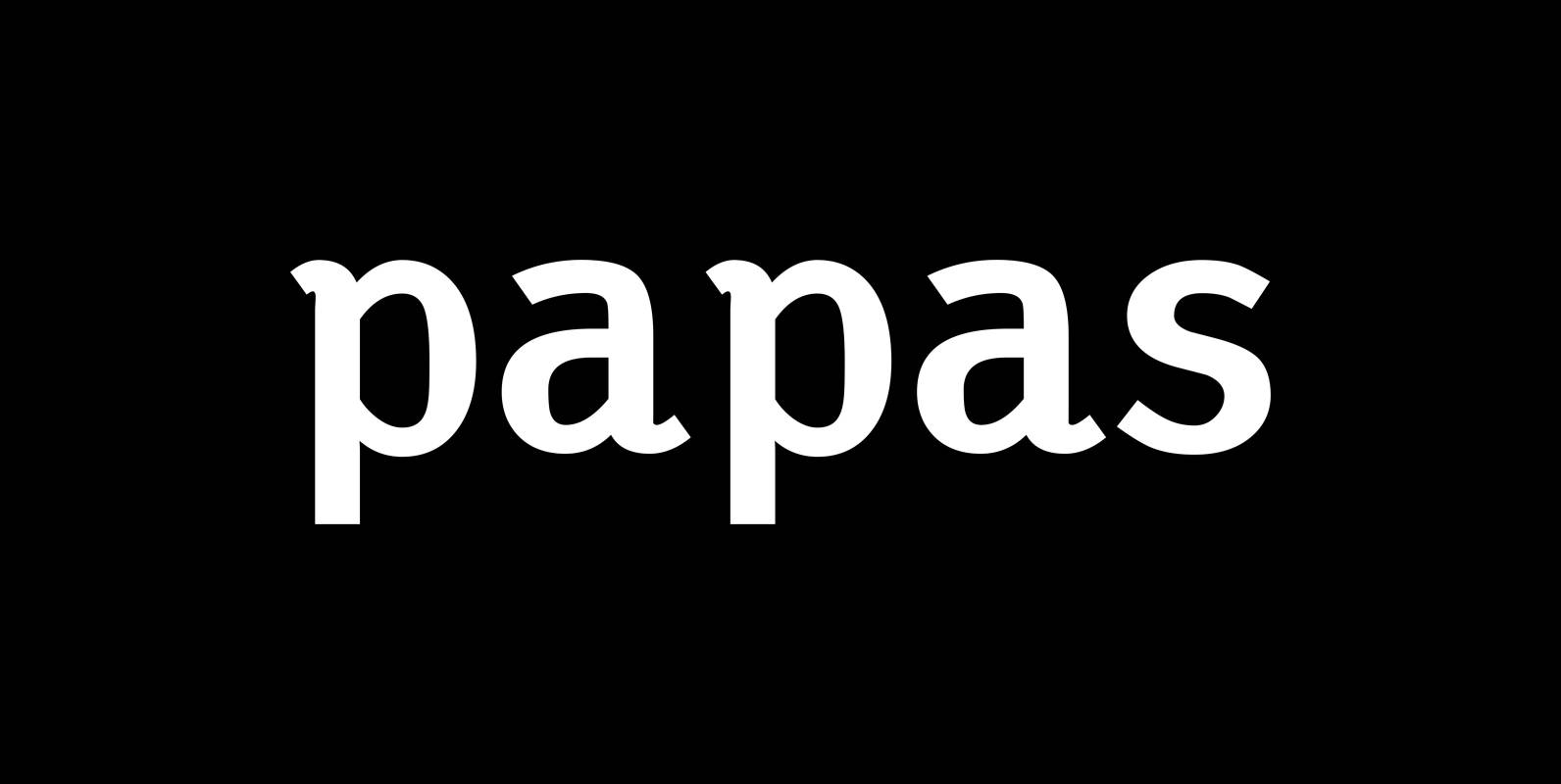
Papas Font
“Papas” is the typeface I use for my own correspondence. My two sons always used to tell each other: “You are not allowed to use this font, it is daddy’s!” And daddy in German is Papa. So this font became
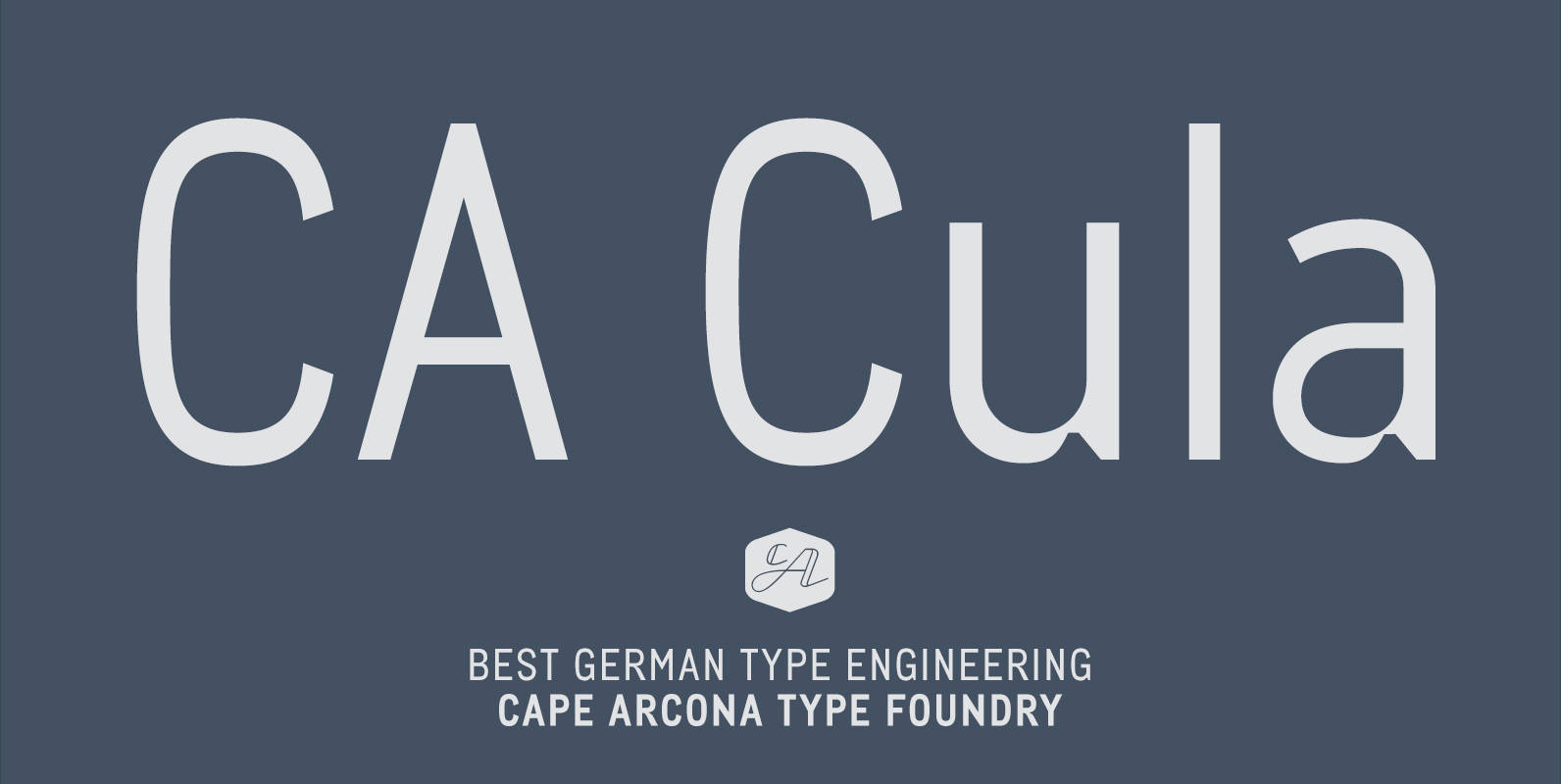
CA Cula Font
CA Cula is standing in the tradition of cool tempered sans serif typefaces like DIN. But at a closer look it reveals a tendency towards rounder reading-friendly forms. The denaturalized ink traps give CA Cula a very special and individual
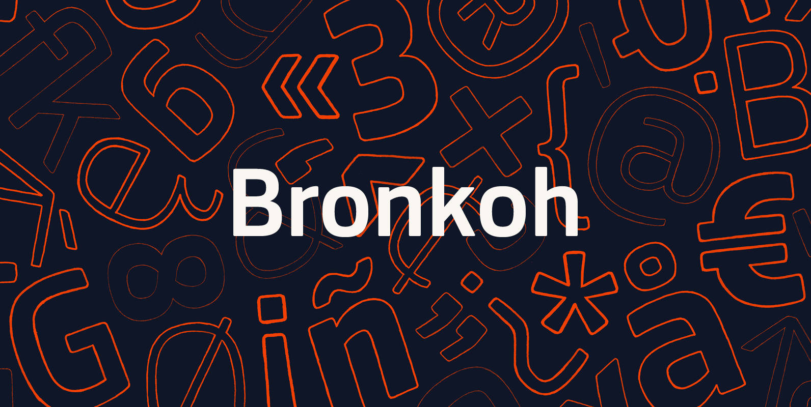
Bronkoh Font
A subtly softened sans, Bronkoh aims to give a friendly face and soft touch to type both onscreen and in print. Humanist forms and generous apertures make this a sturdy and legible face while it's softened curves and terminals give
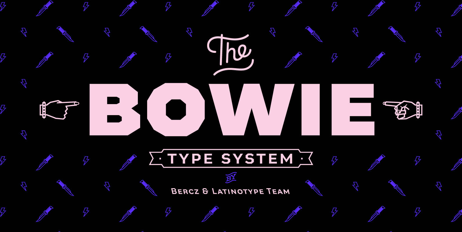
Bowie Font
The name of this typeface comes from the surname of James (Jim) Bowie, American pioneer and inventor of the famous Bowie knife. This is exactly what inspired English rock star David Jones to change his stage name to David Bowie.

Supra Condensed Font
“Supra Condensed” designed by Gert Wiescher in 2013 – is the condensed version to this new sans typeface family of eight weights with matching italics. The condensed version is designed for space-saving typography but with high legibility in mind. The
Supra Compressed Font
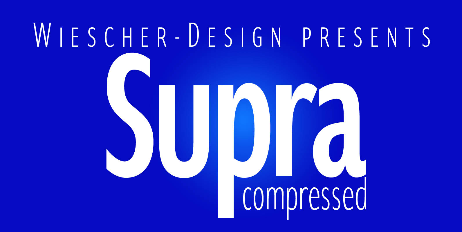
“Supra-compressed” designed by Gert Wiescher in 2013 – is the extreme version of this family. But despite it being very slim it is still – because of its openness – a very readable font. The light and normal weights and

Supra Extended Font
Supra Extended – designed by Gert Wiescher in 2013 – is the extended version to this new sans typeface family of eight weights. The extended version is designed for sheer elegance and has no italics because they didn’t look nice

Supra Font
“Supra” – designed by Gert Wiescher in 2012/13 – is a new sans typeface family of eight weights with matching italics. Supra is influenced by current and past sans typefaces, but has a completely new look. The pleasant flow and
Pensum Pro Font
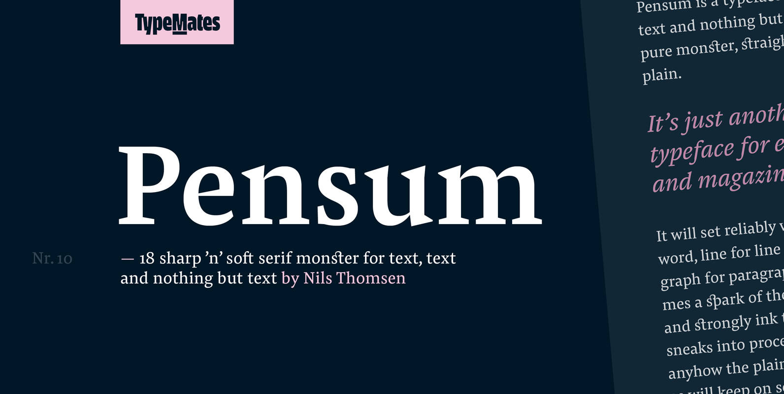
Pensum is a typeface for text, text and nothing but text. A pure monster, straight and plain, it will reliably set word after word, line after line and paragraph after paragraph. Sometimes a spark of the sexy, curvy and sharply

Grenale Slab Font
Grenale Slab adds to the new standard of elegance within the Grenale family. Not your typical slab, Grenale has some unique forms that give it a look all its own. This glamourous slab still draws much inspiration from Grenale’s Didone
Hernandez Niu Font
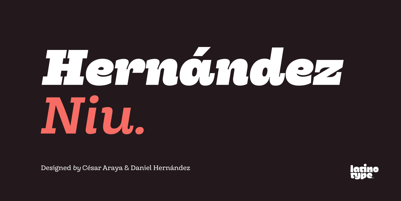
In the typedesign industry the terms ‘nova’, ‘neue’, ‘next’, ‘new’ are often used to refer to a typeface that has been modified in different ways: redesign, technical readjustments, greater number of characters, etc. At Latinotype we are now starting to
Brown Pro Font
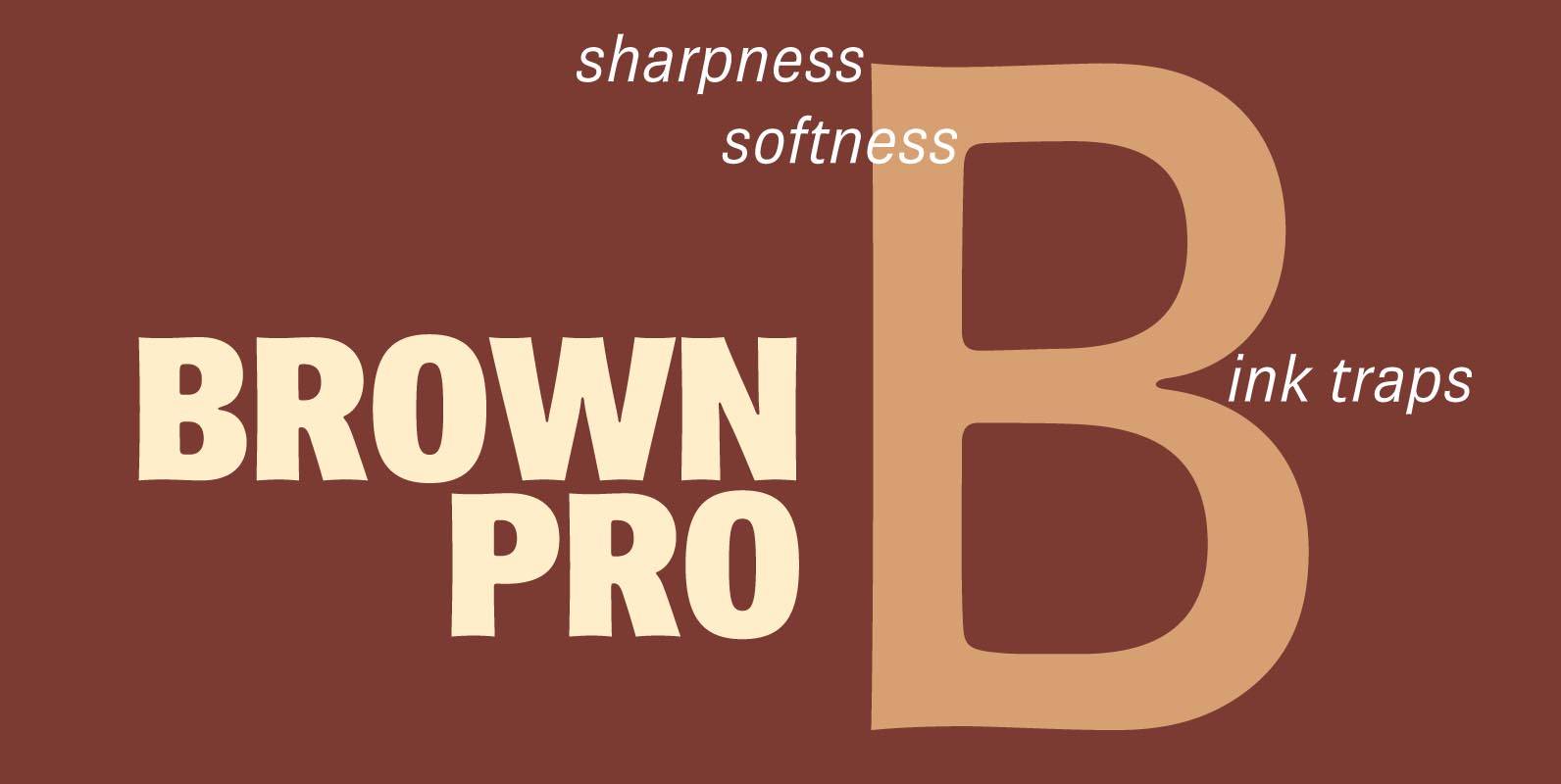
At text size, Brown is a classic grotesque, distinguished by its semi-condensed proportions (especially in the capitals, which harmonize well with the lining figures) and with an exceptional clarity in certain high-resolution media, such as offset printing, achieved by micro-detailing.
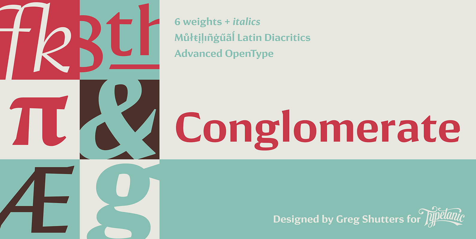
Conglomerate Font
Sans or serif? Square or rounded? Calligraphic or geometric? Conglomerate is both all and none of these things — a subtle yet unorthodox blend of typographic traits resulting in a clean, unique, and versatile font family with large, open counters