Tag: workhorse
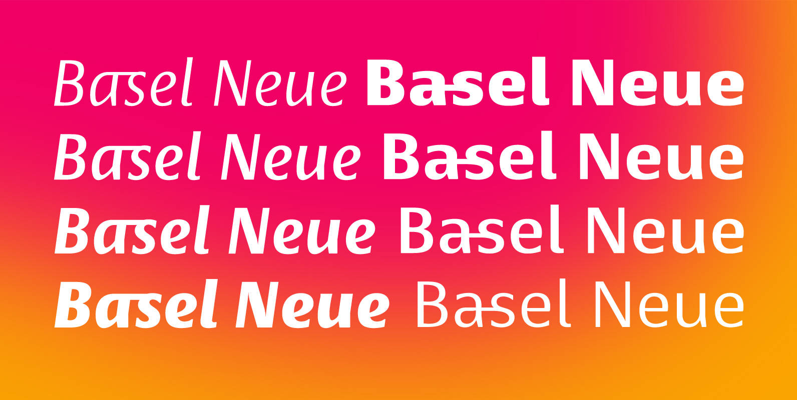
Basel Neue Font
Basel Neue is a legible and discrete typeface, a sans serif with thickness variation and humanistic touch. The family consists of 8 styles, 4 weights plus their respective italic versions. Download the “OT Features” pdf to know and take advantage
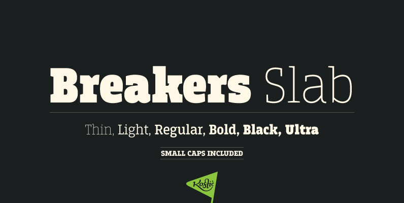
Breakers Slab Font
Breakers Slab is a companion to sans serif Breakers. It’s a versatile typeface that is strong in headlines and legible in text, with a range of distinct weights from delicate thin to chunky ultra. With small caps included and over
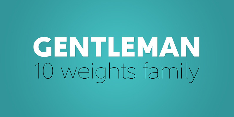
Gentleman Font
It all started with my affection for geometric typefaces. I have always liked their unevenness. Unlike modern proportions types with quite a plain appearance, geometric typefaces tend to keep some dynamism and depth. The decision was taken: my new face
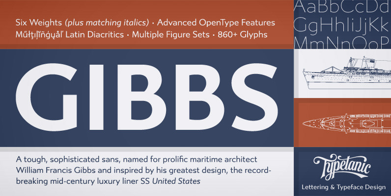
Gibbs Font
Gibbs is a tough, sophisticated sans, named for prolific maritime architect William Francis Gibbs and inspired by his greatest design, the record-breaking mid-century luxury liner SS United States. Taking various cues from the unique cast aluminum signs found on board,

Cantiga Family Font
“Cantiga” is a monophonic song or melody, sometimes repetitive, often with unpretentious themes. In the same simplicity, this font family combines robustness with some very fine details, with 44 versions for various purposes. Choose thinner (or thicker) versions for titles,
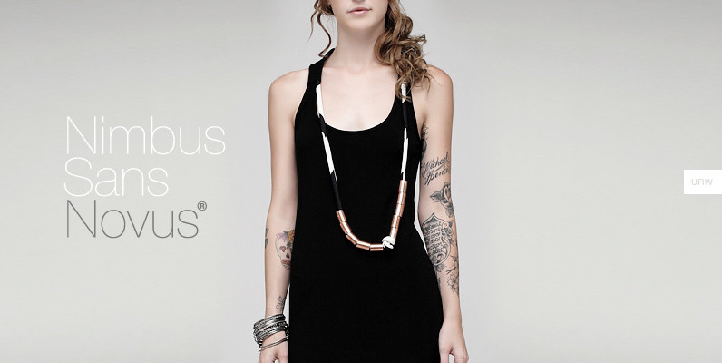
Nimbus Sans Novus Font
Break the Fontopoly. Helvetica. The boss of the 600-lb gorillas. A famous name, known in every corner of the world as the end-all, be-all of sans-serif typefaces. It even has its own feature film. But, what if everything you assumed
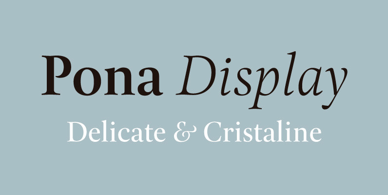
Pona Display Font
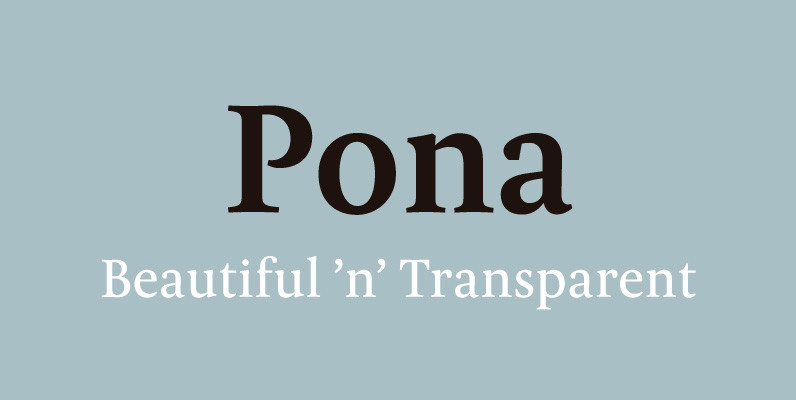
The Pona family of lush curves is completed with the Display version in which letters shine with splendor. Pona Display is an elegant typeface with stunning bodies of remarkable contrast and sophisticated forms. Published by Tipografies Download Pona Display
Aaux Next Cond Pack B Font
When the original Aaux was introduced in 2002, I intended to go back and expand the family to offer more versatility. Years went by before I was willing to pick it up again and invest the proper time into building
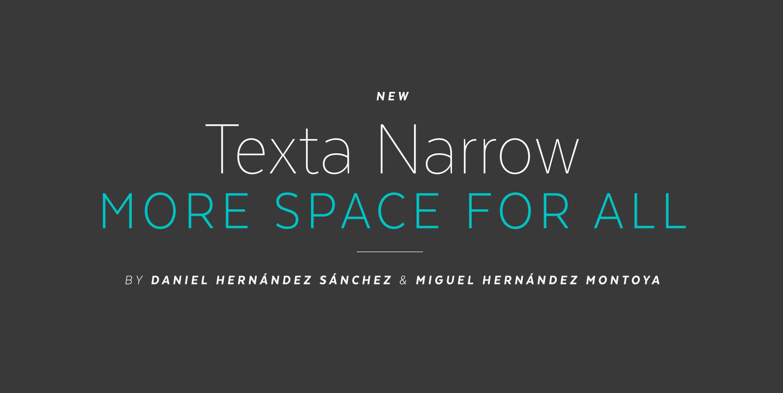
Texta Narrow Font
Texta Narrow. More space for all. Through studying humanists’ models from Edward Johnston to Adrian Frutiger and the Gothic Alphabet made by sign painters comes Texta Narrow, a contemporary, rational, transparent and useful Sans to compose all kind of texts.
Akagi Pro Font
Akagi Pro is a complete rebuild and expansion of my popular Akagi typeface. Contemporary, clean, simple and friendly continue to serve as the adjectives for an expansion that includes 250 additional characters per weight, many new ligature options, expanded stylistic
Armitaged Font
Sturdy and humane, Armitage renders type with vintage American warmth. Even with a subtle sparkle, Armitage stays humble to let words work. Rather than build on recent trends, Armitage starts over, derived from designs of the late nineteenth century. Designer
