Tag: workhorse
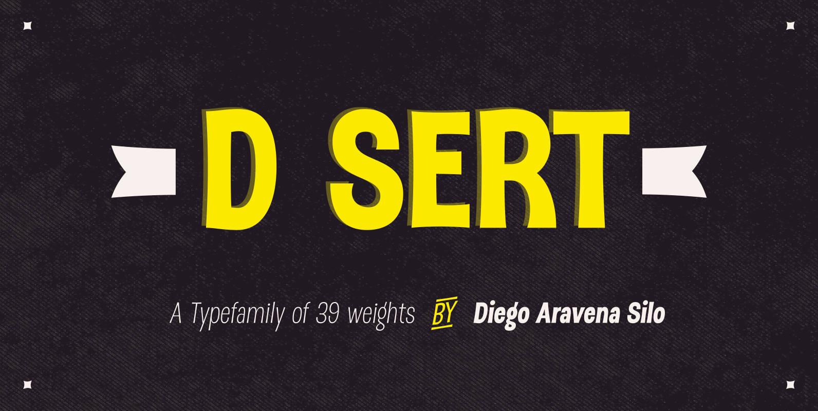
DSert Font
D Sert—based on the Pirata typeface—is inspired by 70s Chilean constructivist design and the political propaganda posters artwork of La Unidad Popular (Chilean political coalition). D Sert is the result of the combination of the Chilean graphic art revival with
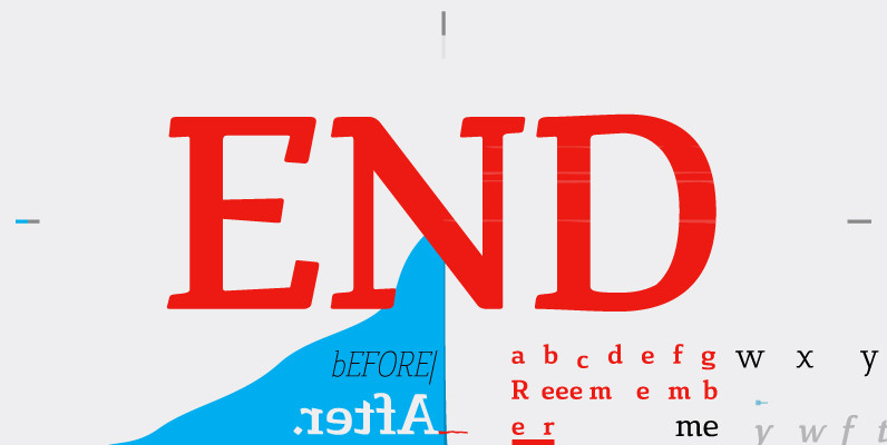
Cavole Slab Font
Cavole Slab is a new slab serif, designed in early 2011, that has a strong influence from Dutch typography. The name is an altered form of the Portuguese word for feather, emphasizing the typefaceís soft and friendly character. Slab serifs
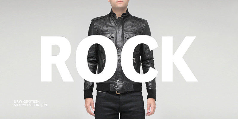
URW Grotesk Font
URW Grotesk was designed exclusively for URW by Prof. Hermann Zapf in 1985. At the same time, Zapf designed URW Antiqua to go with URW Grotesk. At that time, we were working with a large German publishing house (Axel Springer)
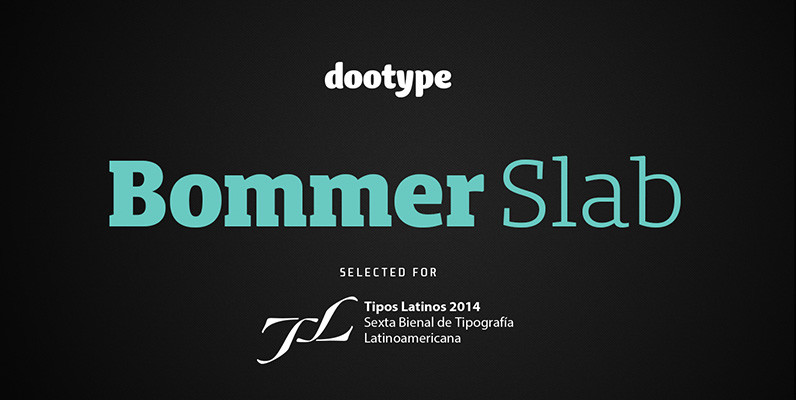
Bommer Slab Font
Bommer project started in January of 2014 and I am happy to announce the first family – Bommer Slab – is now ready for release. This family includes 14 weights – been seven uprights and seven italics. This font has
Corporate E Font
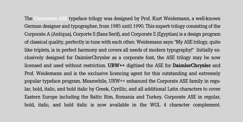
The Corporate ASE typeface trilogy was designed by Prof. Kurt Weidemann, a well-known German designer and typographer, from 1985 until 1990. This superb trilogy consisting of the Corporate A (Antiqua), Corporte S (Sans Serif), and Corporate E (Egyptian) is a
Verb Complete Series Font
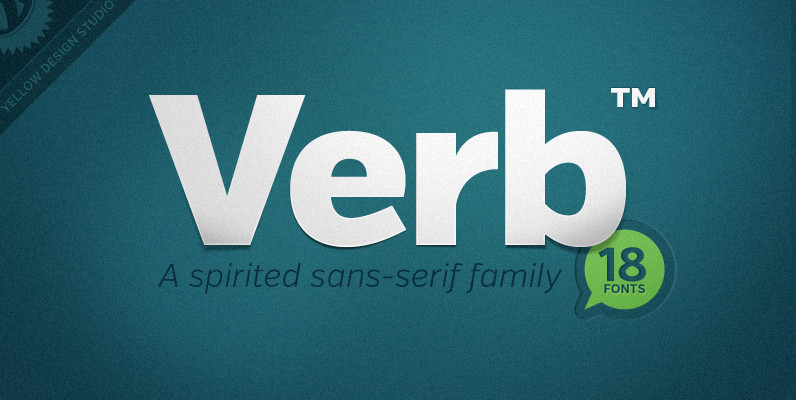
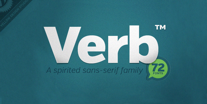
Verb from Yellow Design Studio is a 72-font sans-serif superfamily that’s confident, friendly and energetic. At text sizes it’s highly legible, while at larger sizes it reveals lively shapes and personality. It has four subfamilies including Regular, Condensed, Extra Condensed,
Sommet Slab Font
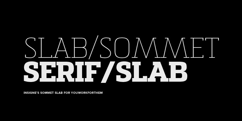
The Sommet family of typefaces has been updated with a new slab serif variant. Expanding on Sommet’s successful design principals, Sommet Slab is there when you need more impact and power. Sommet Slab is available with six weights and complementary
Recta Font
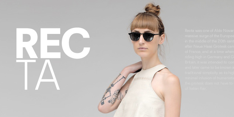
Recta was one of Aldo Novarese’s earliest contributions to the massive surge of the European sans serif genre that was booming in the middle of the 20th century. Initially published just one year after Neue Haas Grotesk came out of
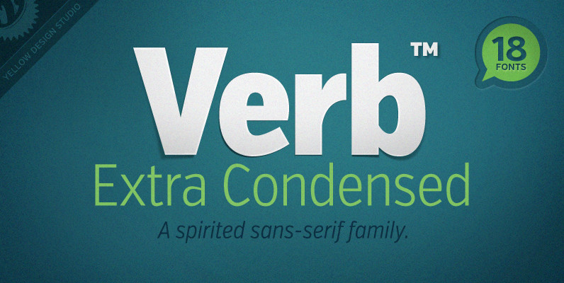
Verb Extra Condensed Font
Like the original Verb family, Verb Extra Condensed from Yellow Design Studio is confident, friendly and energetic, but has been carefully re-drawn with space saving proportions. At text sizes it’s legible and economic, while at larger sizes it reveals lively
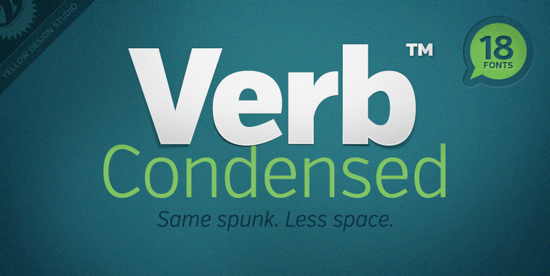
Verb Condensed Font
Verb Condensed from Yellow Design Studio is a modestly condensed version of the original Verb family, taking on more classic sans-serif proportions. It shares the same confidence, energy, and friendliness. At smaller sizes Verb Condensed is open and legible, and
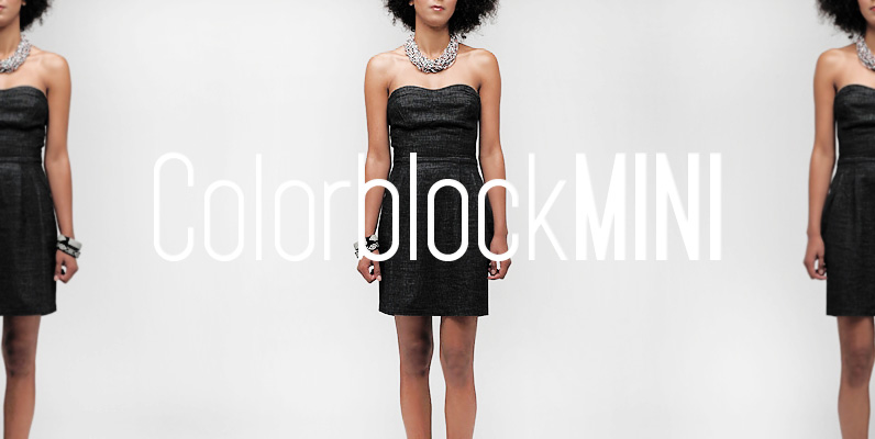
YWFT Pakt Font
YWFT Pakt is a condensed, sans-serif typeface consisting of ten different weights. While the design of YWFT Pakt is conservative, serious and authoritative, it still manages to maintain that fresh feeling that more venerable names just don’t have. Great attention

Libertad Font
Design can do without images, but not without typefaces. Libertad is a sans-serif typeface that mixes humanist and grotesk models – It’s most interesting feature is the combination of balanced regulars with dynamic italics, which makes it a very versatile
Aaux Next Wide Pack B Font
When the original Aaux was introduced in 2002, I intended to go back and expand the family to offer more versatility. Years went by before I was willing to pick it up again and invest the proper time into building

Corporate A Font
The Corporate ASE typeface trilogy was designed by Prof. Kurt Weidemann, a well-known German designer and typographer, from 1985 until 1990. This superb trilogy consisting of the Corporate A (Antiqua), Corporte S (Sans Serif), and Corporate E (Egyptian) is a
