Tag: x-height
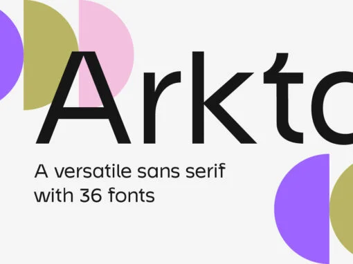
Arkta Font
In a world constantly driven by the digital wave, the craft of typography finds itself dancing on a tightrope, navigating the impassive divide between functionality and artistic flair. An instance of this delicate harmony, a contemporary embodiment of this dialectical
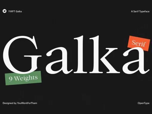
YWFT Galka Font
As we delve into the world of digital design, the name of the game is versatility coupled with aesthetic appeal—a perfect descriptor for YWFT Galka, a modern serif font that continues to impress the design community. This digital innovation, exclusively

Miguer Sans Font
Inscribed within the annals of typographical delightful discoveries is the marvel that is Miguer Sans. This exquisitely crafted, high-contrast modern sans-serif typeface with its unique aesthetic imbues any design undertaking with a distinctive touch of class and sophistication. A notable
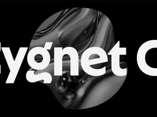
Cygnet CF Font
Cygnet CF charms with classic warmth and curious verve. An absurdly generous x-height makes this surprisingly readable and versatile display typeface perfect for headlines, captions, logos, and more. Nine weights plus italics grant a wide range of applications and moods,
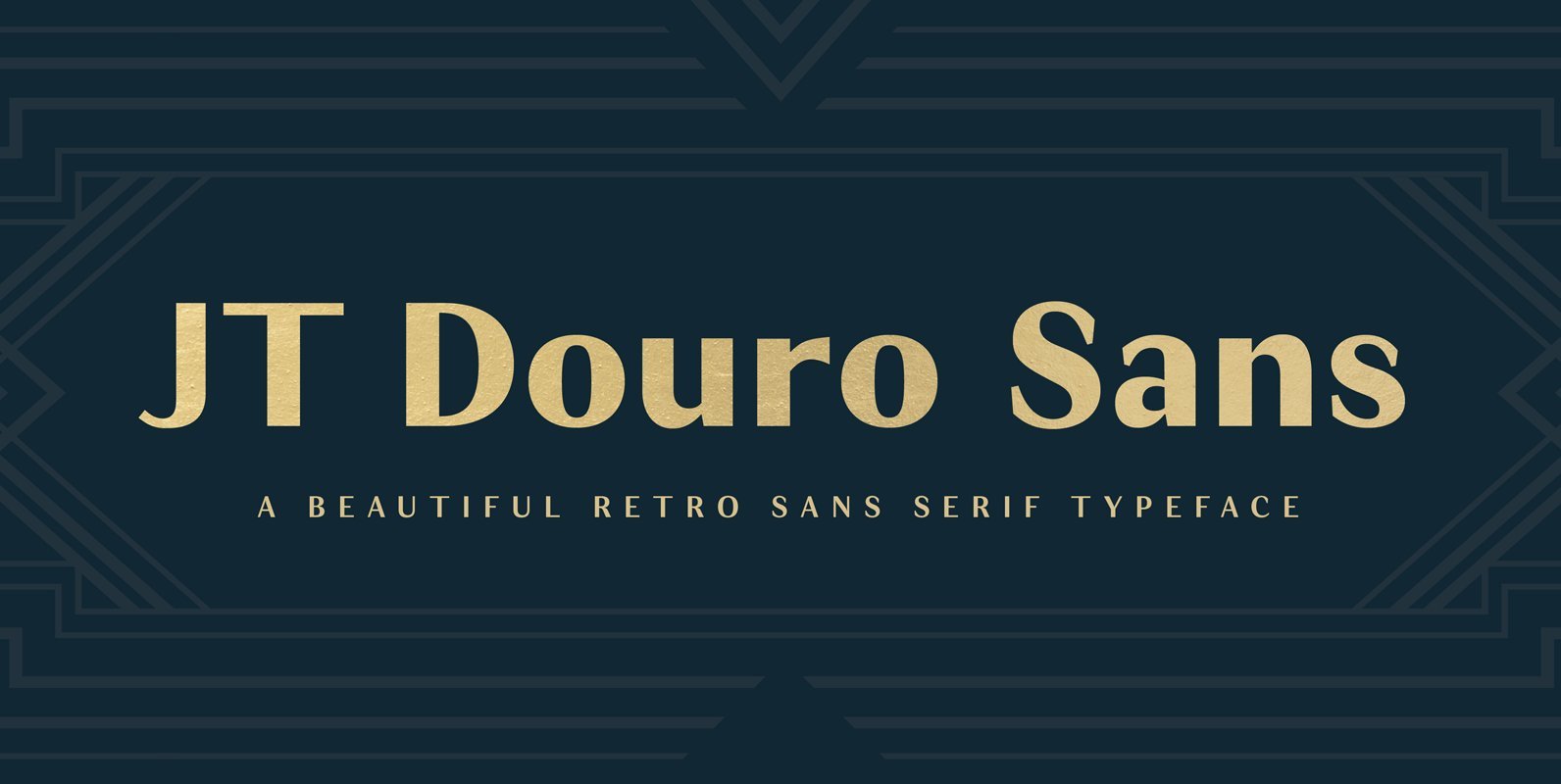
JT Douro Sans Font
Inspired by the art deco movement in France at the turn of the last century and in United States in the 1930s. Boasting over 500 glyphs, with its multiple ligature sets and alternatives, this is a wonderful typeface to use

JT Marnie Font
The design is influenced by the geometric style sans serif faces which were popular during the 1920s and 30s. The JT Marnie font family is well suited for headlines and small blocks of text, particularly in advertising and packaging. Published
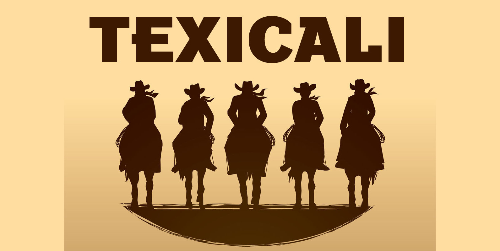
Texicali Font
Texicali is a new multiple weight type design based on our FontMesa logo, the idea was simple, create a sans serif with a few slab serifs added resulting in a style that could feel at home just about anywhere. The
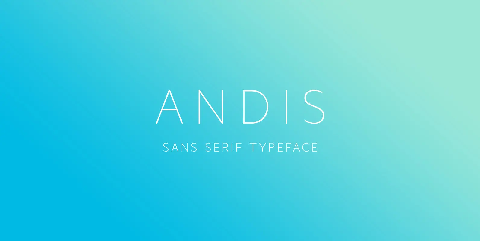
Andis Font
Andis’ rough cut makes it an interesting display typeface, but thanks to its generous x-height and firm serifs, Andis works equally well in text sizes. The typeface’s idiosyncratic italic builds a strong contrast with the roman. Andis is both functional
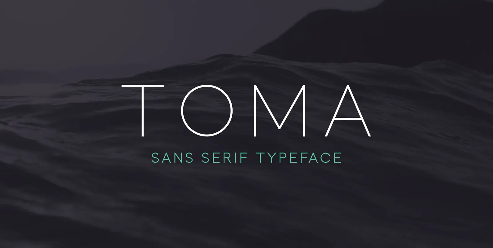
Toma Sans Font
Toma Sans is a sans serif type family of seven weights plus matching italics. Influenced by the geometric-style sans serif faces that were popular during the 1920s and 30s, the fonts are based on geometric forms that have been optically
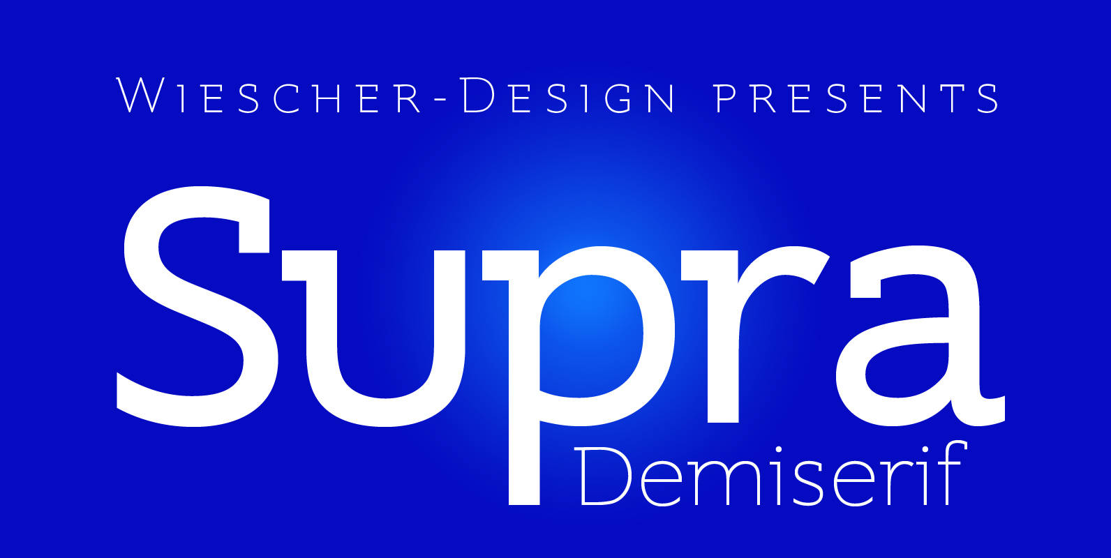
Supra Demiserif Font
“Supra Demiserif” is the demi serif addition to the Supra family. I am no fan of slab serif fonts, so I designed this one with half serifs, that makes the serifs less important. Then I found, that the italic does
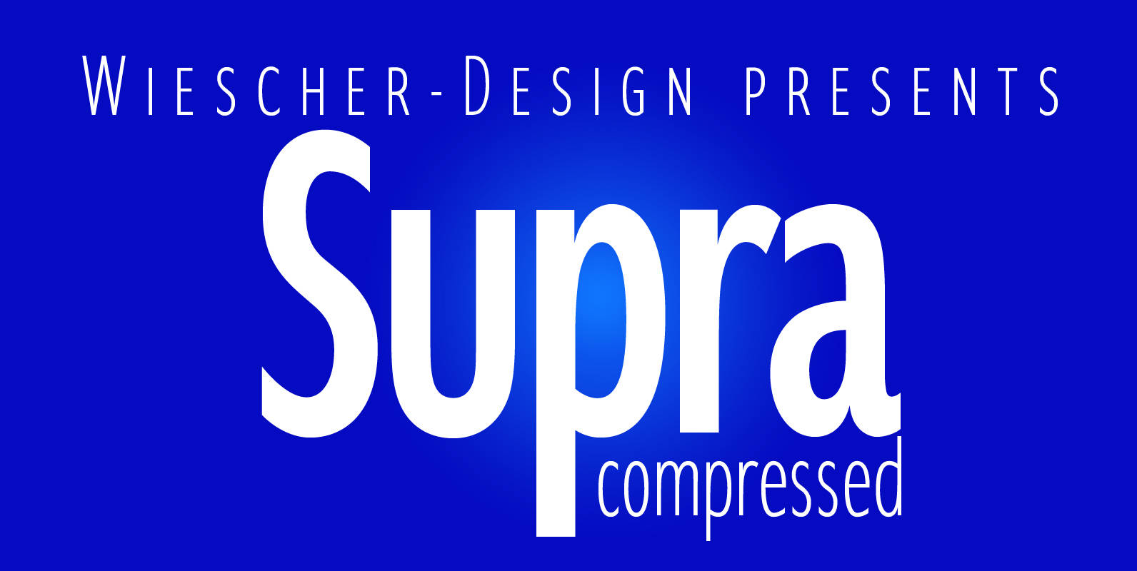
Supra Compressed Font
“Supra-compressed” designed by Gert Wiescher in 2013 – is the extreme version of this family. But despite it being very slim it is still – because of its openness – a very readable font. The light and normal weights and