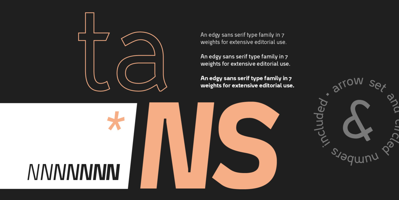
Tans originated in the idea of creating a modern, clear sans-serif with a friendly flair. The design then drove into a more heavy and edgy direction for the bolder weights.
Tans is used best in small to medium sizes, in body copy or bold captions — it's 7 weights allow for great contrast and clear hierarchies. The extensive OpenType LatinPro character set allows multilingual type setting and the various OpenType features along with the set of arrows and circled numbers are suited perfectly for editorial use. Two stylistic sets let you switch between alternate characters and easily access special glyphs.


