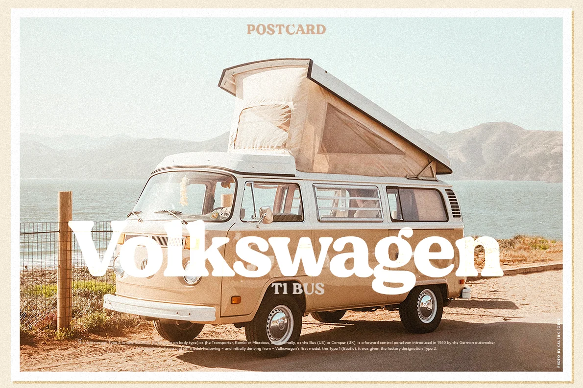
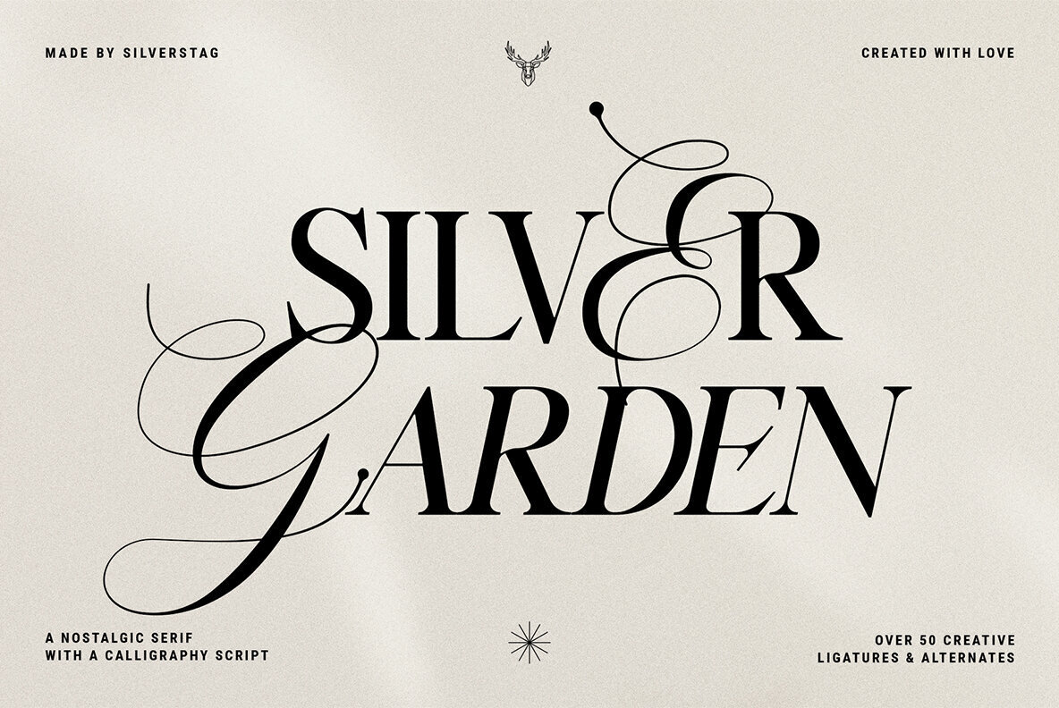
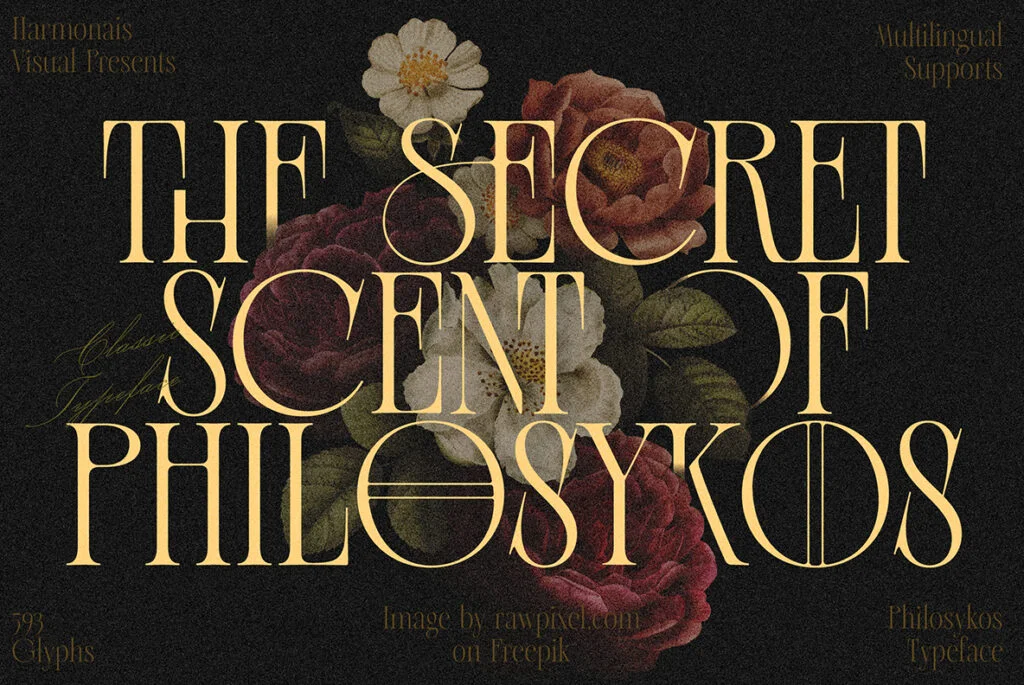
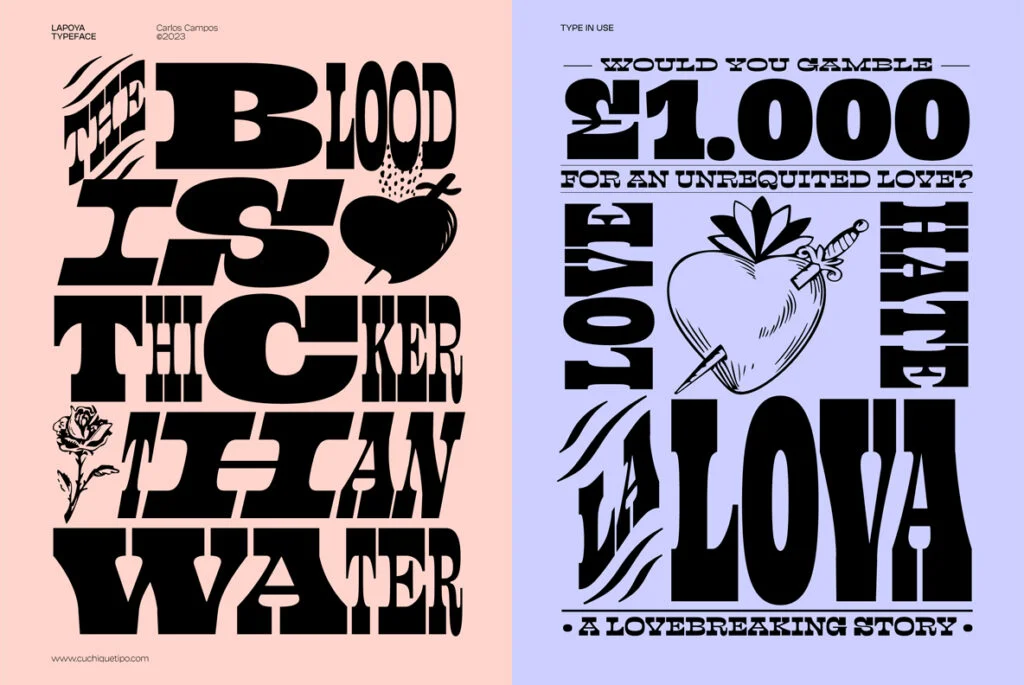
In the vast expanse of font taxonomy, one name stands out with a particular resonance for the aesthetically astute graphic designer: the Serif font. An articulate hybrid of the classical and the contemporary, the Serif font family transcends the boundaries of time and trends, firmly establishing its critical role in the field of digital and graphic design. Savvy designers in search of this timeless font family can discover an impressive array of Serif fonts available for download at YouWorkForThem.
The Distinctive Aesthetic of Serif Fonts
The Serif font traces its origin back to the Roman times, with the etymology of ‘Serif’ hinged on the Dutch word ‘schreef’, meaning ‘line’ or ‘pen stroke’. These fonts are characterized by their distinct decorative strokes (or serifs) at the end of wide, vertical lines. Serif fonts, with their classical appeal, are often the go-to option for print media, embracing books, newspapers and magazines alike, lending an air of tradition and respectability to the content.
The Serif Fonts in the Digital World
In the digital realm, the Serif font family has managed to retain its relevance. It has seamlessly transitioned from print to pixels, providing a versatile toolbox for graphic designers aiming to strike a balance between readability and visual appeal. The Serif font family includes but is not limited to Old Style, Transitional, Didone, Slab, Clarendon, and Neo-grotesque, each with its unique characteristics and appropriate use cases.
For instance, ‘Old Style’ Serif fonts, like Garamond and Caslon, are marked by their low-contrast strokes and rounded forms, exuding an old-world charm that can add authenticity to a vintage-themed design project. On the other hand, ‘Didone’ or ‘Modern’ Serif fonts, such as Didot and Bodoni, are known for their high-contrast, thick-and-thin strokes and vertical stress, offering a more dramatic visual impact, apt for fashion and lifestyle publications.
Unlocking the Potential of Serif Fonts in Design
Wielded in the hands of an adept graphic designer, Serif fonts can bring a distinctive touch of elegance, professionalism, or even playfulness to the design palette. Combining Serif fonts with their Sans Serif counterparts can create an interesting visual hierarchy and typographic contrast, harmonizing the best of both worlds.
The Enduring Elegance of Serif Type
The Serif fonts, notwithstanding their antique origins, are far from being archaic. They remain an essential asset in the graphic designer’s toolkit, lending text a level of sophistication and serenity, a whisper of wisdom and weightiness. Their undeniable elegance and readability make them an ideal choice for long-form text, emphasizing legibility without compromising aesthetic appeal.
The Meeting Point: YouWorkForThem
An extraordinary ensemble of Serif type awaits discovery at YouWorkForThem, where designers could find the perfect Serif typeface that resonates with their creative vision.
From the exquisite artistry of the Classics to the edgy innovation of the Moderns, the Serif fonts continue to inspire and intrigue the world of graphic design. Their enduring elegance, combined with the versatility to suit both print and digital mediums, makes them an invaluable resource for designers aiming to craft compelling visual narratives. Their story is our story, written in Serif, underscoring the timeless legacy of print, the dynamic versatility of digital, and the artful synthesis of the two in contemporary graphic design.


