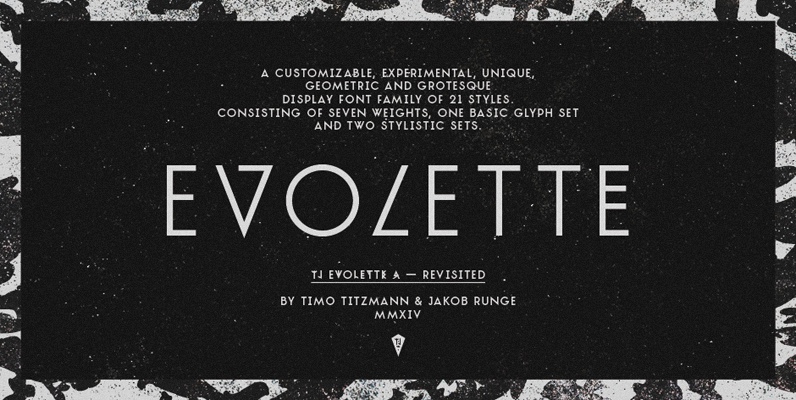
TJ Evolette A is unique, customizable, experimental, fashionable and clean. The geometric constructed uppercase grotesque display font family of 21 styles, features seven weights, one basic glyph set, two integrated extravagant stylistic sets for the whole alphabet and some astonishing special characters as well.
TJ Evolette A was designed in 2011 by Timo Titzmann and Jakob Runge. In 2014 they revisited the typeface with new characters, border language support, runic figures, improved kerning and a better weight gradation with heavier weights.
The typeface offers numerous combination possibilities between the basic glyph set and the two stylistic sets. The stylistic sets are alternate alphabets – interpretations of Art Deco mixed with straight lined shapes of ancient runes. This variety encourages unusual and extroverted creation in editorial and poster design.
In all weights all common character sets of Central, Eastern and Western Europe are supported. Best use of alternate glyphs via OpenType layout features.
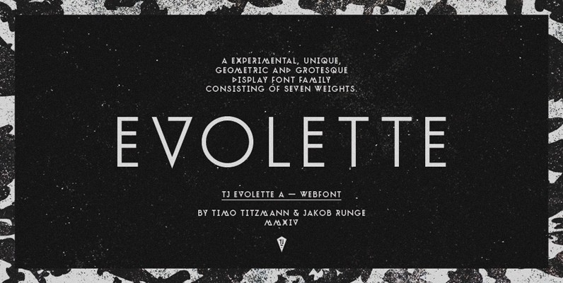
To use the multifarious typeface even without support of OpenType Features (like for web usage) we recommend TJ Evolette A Web. This version offers a predefined mix of all glyphs.
Feature Summary (*new in 2014):
– 7 weights: Hairline, Thin, ExtraLight, Light, Normal, Bold and Black*
– 2 Stylistic Sets with alternates for every letter
– 1 Stylistic Set to mockup the subsetted TJ Evolette A Web
– 1 set of runic alternates for the figures* and punctuation
– Ancient roman figures*
– Automatic fractions*
– Superior and inferior figures*
– Arrows*
– Contextual alternates for arrows and a correct multiply between figures*
– More than 600 glyphs in each weight
– Extended language support* (most Latin-based scripts supported)


