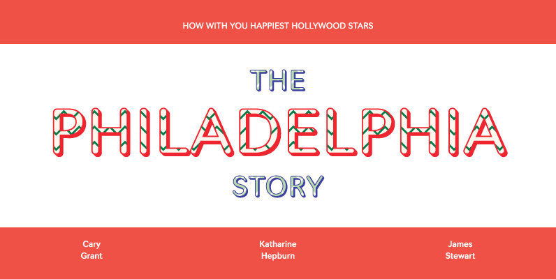
A playful handwriting of a child.
Twelve-year old Tobias Düsel designed the characters of this font in 2002 during his family’s furlough in the USA.
He drew the alphabet freehand in pencil on a piece of stationery, and clearly had examples of the well-known college and military fonts in mind. The characters in their basic form are geometrically thought out, as well as the construction of the shadows.
But remarkably, while drawing, Tobias Düsel did not reach for the obvious aid of a ruler. In fact, the strokes of the letters are not linear, rather are recognizably well-balanced with declining and increasing straights as can be seen in polished classical fonts. Originally this font consists only of upper case letters — all other characters (punctuation marks, figures and similar) have been modified from the components of the capital letters.
Complementary to the original Outline-Shadow-Version TobyFont Empty, the variations TobyFont Inside and TobyFont Full are also available. ”Empty“ is, so to speak, the frame of the typeface as “Inside” is the filling, and “Full” is the sum of both.
All three versions have the exact same body size so that they can be placed over one another congruently. In this way the effect of a font in two or three colors can be attained.
TobyFont is excellently suitable for designing “picturesque” or “hand-carved” contents; large weights are especially charming and striking.


