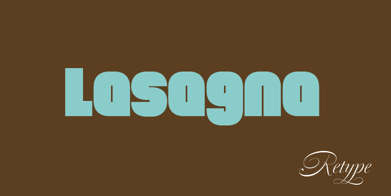
Tomate’ started in 2006 as a brush lettering exercise for a poster and was later used for the ReType identity. In 2008 its author decided to turn it into a super fat typeface suitable for packaging and mass consumption products. The possibilities of ultra heavy forms are explored in this alphabet; trying to solve the design problems that these sort of forms present. ‘Tomate’ shows influences from the beautiful ‘Goudy Heavyface Italic’ which is a design the author admires.
Save 10% off YouWorkForThem fonts with the code: MRSAVE10

