When it was published by the Weber foundry in 1955, Signum became an instant classic. Less than one year later, the Czech foundry Grafotechna released Stanislav Marso's Kamene, a reinterpretation of Signum. The differences between the two were quite subtle in most forms, but functionally proved to offer different levels of visual flexibility. Marso changed a few letters, most notably the wonderful a and g he added, and also made a bold weight.
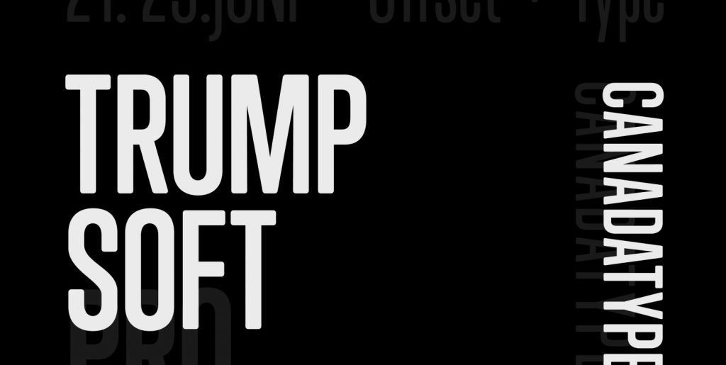
Trump Gothic West is a revival of Trump's original Signum, but in three weights and italics for each. Trump Gothic East is a revival of Marso's Kamene, but also in three weights and corresponding italics.
In the 1950s the popularity of Signum in Western Europe and Kamene in Eastern Europe was mostly due to their tremendous appeal and functionality in poster design and other large applications. But in this information millennium, types like these are a necessity because of the large amount of information they can set in little space. These are the kinds of types that gave newspapers some breathing room and allowed them to go beyond the three- or four-letter headline and into the world of teasers made of comprehensible sentences. Goodbye “Hoffa Missing!”. Hello “Where is Jimmy Hoffa?”.
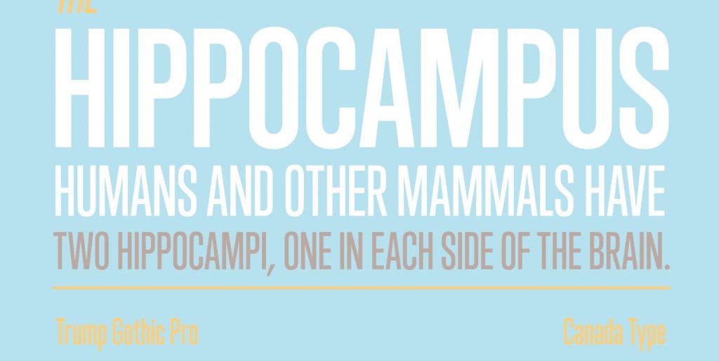
Available in all common font formats, both variations of Trump Gothic are very useful in design situations where economy is a concern, as well as in small print applications, such as event tickets, legal notices. The Trump Gothic types are also very suited for film/movie credits of all sizes. Published by Canada Type.


