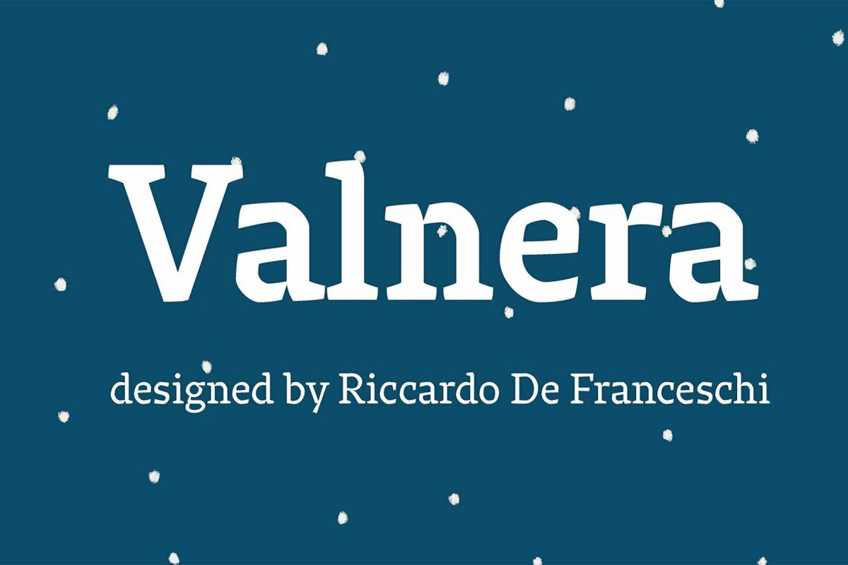
Valnera is a low-contrast humanist serif typeface of a distinctly angular design which works well at display and text sizes. Valnera comes in eight weights with matching italics and the headline font Valnera Monster.
It has open counters and flat horizontal curves. Its simil-slab serifs are strong and its horizontal terminals show the influence of a broad pen. Connections between stems and arches are very sharp. Cuts at crotches are also sharp and work like ink traps. The angular appearance produces a somewhat interrupted construction of counters of some round letters too – reminiscent of Dwiggins’s m-formula. While suggesting spiky Alpine landscapes Valnera evokes the calligraphic appeal of Oldřich Menhart’s typefaces. It also expresses in a very contemporary way that kind of 1970s photocomposition feeling typical of two iconic faces: Cartier (1967) and ITC Mendoza (1991). First designed in 2010-2011, Valnera was reviewed, updated and completed in collaboration with CAST. A random version, Valnera Random, has been developed in order to obtain a greater variety of text images.


