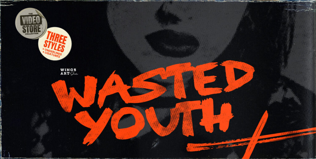
It’s messy, turbulent, handwritten. With over 350 glyphs.
Why does it look so realistic?
Hundreds of handwritten custom letter combinations make this font look like it was scrawled with a pen, not typed with a computer. These characters belong next to each other… that’s how the natural flow and messy style is achieved. You won't see many duplicate letter styles here.